Enxuto
Food and Beverages
Enxuto is the trademark of a Group which entrepreneurial DNA always seeks to innovate and generate relevant and attractive experiences. The phrase that works as a slogan for the company: “Tudo por você!” (Everything for you!), expresses the purpose of delivering the maximum benefits and resources to the consumer. To materialize this commitment in its product lines, the Grupo Enxuto started a partnership with Pande. Nothing is more suitable to make the value proposition of the Enxuto Group tangible than to rely on the expertise of the agency which is driven by Value.
Pande, considering the expansion of the Grupo Enxuto’s portfolio, conducted this growth by relating it to the company’s purpose of offering convenience to its consumers in a clear and objective manner. In addition to modernizing the brand, we had to differentiate the product lines by categories, subdividing them in a way that made their identification evident and their communication direct. In order to do this, we needed to develop a cohesive identity and, at the same time, invest in creating logical distinguishing elements. Pande developed, in partnership with the group, the naming of the two sub-brands that streamline the company’s product portfolio.
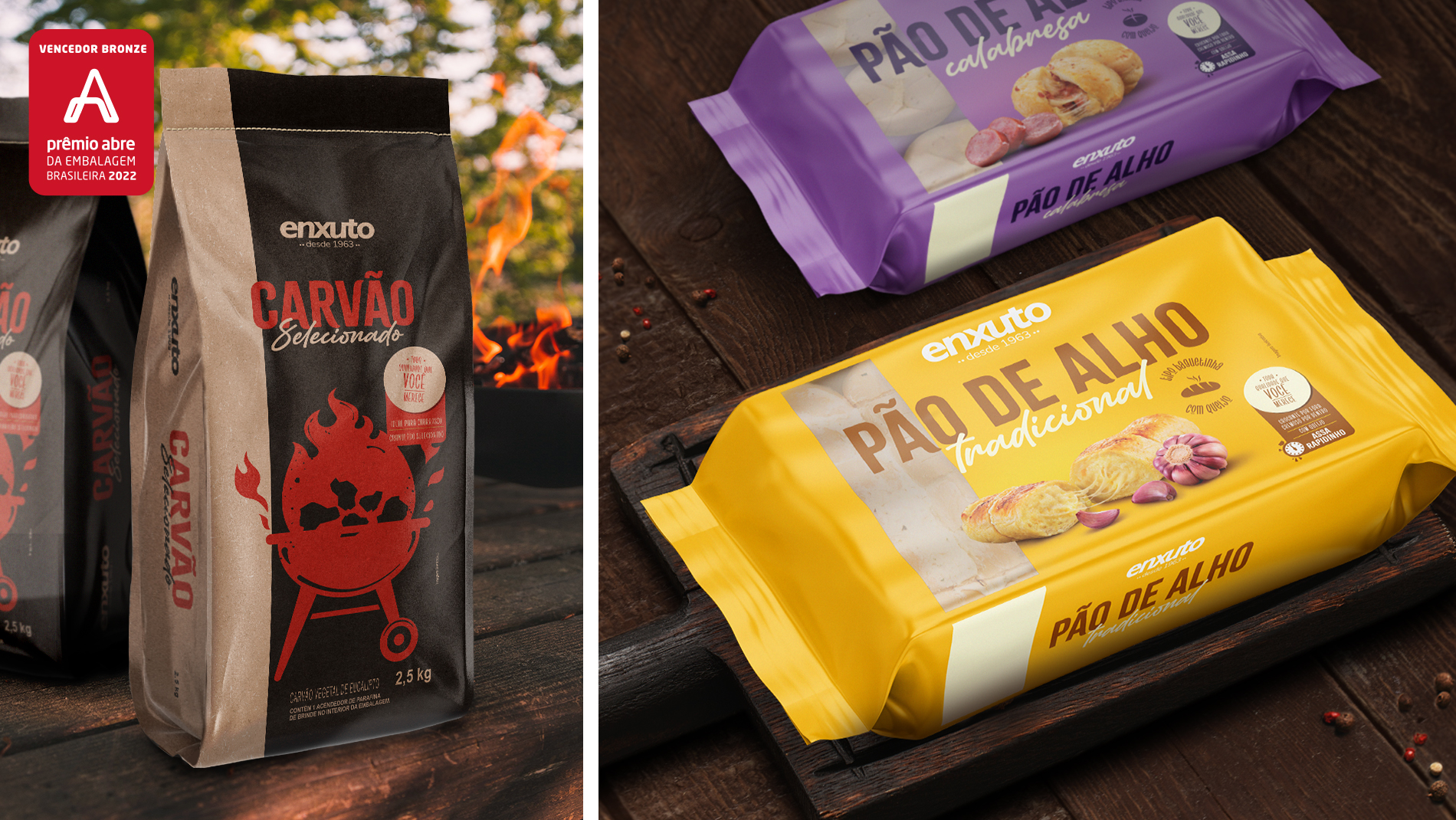
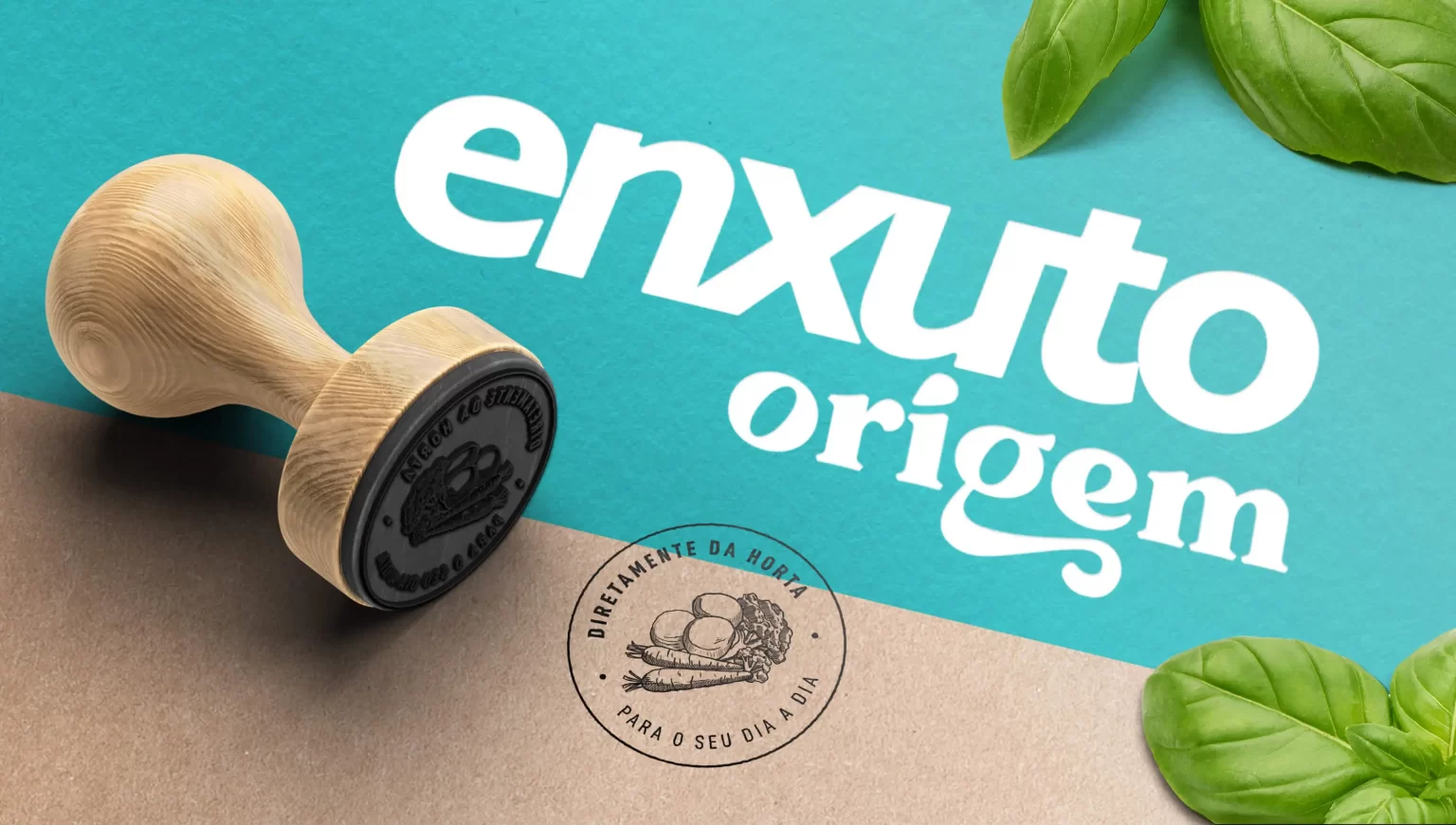
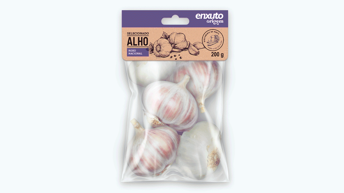
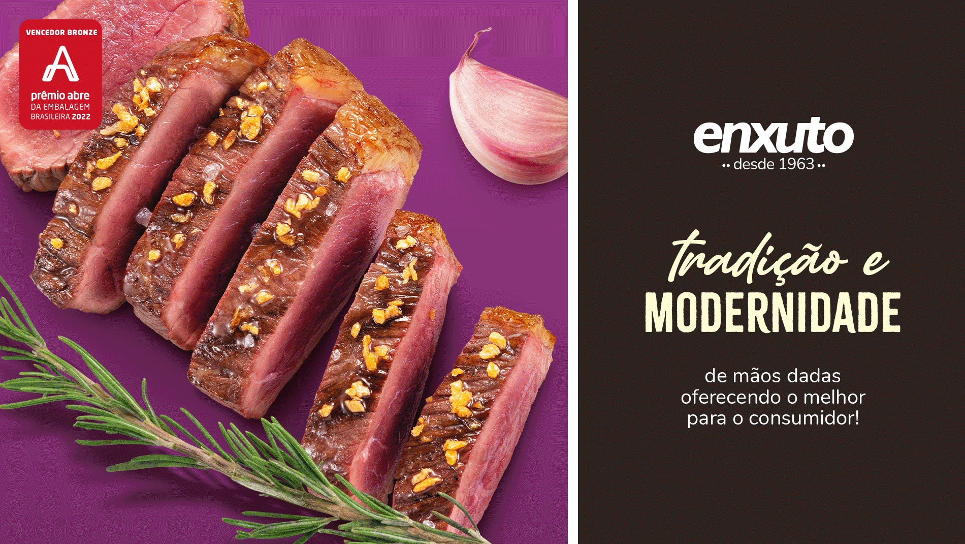
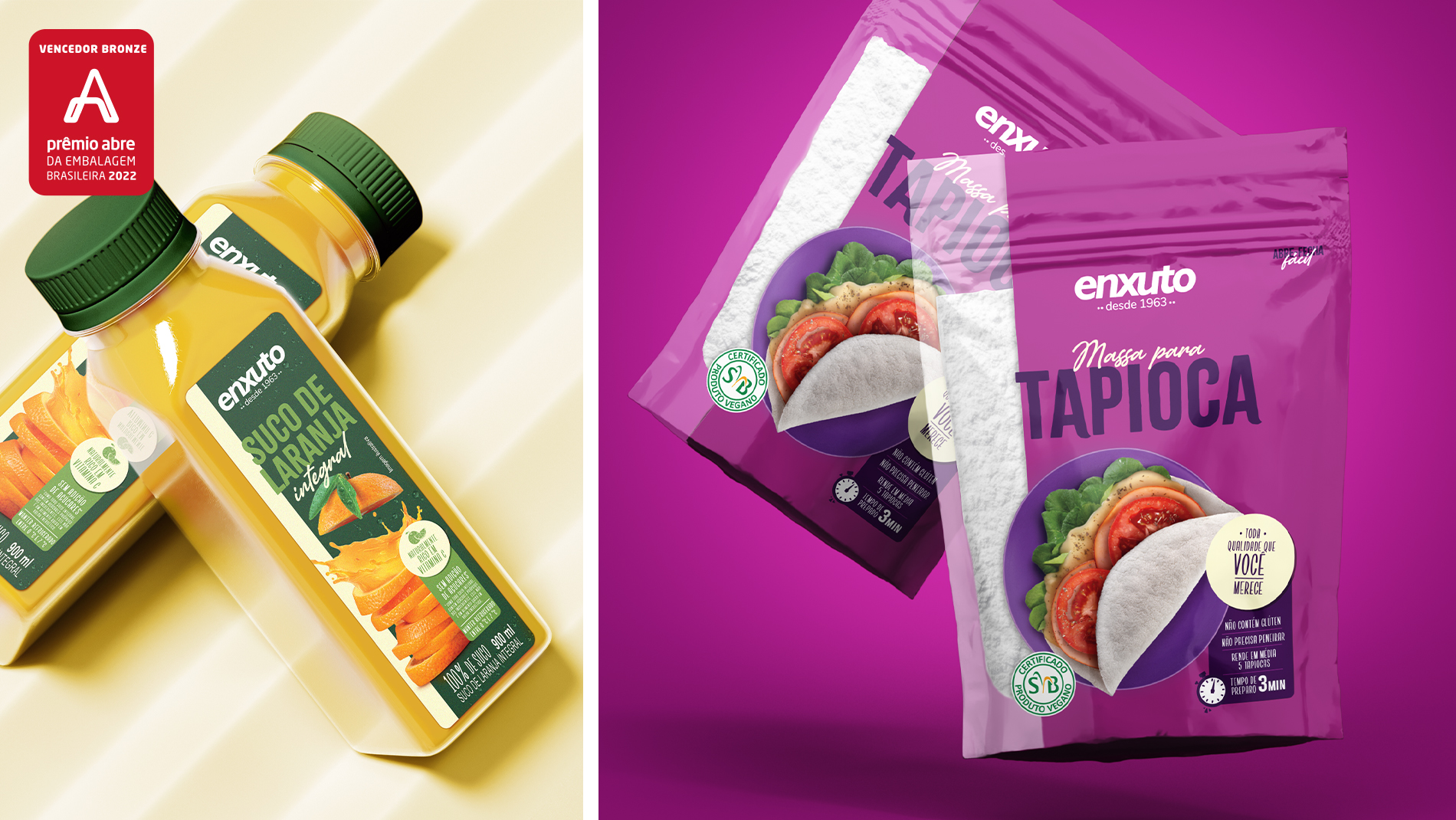
In order to organize the products within the logic of their exhibition sectors, two sub-brands were created: Origem and desde 1963. While Enxuto desde 1963 encompasses grocery, beverage, hygiene, and cleaning items; Enxuto Origem contemplates butchery, fish market, bakery, rotisserie, ready meals, and FLV (fruits, vegetables and greens) sectors. The Enxuto brand endorses quality and tradition for these sub-brands. However, the identity of each of them was designed to establish a dynamic dialog with the consumer according to its characteristics.
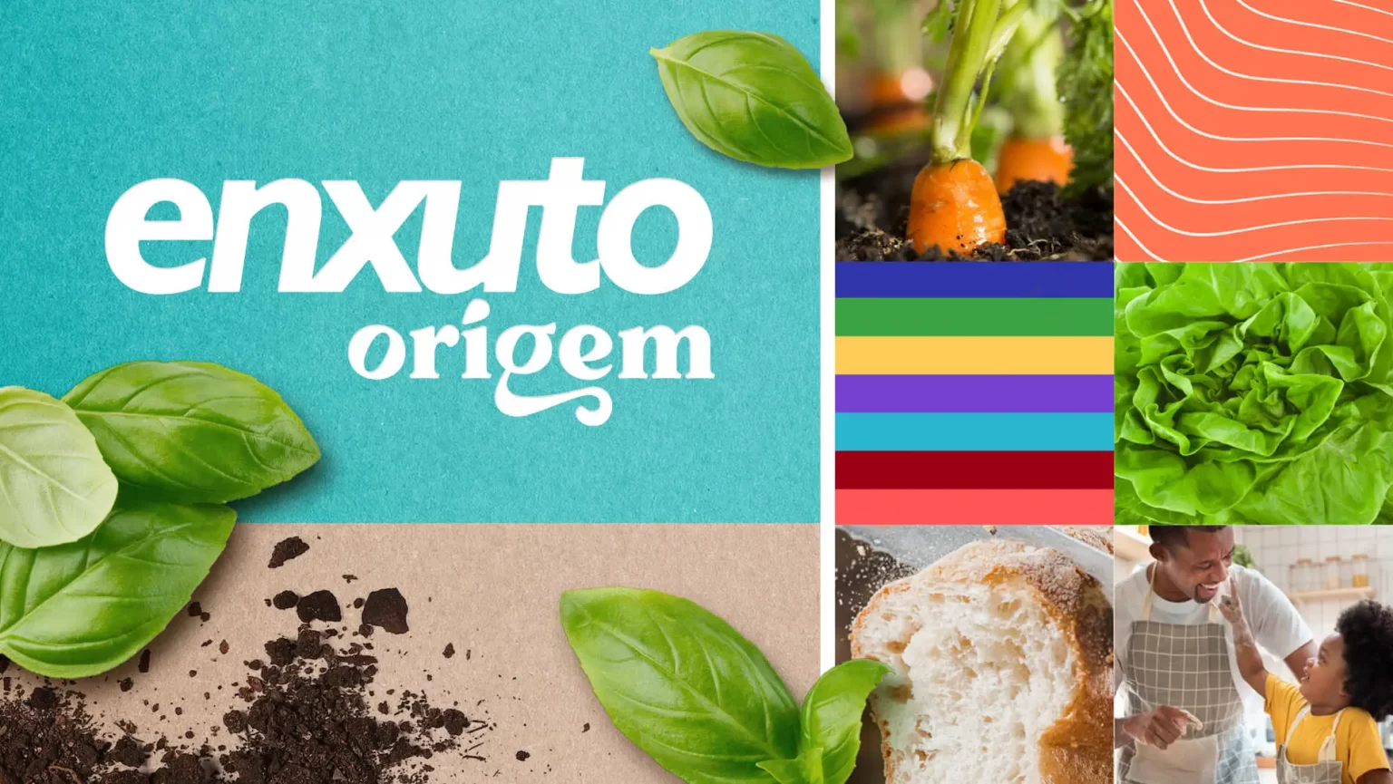
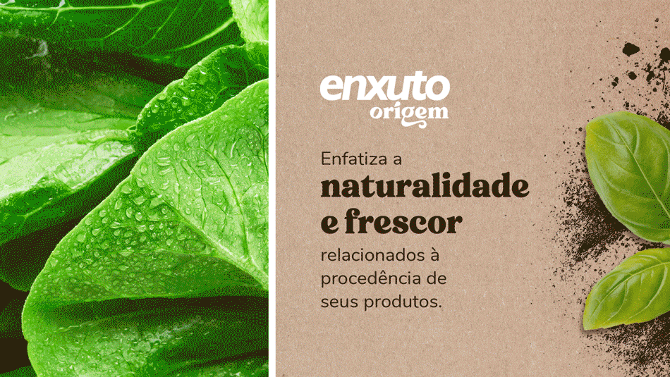
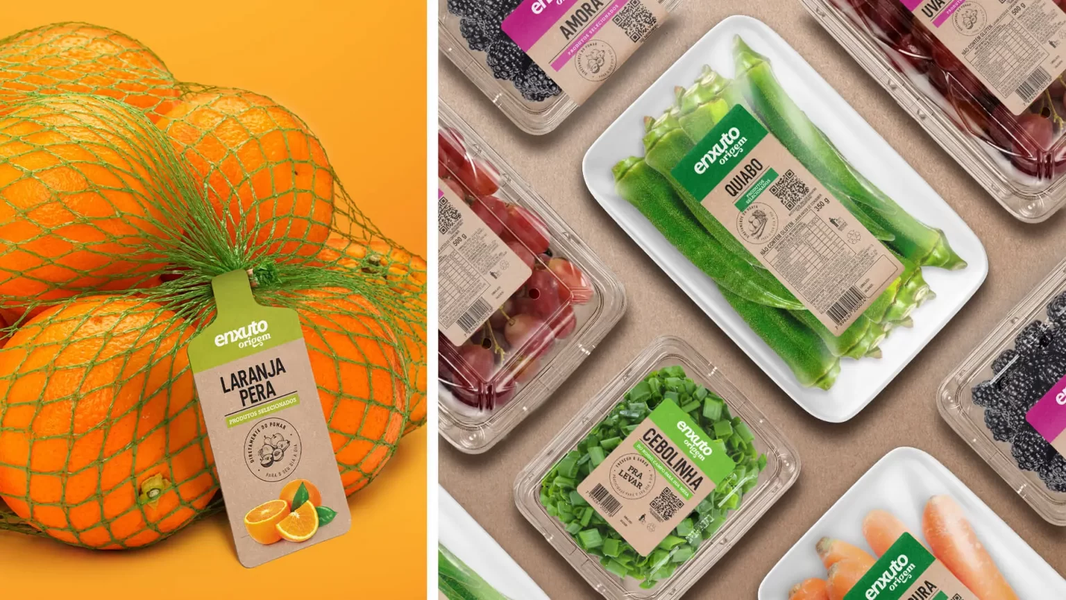
In Enxuto Origem, we have maintained the communicative objectivity and emphasized the transparence areas of the packaging, all to highlight quality. The goal, in this sub-brand, is precisely to emphasize the natural aspect and freshness related to source.
On the packaging of this sub-brand, the highlights are to the craft, which suggests the more manufactured aspect of the products, and the illustrative images predominantly formed by engravings. The claims of Origin are displayed in the form of a stamp, an element that attests the quality and source of the products.
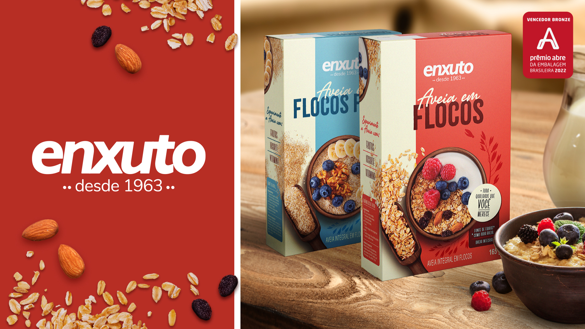
In desde 1963 we have a modern, vibrant, objective language, with emphasis on the composition of the illustrative images and on the graphic elements that have a proportion carefully distributed by the layout, generating a robust and homogeneous identity, as well as highlight on the shelves in comparison to concurrence.
As Enxuto aims to offer the experience of convenience and freshness, our main goal was to make these attributes tangible by using features that made the packaging more expressive and impactful, and with a clear hierarchical definition of the information. All to facilitate an objective dialogue with the consumer and an assertive navigation through the portfolio.
Private brands have gained relevance in buying habits and the design has the role of making evident a new value proposition: that related to emphasizing, beyond the benefit with price, the high quality of private brand products.