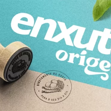
Why did typography become the star of branding projects?

Get inspired
Have you analyzed the most successful branding projects in recent years? If you look closely, you will see that there is something common between them: typography. During our internal cycle of lectures, Pande Wise, the typographer Fábio Haag said: the typographic font gained prominence in the visual communication of the brands.
Haag’s quote was reinforced by several trend reports for 2021, such as “Dieline’s 2021 Trend Report”, from the Dieline portal. But what explains this phenomenon? And how can brands be more assertive with typography in their branding strategies in the future? Check out the insights gathered by our team!
What explains the rise of typography in design?
Before the typographers on duty stand up in protest, we would like to clarify a point: typography has always played an important role in the visual communication projects of the brands. After all, it is in charge of arranging the texts in a legible way, capturing the public’s attention and giving the right tone to the text. For this, it considers not only the types of letters, but also the fonts, hierarchy, consistency, alignment, colors and even the white spaces between the elements.
However, in recent years, typography has gained prominence in branding projects. Whoever followed the launch of the new Burger King brand knows what we’re talking about – we did an analysis of the project on our Instagram! In the rebranding, BK presented a proprietary typographic font, Flame, which refers to the format of its snacks and communicates with the modern aesthetics of the chain. Before him, Netflix, Google and Samsung also adopted their own typography, as shown by an article from the technology portal The Verge.

One of the factors that explain this phenomenon is the growth of mobile. Cell phones are the main way to access the internet in Brazil, according to the most recent data from the “Continuous National Household Sample Survey – Information and Communication Technology” released by Agência Brasil. And in this environment, it is crucial that brands communicate their identity and information clearly. After all, with a smaller screen, there is not so much space to rely on photos and videos.
The agility of the contemporary lifestyle also explains the rise of typography in branding projects. Some brands have become so recognizable by their typographic fonts that, just by looking at their texts, we already know who is behind them without even having to check the logo. Want an example? The font used by Uber on its mobile interfaces. Check out the image below: you don’t even need an icon to identify which app this is. Right?

Typography and design: how to make the right choice for your brand?
Now that you know why typography is becoming the spotlight in branding projects, it’s time to understand what to consider when choosing a font for your brand. We give you a little help!
Can’t you start from scratch? Adapt!
The elaboration of a typography project takes time and requires a team of experienced and dedicated designers, which can make the branding project more expensive. For this reason, some brands look for companies specialized in typography to perform this work. For those who do not have the time or cannot afford to create a font from scratch, an alternative is to use an existing font and adapt it, as Airbnb did when transforming the Circular font into Cereal, applied by the brand.
These adaptations have some legal implications. So it is very important to have the support of a design and branding agency experienced in this process!

Adopt inclusion as a criterion
The function of a typographic font is to allow the text to be easily understood – unless you are behind an experimental project full of riddles! Therefore, inclusion needs to be taken as an essential requirement. Letters such as “p”, “b”, “q” and “d”, for example, are mirrored reflections of each other, which can cause difficulties in apprehension for people with some types of cognitive disabilities, like dyslexia.
Poor kerning adjustments – that is, adding or removing space between characters so that the fit between them does not impair the visual appeal or readability of the text – or overly decorated fonts can harm many users, not just those who have difficulties of reading. In 2012, the typography company Monotype, in partnership with the MIT Media Lab, demonstrated that just by changing the geometric font applied on the vehicle panels for a more widely spaced and humanized one, the attention of the drivers improved.

Say “bye” to trends and “hello” to authenticity
This message came from the “Dieline’s 2021 Trend Report”. After years of seeing projects with minimalist typographic fonts, combined with very clean color palettes, some professionals looked for ways to do it differently. And, for the public’s happiness, some brands have shown themselves open to embrace this more authentic expression. After all, as important as being understood is having a message that catches the public’s attention and communicates what only you have!
It was the Omson, an Asian seasoning brand, that came up with this mission. The typography suffers distortions as if it were under water, making an allusion to the typical soups of oriental cuisine.

Typography is gaining an increasing role in branding and visual communication projects for brands. But before diving into this alphabet soup, it is important to check what is the budget available for the project and have an experienced team that can deliver types that are not only expressive, but also accessible!
Do you want to receive another dose of inspiration? Follow us also on Instagram, Instagram, Facebook and Linkedin!


