Piracanjuba
Food and Beverages
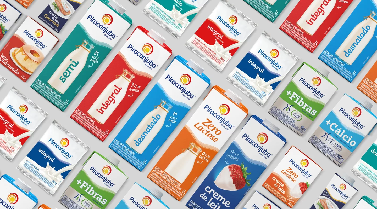
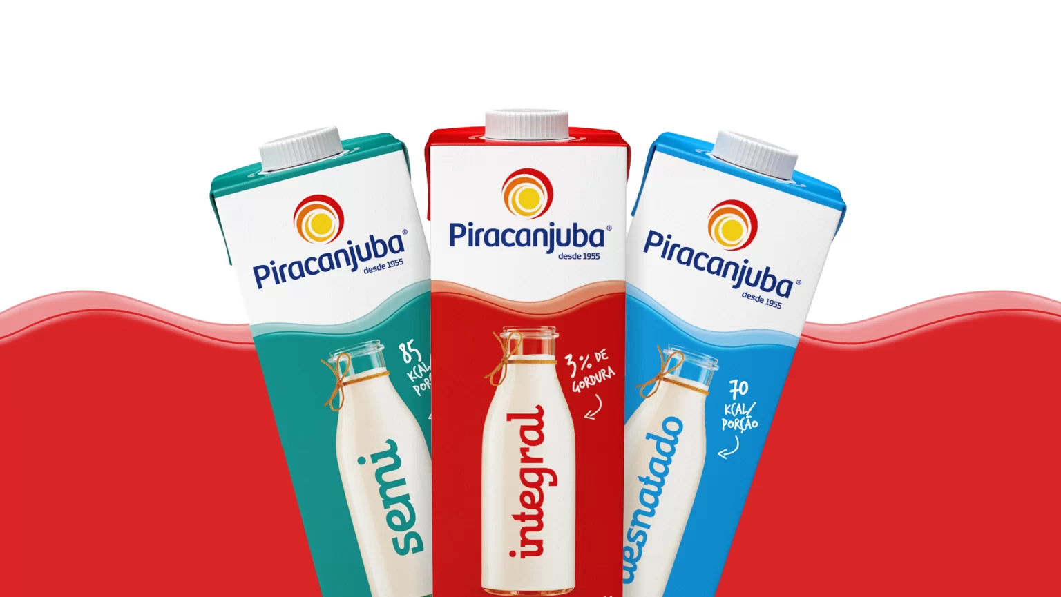
Piracanjuba, one of the largest brands in the dairy segment in Brazil, attained significant growth in recent years as a consequence of launching new product lines and expanding to new regions. In the process, it felt the need to modernize and standardize its visual identity reflected in packaging and communication.
A significant part of our challenge was related to the need to preserve the brand’s recognition, much consolidated and very traditional in some markets, thus respecting the equities built with the older packages.
After a language workshop, conducted by Pande with Piracanjuba consumers, we understood that, in order to potentialize the attributes of tradition, family values and quality, pillars of the brand, we needed to add a light hint of nostalgia and purity while bringing appetite appeal, visual impact and textures of ingredients in the packages.
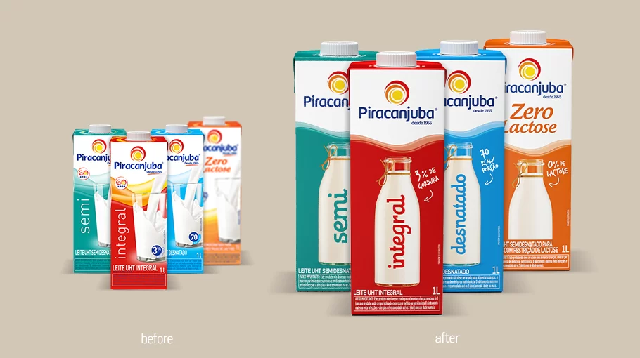
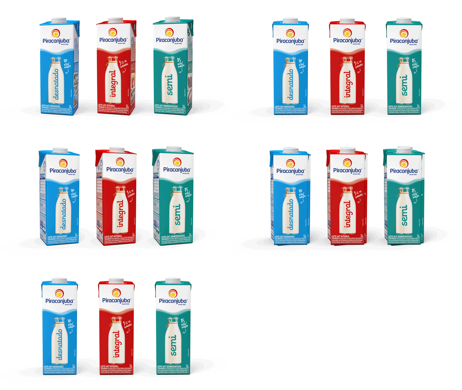
Since it’s an extremely competitive segment, we needed Piracanjuba’s brand to stand out. In order to achieve that, we simplified all of the visual equities present in the packages, making them clearer, more objective and efficient in the shelves. A recognizable wave-shaped pattern of imagery was conceived across all the categories in which Piracanjuba is involved, building visual unity. We also focused mainly in the names of each product variation, making customers’ lives easier.
