Nestle Grego

Nestlé DPA, one of the greatest companies of yogurt in Brazil, was the pioneer in the introduction of Greek type yogurt in the country. Since then, the market has evolved a lot and the visual identity of the category has tried versions of the players that act in the segment. After the maturity of this segment, the company proposed the challenge to define an evolutive mark for the category in Brazil, reconfiguring the credentials of the product. It has developed a project that included since the reformulation of the yogurt until the reconfiguration of the packages with the goal to encapsulate, in only one brand, the best standard of all drivers of the consumer. With that, it has improved the experience with the brand through the tangible aspects.
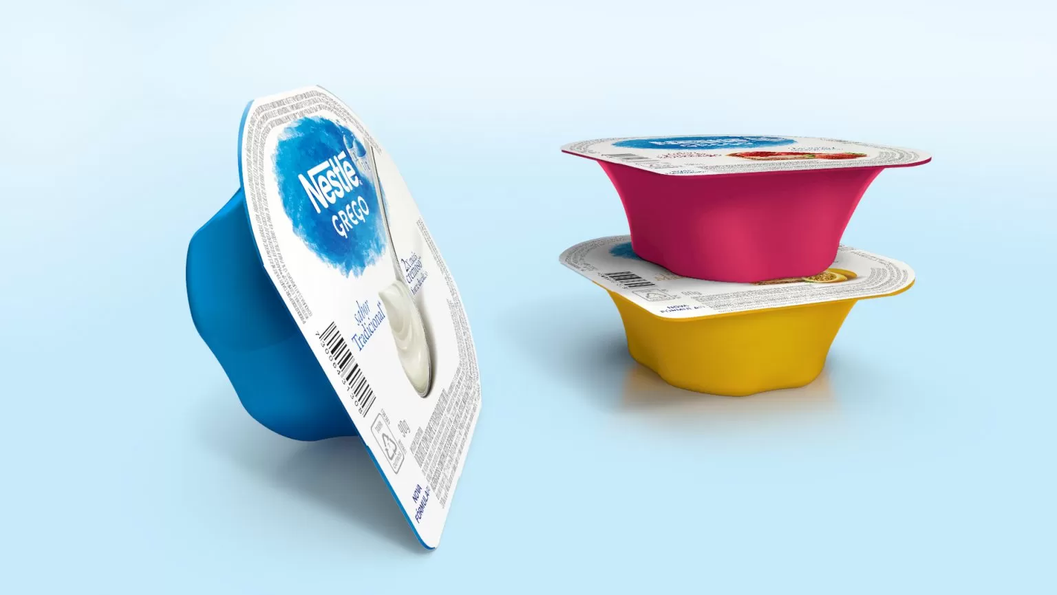
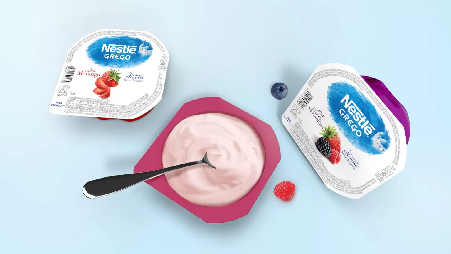
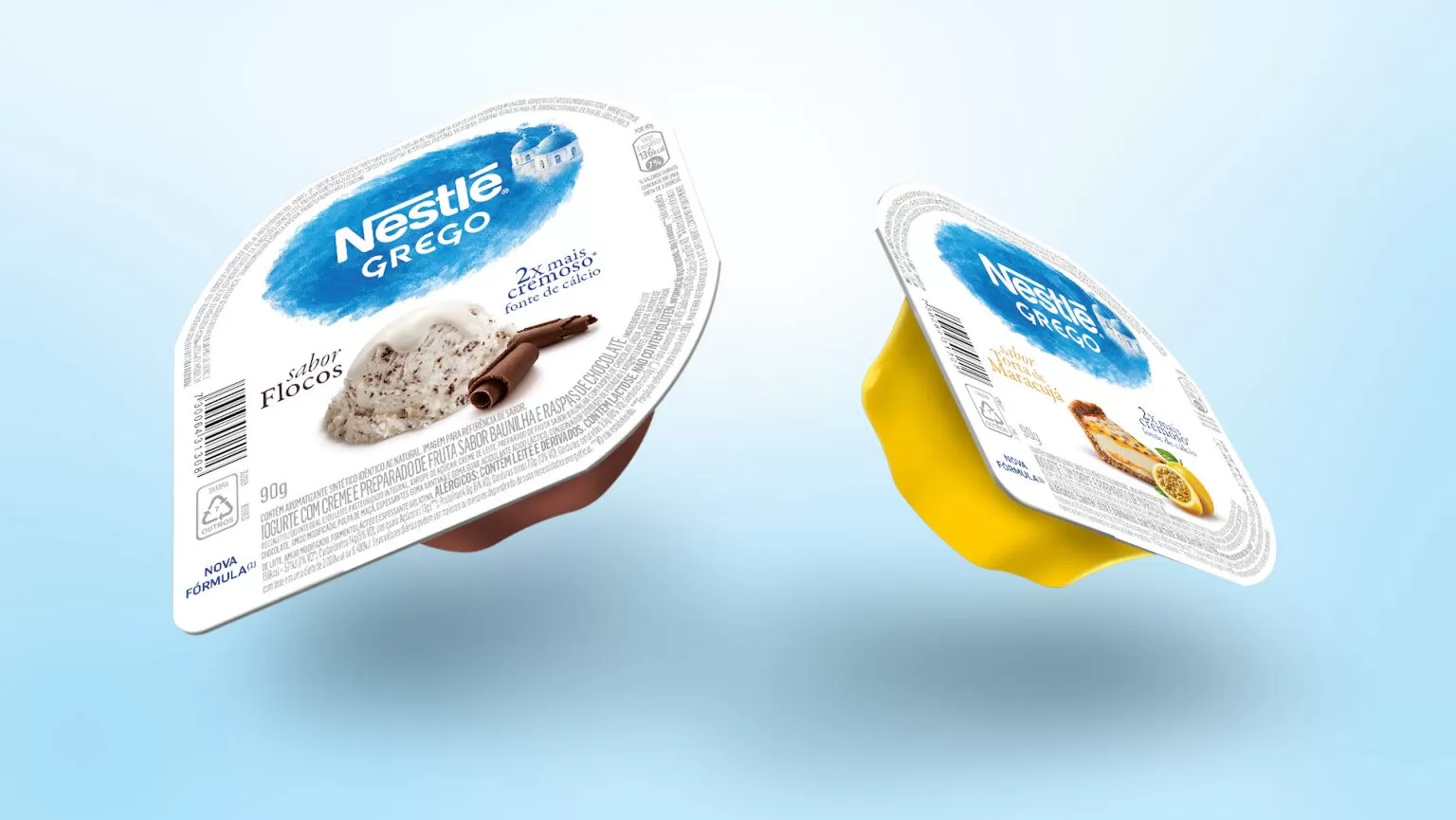
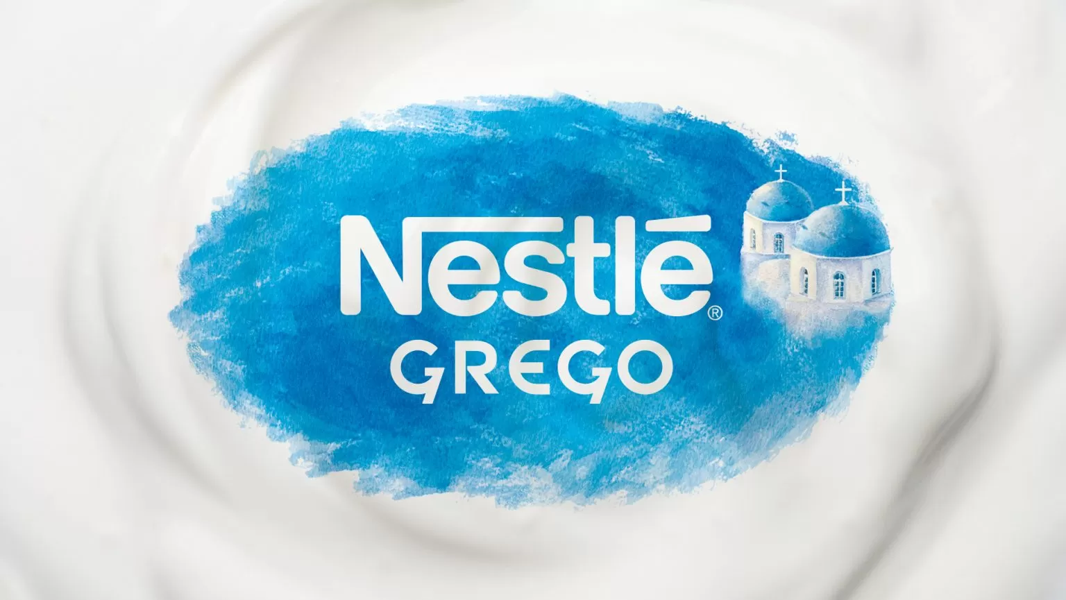
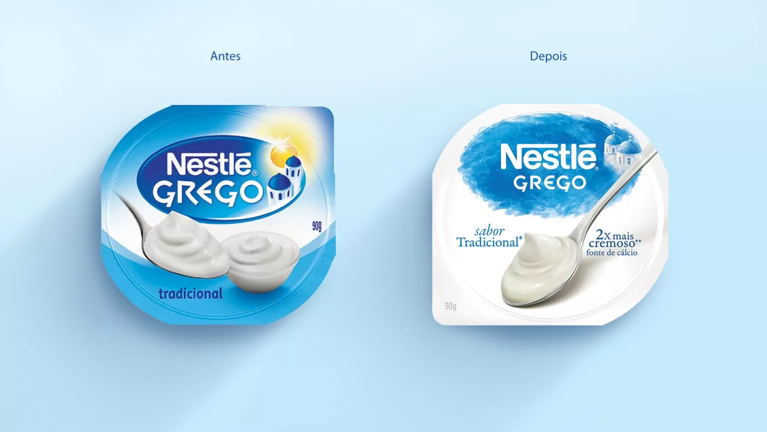
A new visual identity of the Grego Nestlé Yoghurts was developed, more modern and attractive, powering the credentials of light and healthy indulgence, suggested by the category consumers. The new identity went through a full redesign that highlighted the Nestlé logo, incorporating a language of watercolor to the traditional images of the churches of Santorini, which have already become an international symbol of the category. The other elements were disposed in a way to transmit, according to the proposal of the brand, lightness and simplicity, highlighting the images of appetite appeal that, in addition to attracting the consumers, represent, in a clear way, the diversity of portfolio of the Nestlé Grego yogurts.
In the stage of concept design, we made an immersion, from North to South, in the outlets and discovered two main points where the packages should evolve: the excess of information, which complicate a clear and direct exposition, and the challenge to verticalize the exposition of the unit product to facilitate the shopper to see the interface. The challenge was to develop a more attractive product for the consumer with a greater exposition of the product.
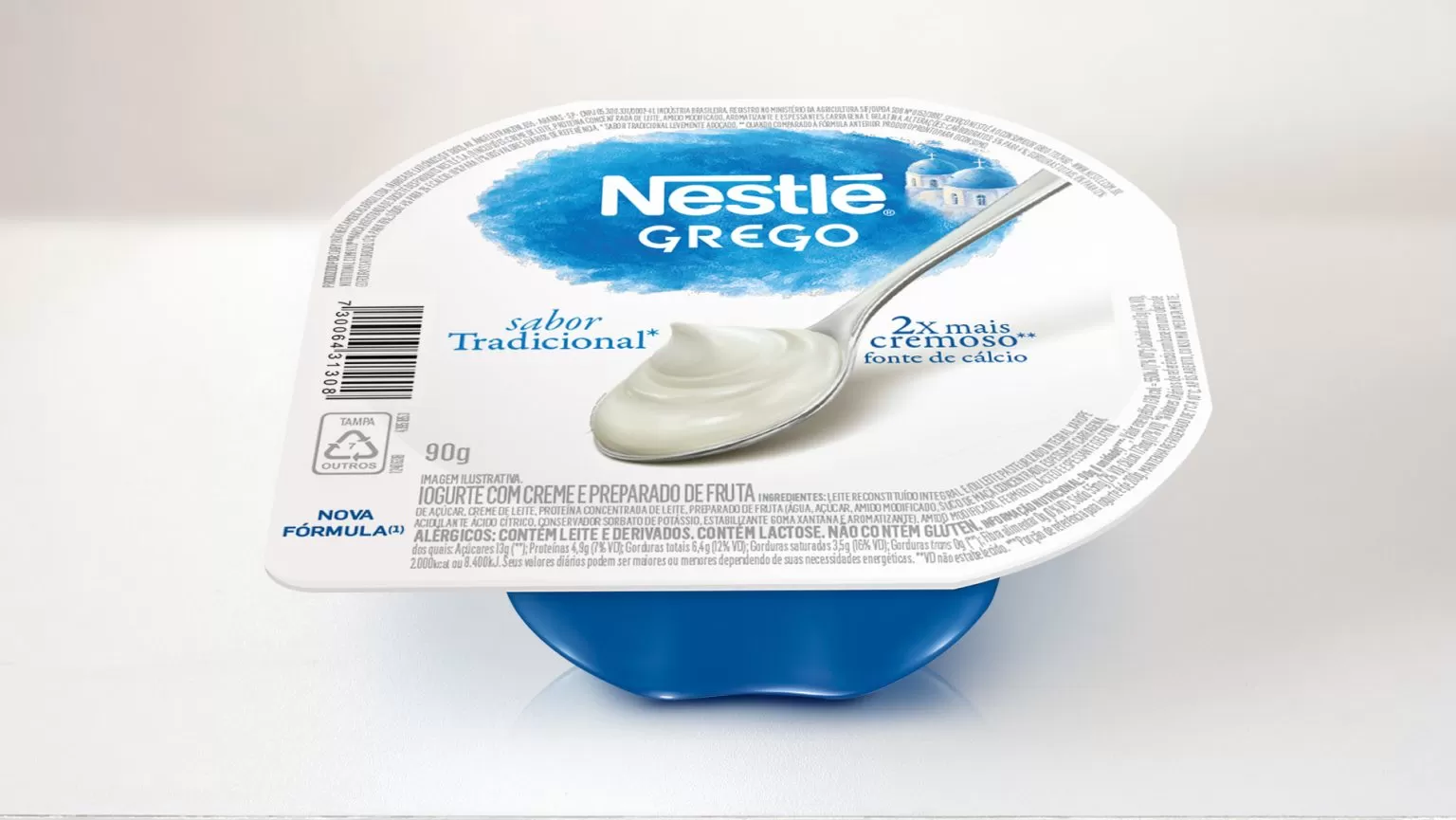
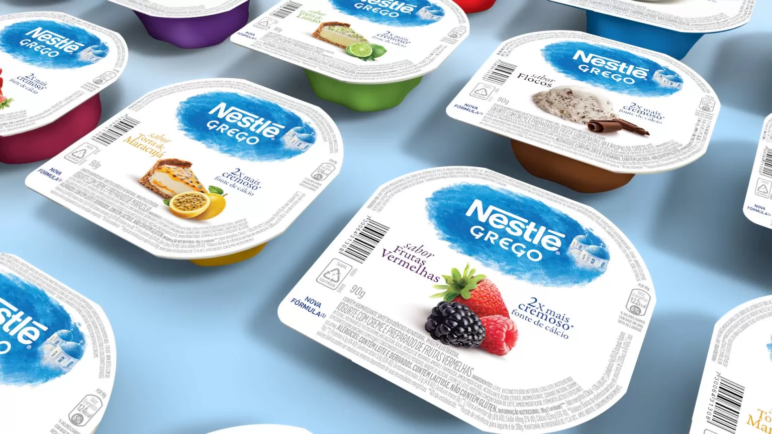
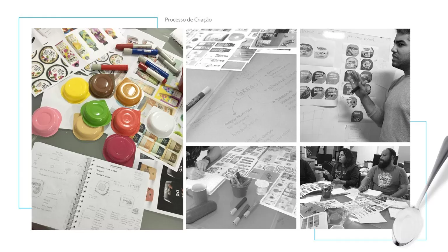
In parallel, an innovator new shape was developed for the category that, maintaining the same volume of the product, allowed the vertical exposition, leaving the presence of the brand in the outlets with much more emphasis. All that, incorporated to the use, unique in the category, of color pots for each type, helping the consumer to navigate through the great variety of flavors.