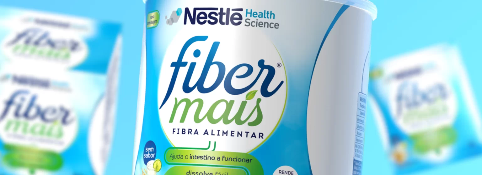
Nestlé Fiber Mais
Food and Beverages
Nestlé Health Science, a company focused on creating innovative solutions in nutritional therapy, has entrusted Pande with redesigning the brand and packaging of Fiber Mais. The brand, acquired by Nestlé, despite being consolidated 10 years ago in the market, had a language outdated in front of its competitors.
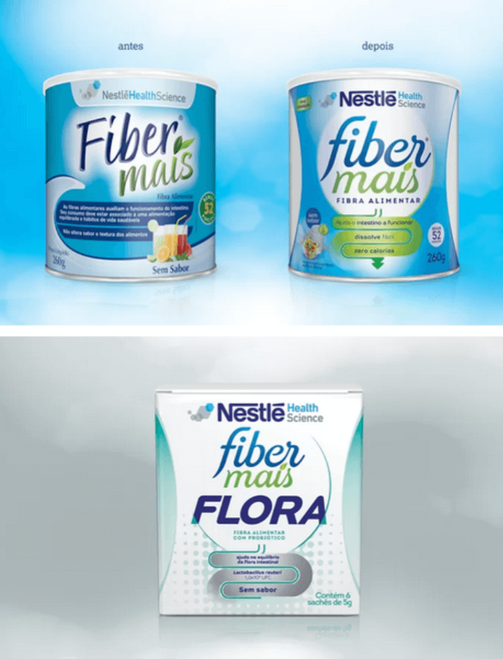
During the project, we investigated two vectors of information: the market for digestion solutions (drugs, laxatives and other fiber components), and the target consumer of the brand (how they talk about the topic, which medical specialties they seek, and the language used by them describing their problems). In addition to these searches, we compared the channels and found that Fiber Mais uses a color code that sets it apart from its competitors who predominantly work with shades of green.
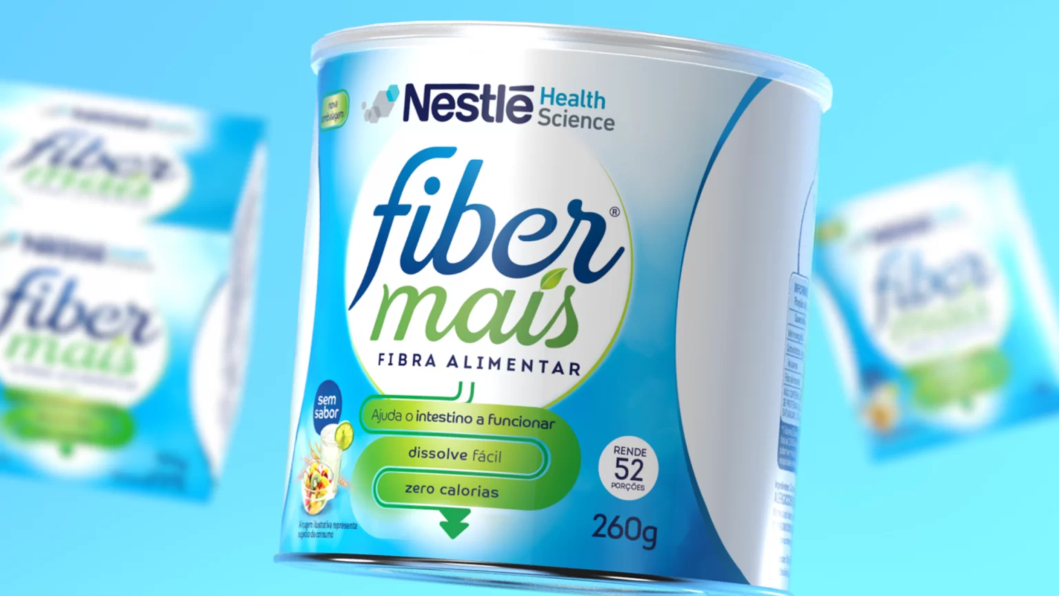
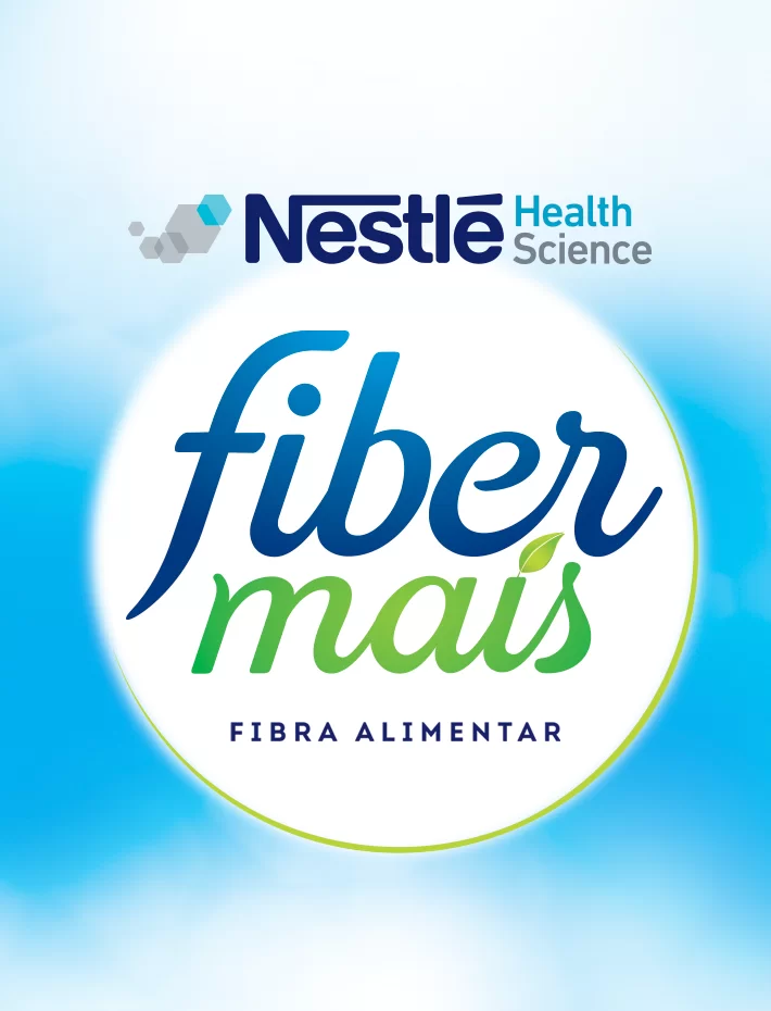
We have redesigned the logo and packaging of Fiber Mais, preserving blue as the brand’s own color code. We have inserted a new element that clearly shows the benefits, making it easier for the consumer to identify the solution proposed. fibers with probiotic, we change the visual codes so that the differentiation in relation to the traditional version is greater and so that its benefits are transmitted more clearly.
With the changes implemented, we help the brand to strengthen its presence, making it more modern at the point of sale, much more objective in describing its benefits and easily identifiable by the consumer. The new packaging, along with Nestlé’s communication effort, helped the brand exceed the company’s growth target for 2017.