Nesfit
Our consuming habits have changed. We are increasingly concerned about demands as healthiness, naturalness and especially with the truth about everything we eat. Eyeing this new context, Nestlé DPA decided to change the category of yogurts and launched a brand new line of products focused on meet that requirement. Thus was born the line Nesfit yogurts.
Guided by this scenario, Nestlé DPA staff called us to help her to fully conceptualize the line: from the development process of flavors, through the design of the bottles until the logical adaptation of the visual assets of Nesfit mark for the category yogurts.
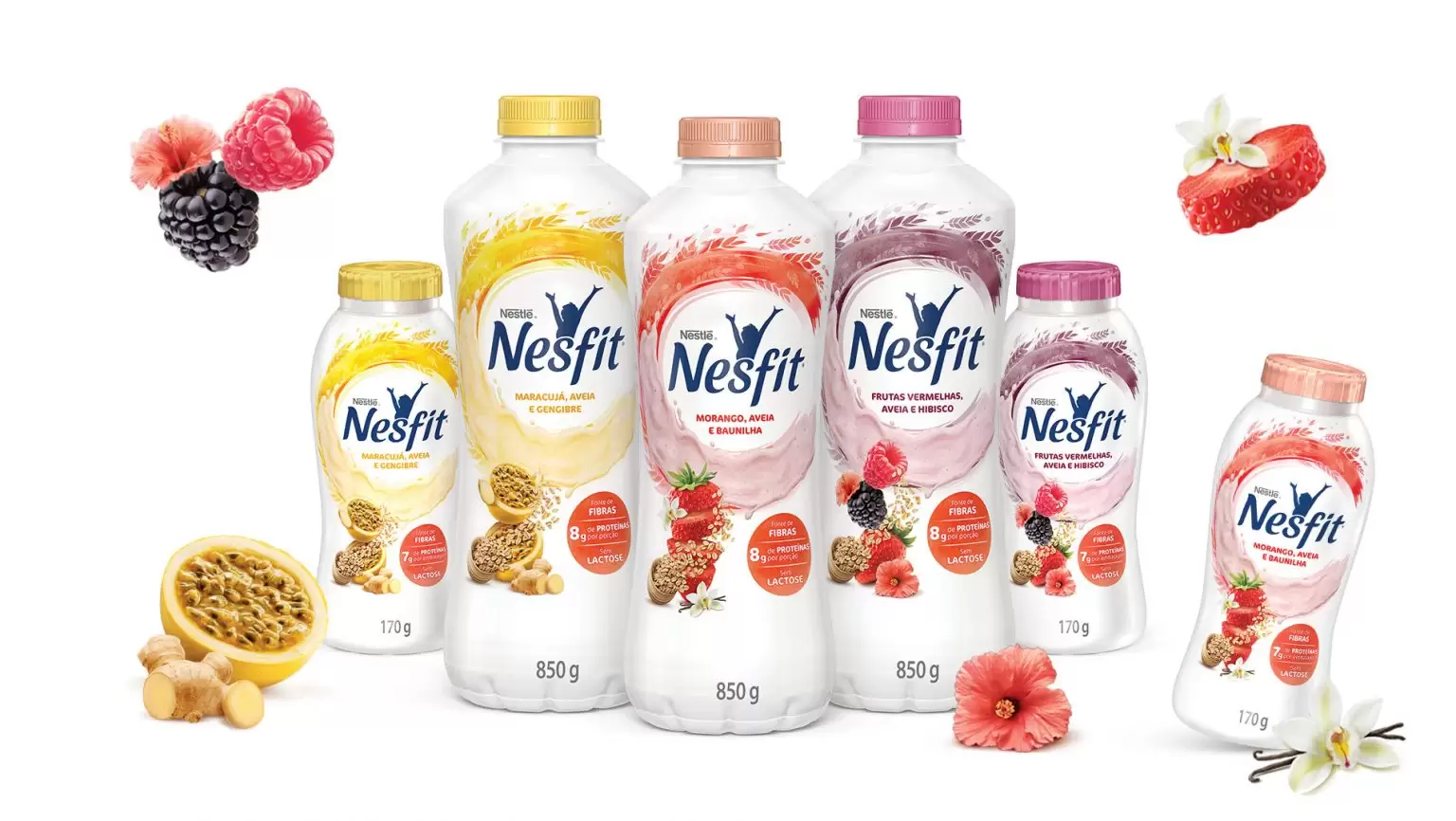
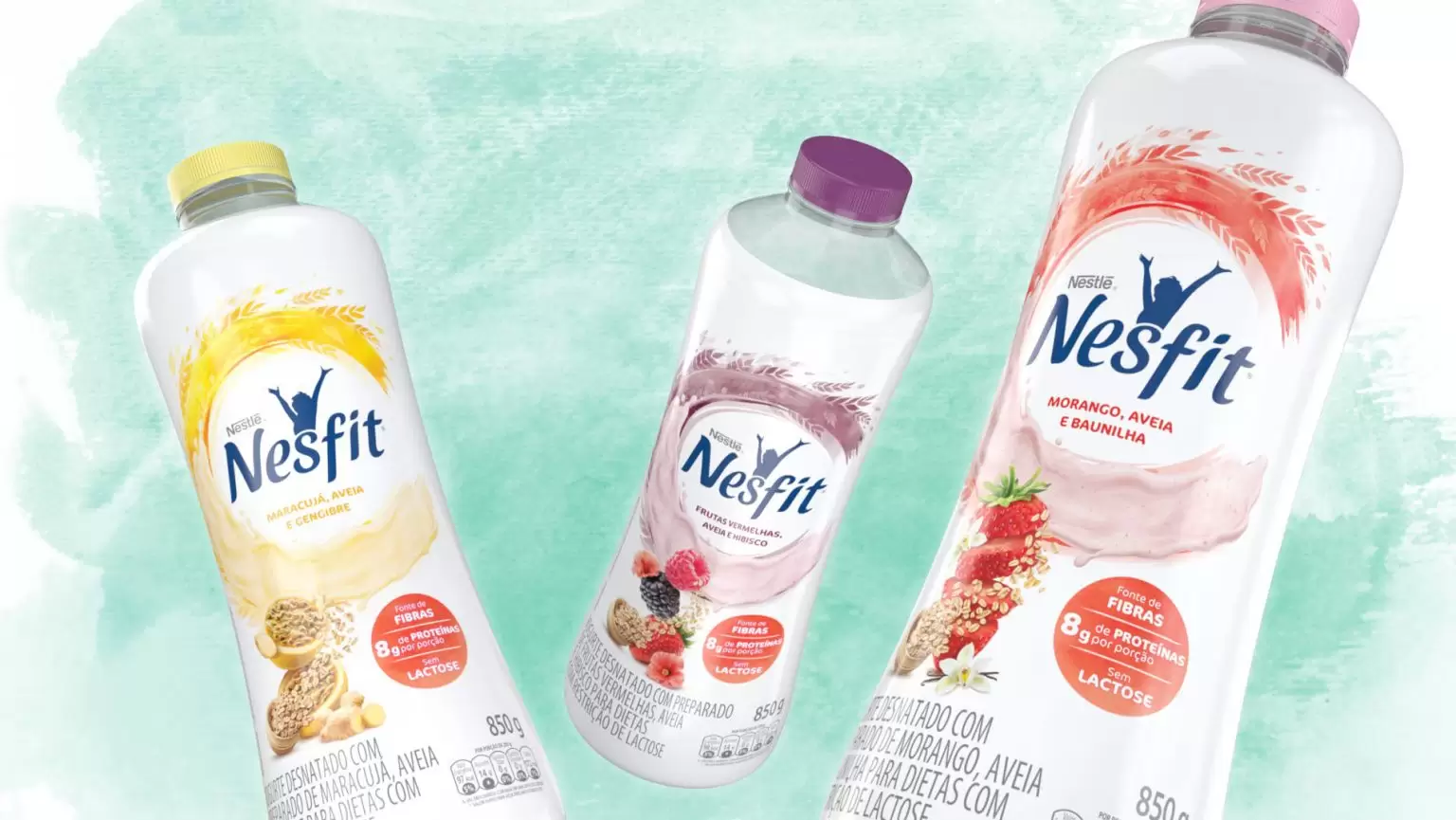
This project was challenging from the beginning, because the goal was to create a different product line. A distinct line of everything that is currently offered in the yogurt market and to guarantee a complete delivery attributes related to health, such as source of fiber, zero lactose, protein source, no added sugar and low calorie. All this, combined with a unique taste experience, ensuring the link between functionality and taste, as both aspects are important to the consumer target of the brand.
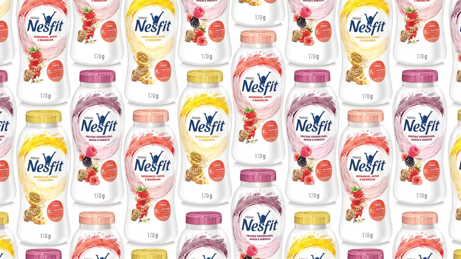
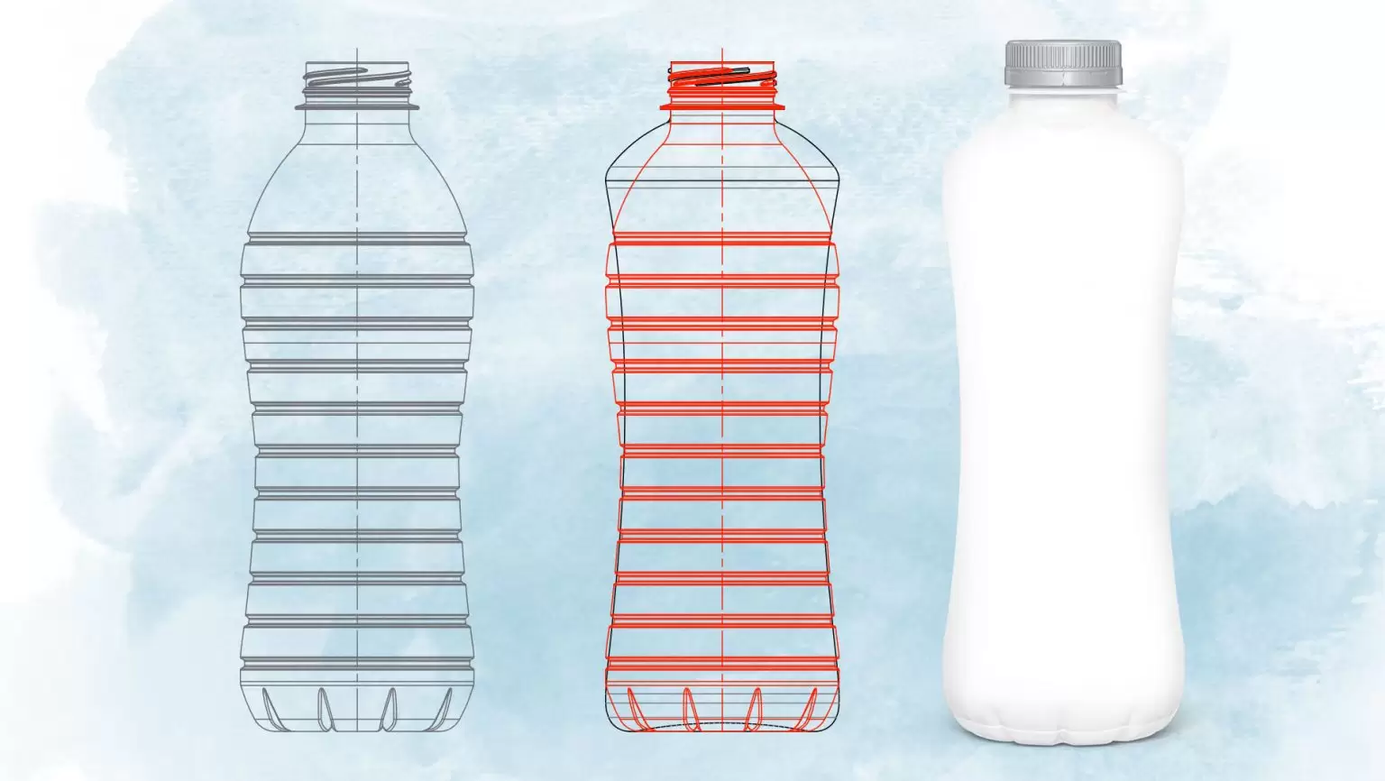
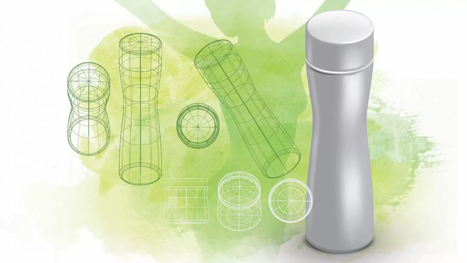
In the design of the bottle and the visual identity of the mark, it was prioritized a minimalism elements seeking presence at the Point of Sale performance and clarity about the benefits offered by the products.
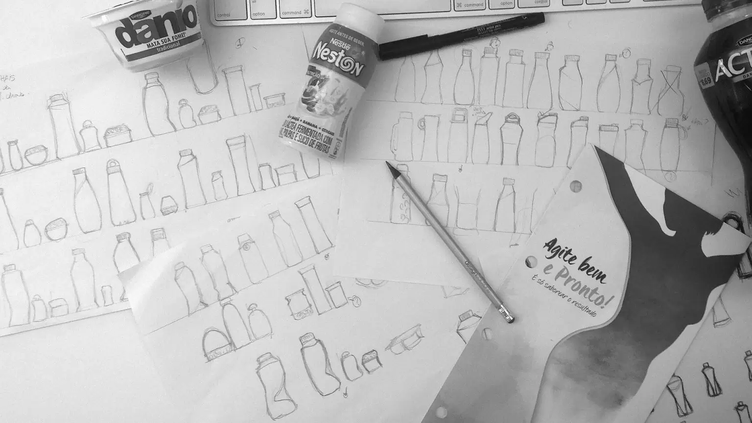
This is because, during the immersion phase in which visited various point of sales and audited competition in the segment, we found that traditionally the category of yogurt in Brazil has its products primarily by brands. Thus, the construction of exhibition display blocks (walls mark) is highly valued. This same logic exhibition creates a very confusing hallway and polluted with excess brands and colors that confuse the user orientation. The final design is a product line that has gone through two stages of validation with consumers, has a standard monolithic identity, powerful enough to stand out on the shelf and give conditions for the brand get earnings growth in the segment.