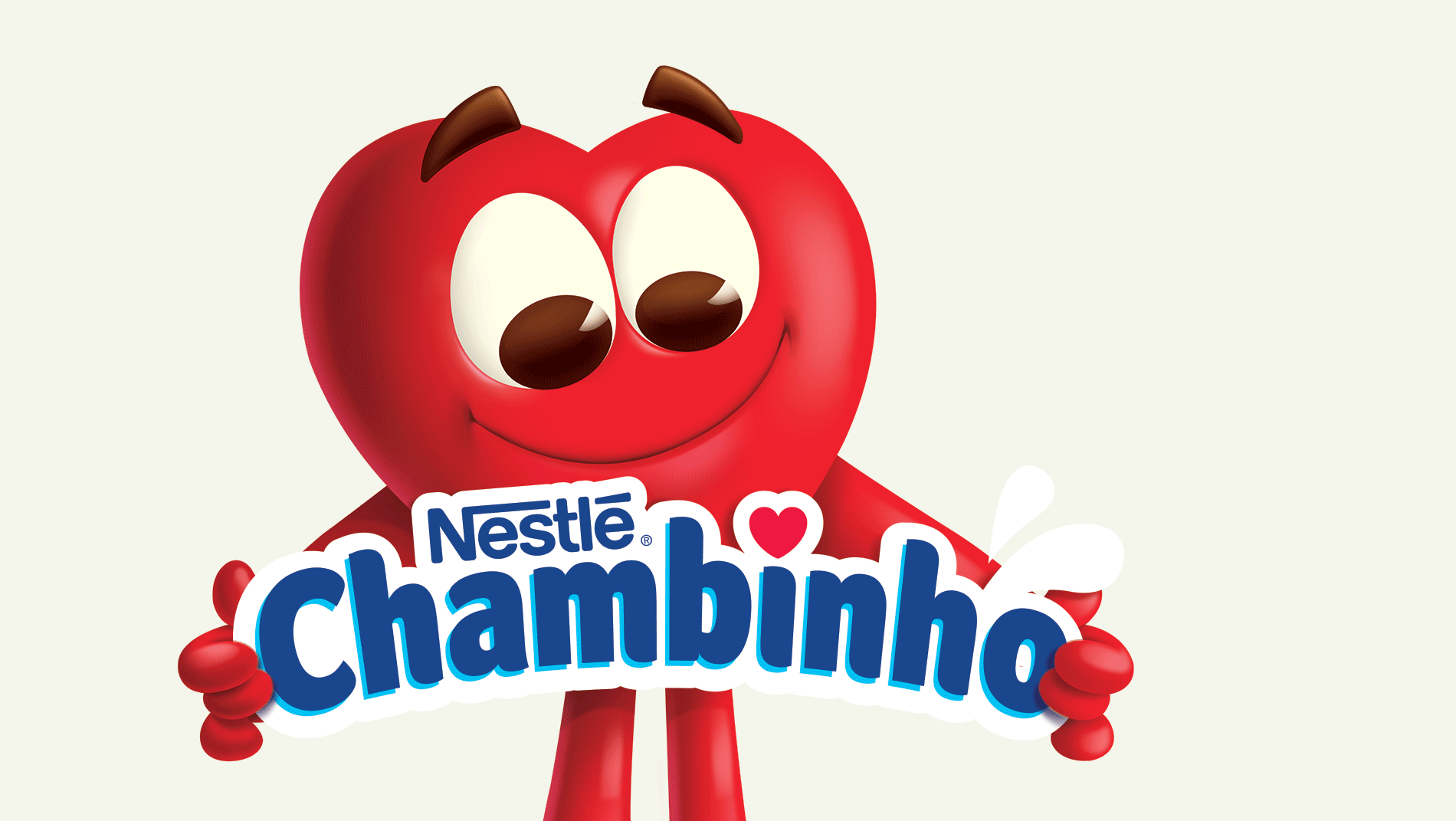
Chambinho
Packaging Design
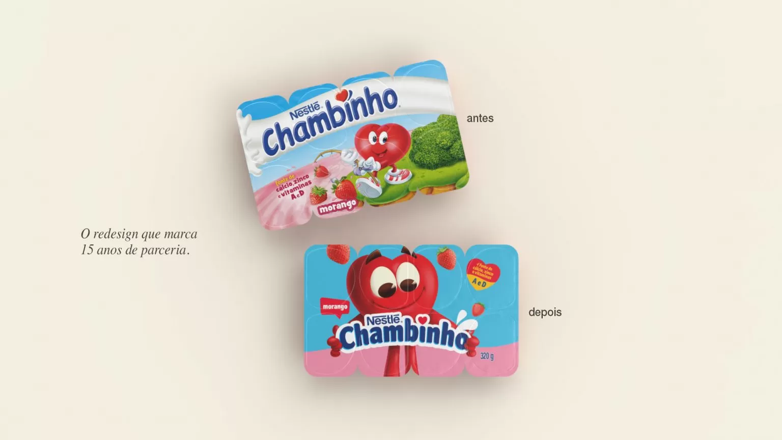
Chambinho is a historic brand of Nestlé and has not updated its visual language for years. Thus, the Dairy Partners Americas team requested that we investigate the petits-suisses market, analyze the brand equities, considering national and international trends in order to present different strategic options for the rejuvenation of the brand.
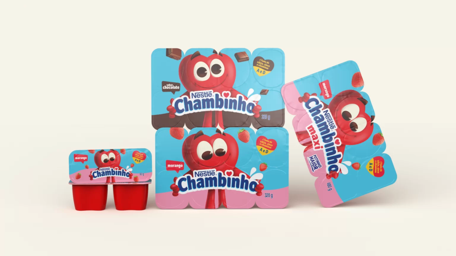
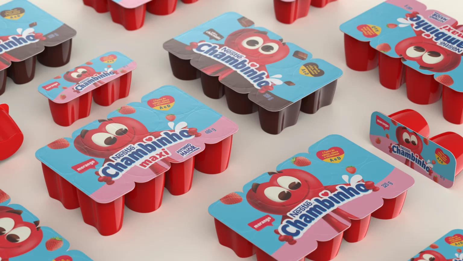
Pande had redesigned Chambinho’s packaging in 2006. After 14 years, we needed to evolve the main equities of this classic brand (logo and character), updating them to the new market context and the visual repertoire of children. We had to explore different ways to enhance the personality and expression of the brand’s protagonist, in order to gain greater prominence and facilitate differentiation.
We use a more natural playful language. We explore contemporary trends in visual language: Simpler, more innocent elements and a cleaner visual identity, highlighting the Heart which, as a whole, reinforces the perception of the brand as a provider of quality and health.
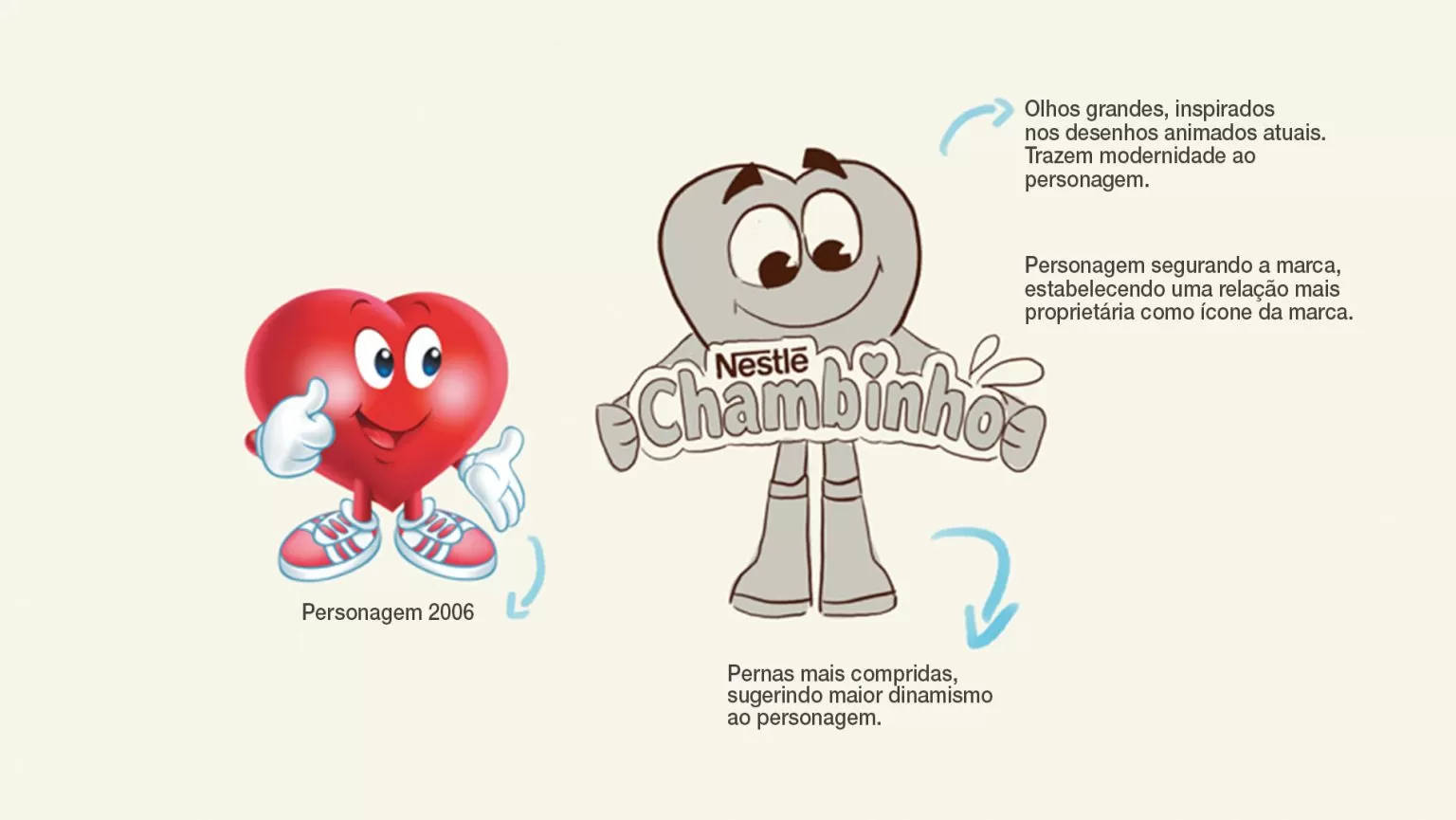
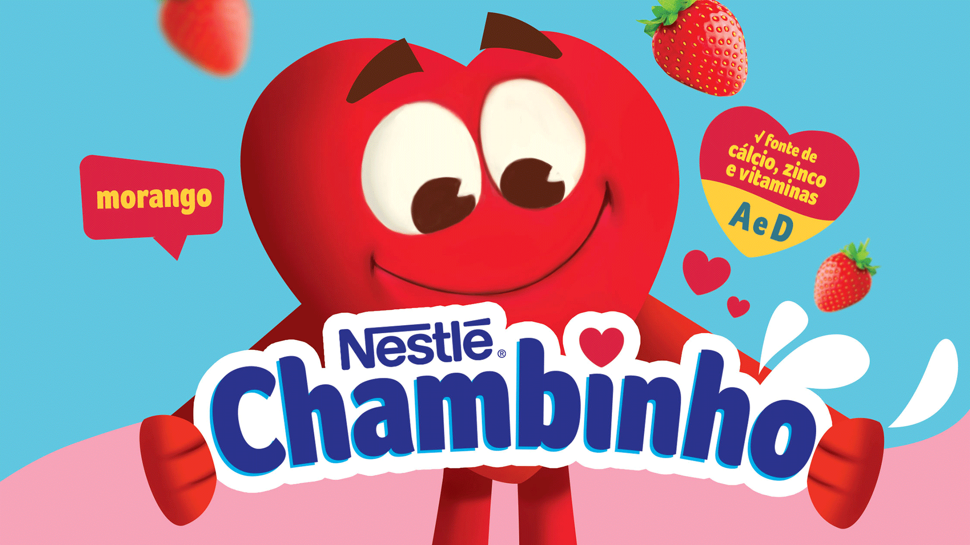
The character’s redesign was the focal point to make the transition in the best way. Over the years, the configuration of the iconic Little Heart had not evolved. To follow the trends of the new audience, we studied the children’s universe and identified which elements best dialogue with the child and the parents. We gave more prominence to the character, which guarantees better performance at the sale points.