Responsive logo: the importance of thinking about adaptations for different screens
Get inspired
Have you noticed how many devices we use every day? You probably have accessed your social networks from your smartphone and logged into a website from your computer today, right? Well, in the digital context that we are living, it is common to have daily access to a huge variety of devices with different screen sizes and, because of this, designers are inflicted with a big challenge: think of a responsive logo for each platform.
But what do you mean by responsive logo?
In fact, this concept is not that new. The term comes from the idea of responsive layout, which is a layout that can adapt to various formats and sizes without losing readability. A responsive site, for example, can be applied across multiple platforms, being useful in every platform. To get a sense of how important this functionality is, Google itself, disqualifies sites that aren’t responsive to your search engine.
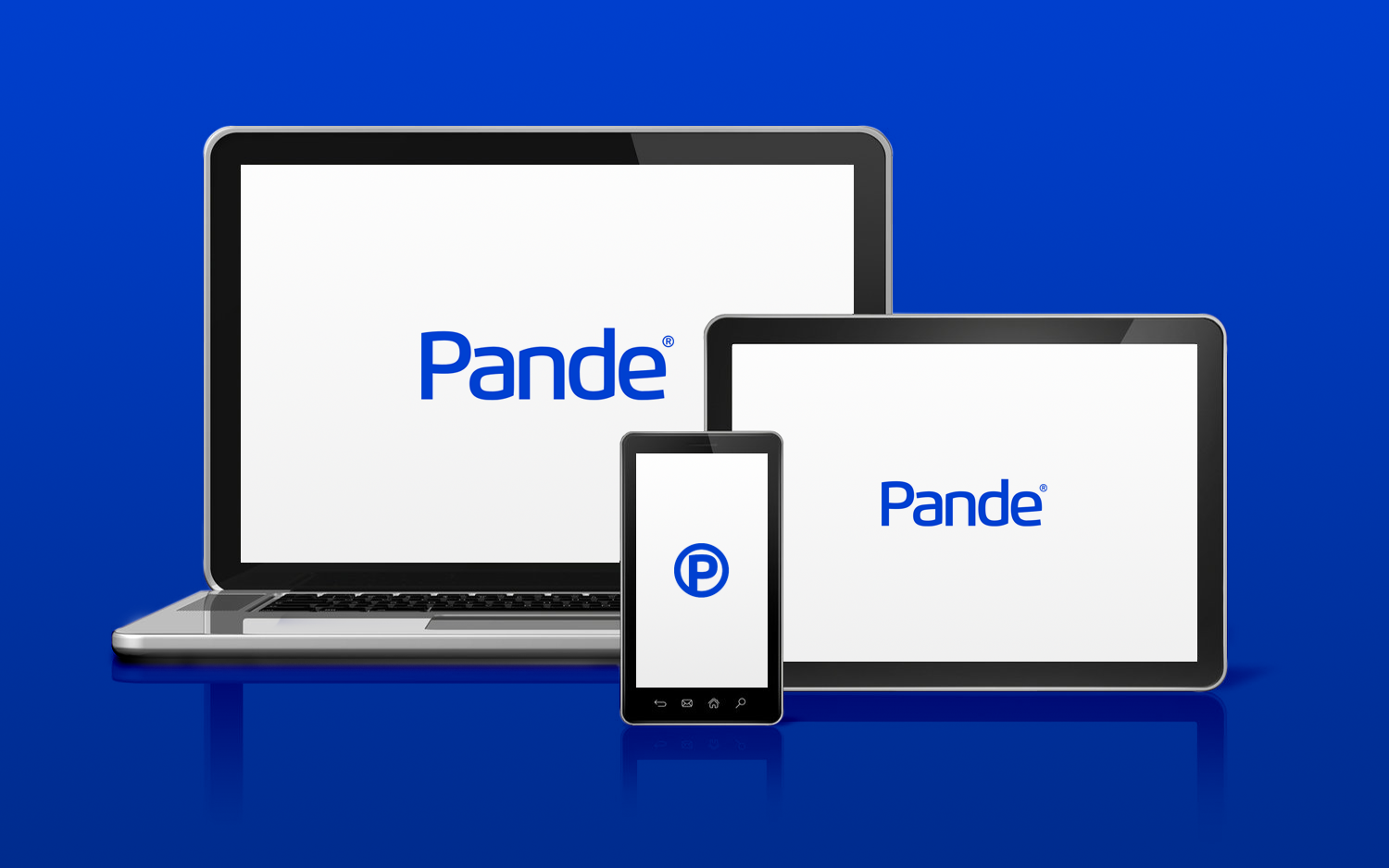
When it comes to logos, the idea is the same. Given the plurality of devices used and the variety of contact points between brands and consumers, it is critical that designers develop logos that adapt to any screen (from phones, computers, tablets, video games or other devices). The challenge, however, is to do this while maintaining the original logo features, without cuts or changes, to ensure that the user has no problems understanding it.
Do I need a responsive logo?
One of the main reasons designers think about logo responsiveness is the importance of this in understanding a brand’s identity. After all, it has no use having a beautiful logo if it loses in quality or cannot be recognized by consumers when exposed on different platforms.
A survey released in 2016 by TIC domicílios on how Brazilians access the Internet, showed that 89% of people browsed the smartphone, 40% desktop, 39% notebooks, 19% tablets, 13% by television and 8% by video games. This means that in fact, there is a variety of possible points of contact between consumers and brands – and a good logo needs to be designed for all of them.
Plan and test
Creating a responsive logo is not just a matter of removing visual elements to make it “simpler” and replicable. In fact, if a logo remains recognizable without a particular detail, it is a good call understand if that detail should really be in the logo. But you need to go further. Like in every design process, is necessary to plan and especially to test!
The first test you should check, is if the logo maintains a good performance even without sharpness. Blur it to the maximum and see if the design still holds the brand identity. This is going to be super important for digital environments – where images don’t always load at maximum resolution.

Another important test the dimension test. it serves to check what is the minimum size that the logo remains readable, but it is also important to analyze the distortions and variations that occurs when the logo is, reduced to just a symbol.

The benefits of a responsive logo
Developing a responsive logo usually involves creating variations of a visual identity, which can be extremely positive. With more varieties, it is possible to increase the strength of a logo in the minds of consumers, because it will be recognizable even with few elements.
A good example comes from Mastercard, which recently made its logo simpler, more adaptable and yet super striking. The company has reshaped its visual identity by thinking of the digital environment, which requires simpler, more modern and objective brands. Now the logo does not carry the company name and only displays the red and yellow circles.

Logos are a key factor to identifying a company, representing the values of a brand, and setting concepts in the public mind. They carry important messages and because of that the responsiveness should not be neglected. After all, logos need to fulfill their goal no matter what device people use.