Check out the main trends in logo design
Get inspired
Creating the graphic representation of a brand, conveying the essence of its characteristics and values, is quite the complex task for designers. That’s because logos are perfect examples of how every detail makes a difference in the final result.
Often, changes in colors and typography can completely alter the way in which many consumers interpret what the brand is trying to express. Since there is no perfect recipe for developing logos, designers must have knowledge of different strategies in order to produce something unique, coherent and legible (in small formats and black and white prints).
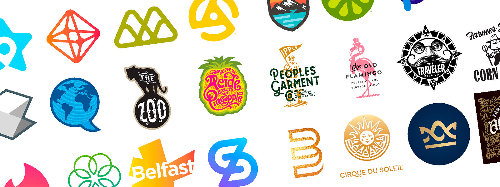
With that in mind, we decided to take advantage of a recent report made by one of the main logo search engines in the world, LogoLounge, and select 10 design trends in this field that are worthy of attention. Access the complete report here and check out our infographic below with the most relevant trends.
1) Soft corners
Round corners are a hit because they convey a friendly idea and are approachable to the brand’s customers. Designers only need to be careful about over-simplifying, which can end up making the logo a bit childish.
2) Parallelogram
In design, advancing means going upwards and to the right. That’s why many logos show a movement in those directions, conveying an energetic and precise posture.
3) Outlines
Quite common in sports teams, outline logos are popping up more and more in companies from different fields. The style catches the eye because it gives the brand an aura and feeling of a strong and united team.
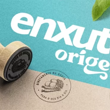
4) Neo Vintage
Modern projects with influences from the past are here to stay. The construction of logos with that style combines a main image with typographic solutions to convey a fun and loose tone.
5) Light gradients
The use of gradients in logos is not new, but it’s being transformed by designers. The vibrant colors remain, but in a much more subtle way and with the aim of expressing lightness.
6) Golden
Formerly seen as an unnecessary excess, the use of golden in logos now has become more accepted by designers, especially on account of the popularity of light gradients. If applied correctly, the golden manages to convey prestige and sophistication.
7) Scale geometry
If past and future are intrinsically connected, designers know that looking back can be inspiring. That’s why scale geometry is back in a fresher and more vibrant way, combining lines with a variety of elements.
8) Cuts
They are bold, but capture the attention of consumers. Cuts made intelligently don’t hurt legibility and help convey a specific value of the brand.
9) Serifs
In design, trends are like pendulums: they go back and forth. That’s the case with serifs, which won back designers with their undeniable charm and retro aspect.
10) Punctuation
Punctuation in logos communicates with customers in a way other resources can’t. A period, for example, securely reaffirms the quality of a brand, while a comma prepares the person for what’s to come.