Catupiry, much more than Catupiry

Get inspired
When your product is so successful, but so successful, that it becomes synonymous with the category, can it end up eclipsing the brand? Yes, it is possible. At least, this is what we verified in our immersion inside Catupiry.
In a long and detailed process, we conducted workshops with the team, interviews with the board of directors, focus groups with consumers and audits at the points of sale. The diagnosis revealed that Catupiry was widely recognized as a product brand, but its recognition was lower as a food company. We also found that this occurred because of a common problem among companies from various segments: lack of consistency and visual unity in packaging design.
To deal with these challenges and guide strategic decisions, in addition to a new positioning, we recommended new approaches in brand architecture and in reorganizing the product portfolio. To enhance the brand’s expressions and make it more visible at the point of sale, we created a new visual language for the packaging line, respecting the characteristics of each product. The colored watercolors used in the new Catupiry Identity System were chosen as the element of unity among all items of the brand portfolio, making the line more impactful and recognizable in supermarkets.

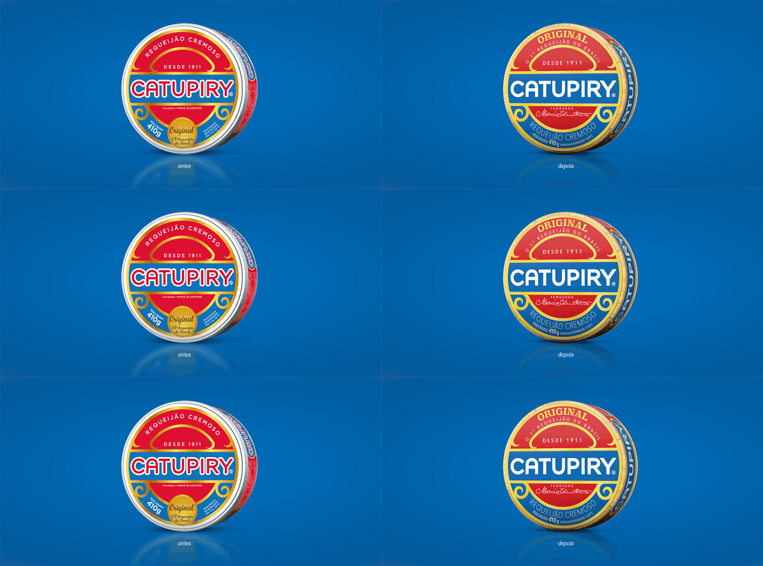
We also suggested a subtle redesign of the logo, which lost the outlines, thus gaining more legibility and modernity. A more current identity for a brand that is connected to its audience and to market changes.

The result of this strategy and the proposed changes can already be seen in numbers: a 40% increase in Catupiry sales.


