AlaCena celebrates the coming of age with a new face
Get inspired
In most countries, a person’s 21st birthday represents coming of age and gaining full autonomy. For brands, this date represents even more: Tradition, reliability, and solidity.
AlaCena is the market leader in sauces, or rather packaged salsas, in Peru. The brand entered the market in 2000 with the sale of mayonnaise and since then has had an increasing portfolio, consolidating itself as the specialist in accompaniment sauces in the country.
Upon completing 21 years, AlaCena saw the need to renew its visual identity, reinforcing the brand as a leader and positioning itself as a modern player, in line with the trends and interests of today’s consumer.
For this update, we conducted a deep analysis to understand the brand, its values, history, and market positioning. This work also involved a study of the category and competing brands, resulting in a diagnosis of what were the best strategies for AlaCena.
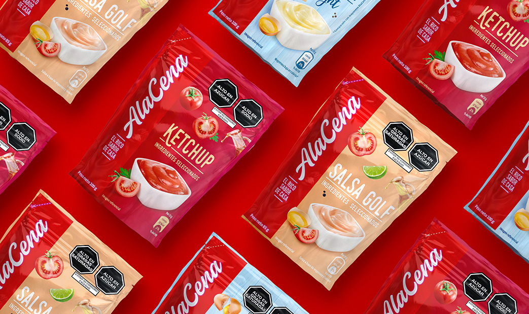
Our proposal is the redesign of the logo, which preserves visual codes already consolidated by the brand and known by the public in Peru, but modernizes AlaCena’s image. We also developed a new graphic concept for packaging, which values the flavor and the ingredients of the products.
As consumers purchase in an increasingly dynamic way, we adopted unique codes that help in the quick differentiation of each product line, without losing the synergy between the other items in the portfolio.

The result is a simple, attractive and informative design, which matches AlaCena’s relevance and helps consumers make their purchases in a faster and more assertive way.
It is more than just pretty packaging: It is research, strategy, and appreciation of each brand’s strengths.