Tintas MC
Tintas MC, founded in 1964, in São Paulo, today has 200 stores in several states – it is the largest chain of paint stores in the country. With the mission of making Brazil more colorful, it is recognized for its avant-garde and pioneering spirit and plays a fundamental role in the revolution of the Brazilian paint retail market.
It operates in several segments – real estate, industrial and automotive refinishing paints, accessories and professional tools – offering the best brands in the sector.
It is a reference in a competitive market, never stops facing challenges and innovating and keeps the founders’ vision alive by providing colors and quality service.
Recently, Tintas MC faced the challenge of creating its own brand line, with distinctions at three levels: economical, standard and premium. After an in-depth analysis of the market, the company chose trust as the main value to be transmitted by its line. This approach seeks to communicate a sense of relaxation, friendliness and closeness to customers, while maintaining a commitment to quality.
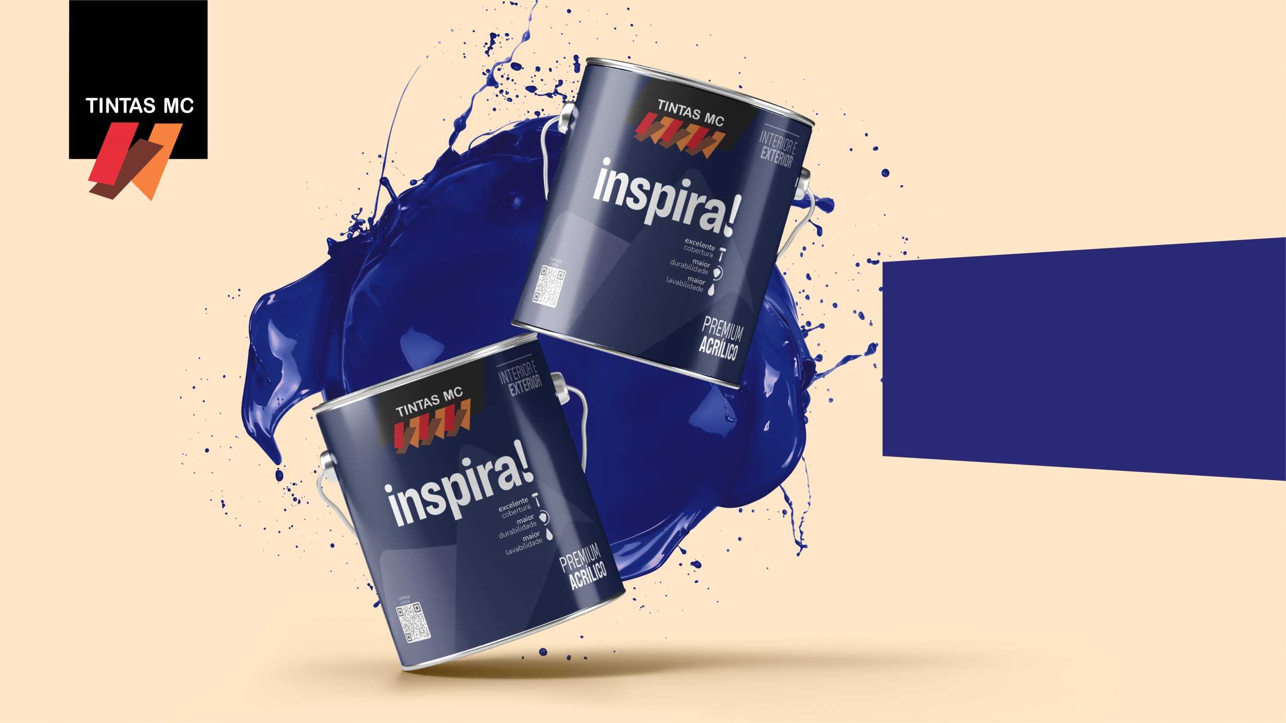
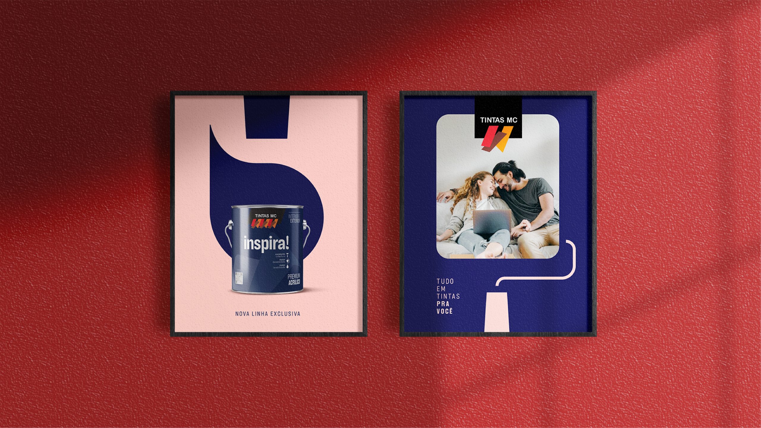
In this context, we created two names for the sub-brands: Inspira! for the premium line and Rende Super! for the standard line. For the economy line, as a strategy, we developed a new brand, Luminova, which has a distinct visual identity compared to the others. For all lines, we seek to represent significant aspects through typographic language and graphic resources that refer to the Tintas MC brand, already consolidated in the market and representing guarantee, quality and partnership for almost 60 years.


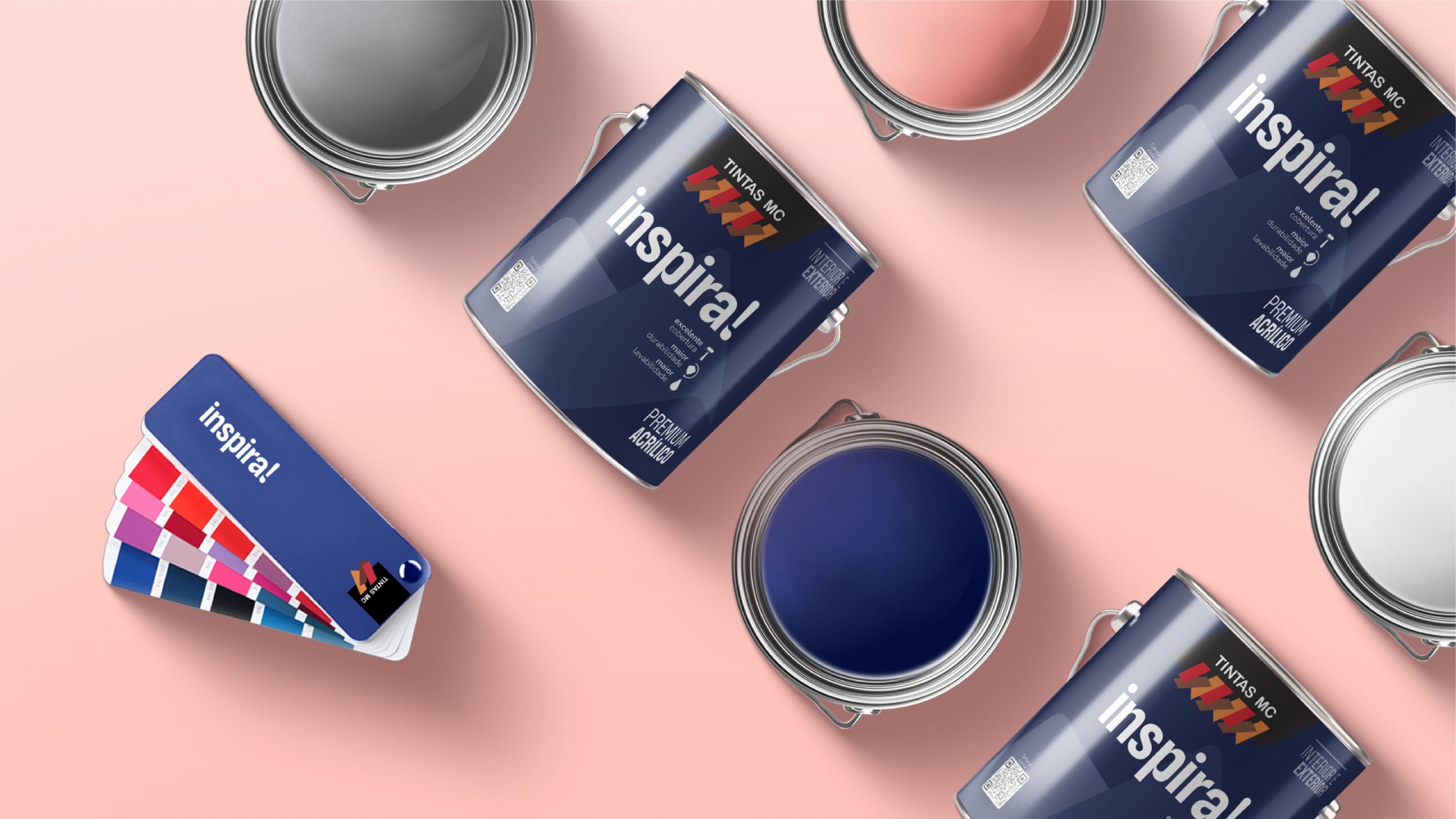
Considering Tintas MC’s extensive market experience, we developed the premium Inspira lines! and standard Rende Super! bringing the brand’s characteristic elements to the packaging and reinforcing the commitment to quality and partnership present in the history of Tintas MC.
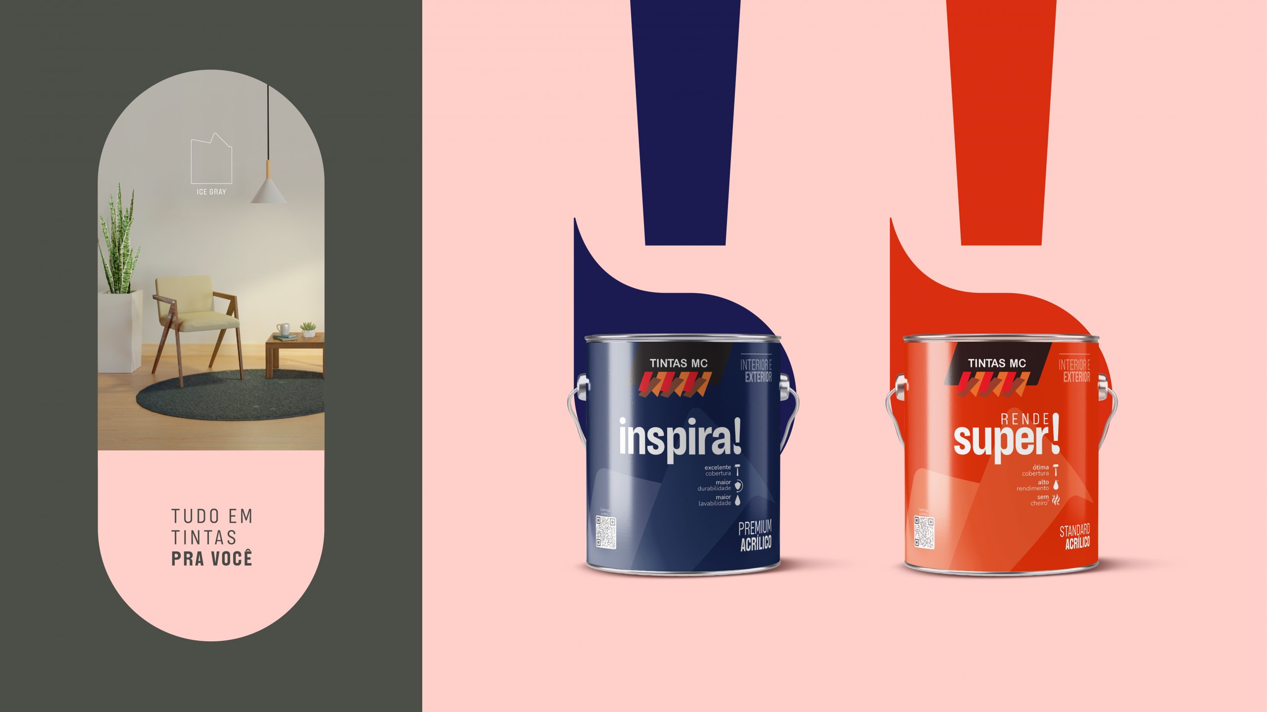
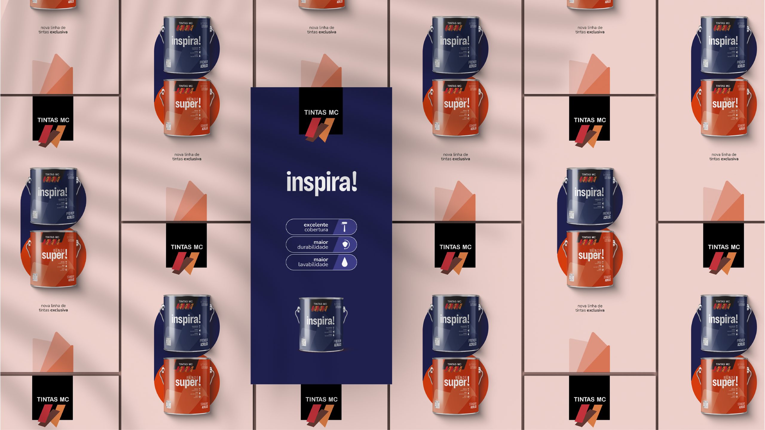
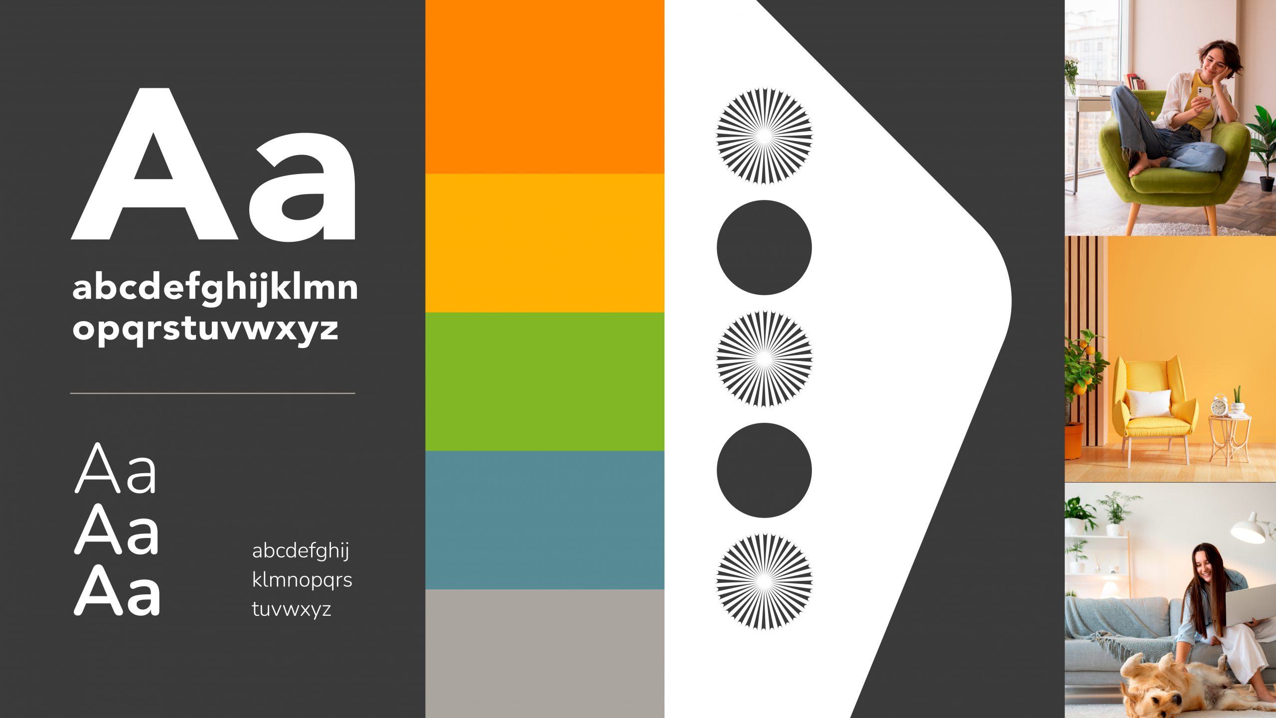
We developed a fluid and simplified structure to serve and unify the brand’s entire portfolio in the premium line, which has products from finishes to complements for construction and renovations. The brush drop, which is part of the graphic element and symbol of the Inspira sub-brand! It is present on all packaging, reinforcing the visual identity of the line.
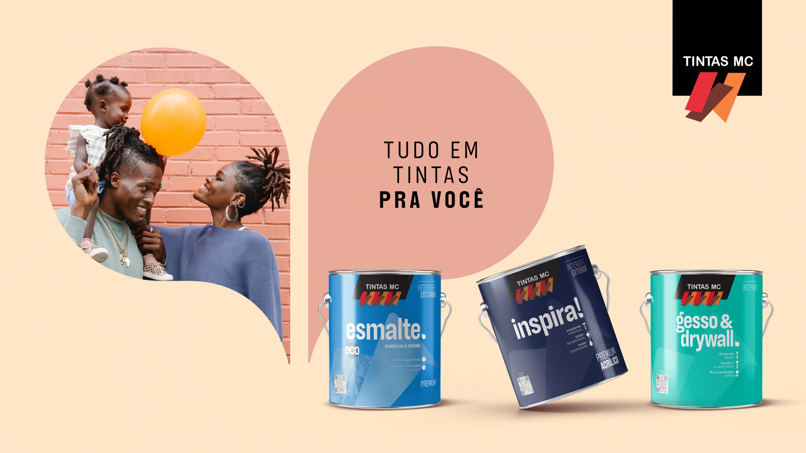
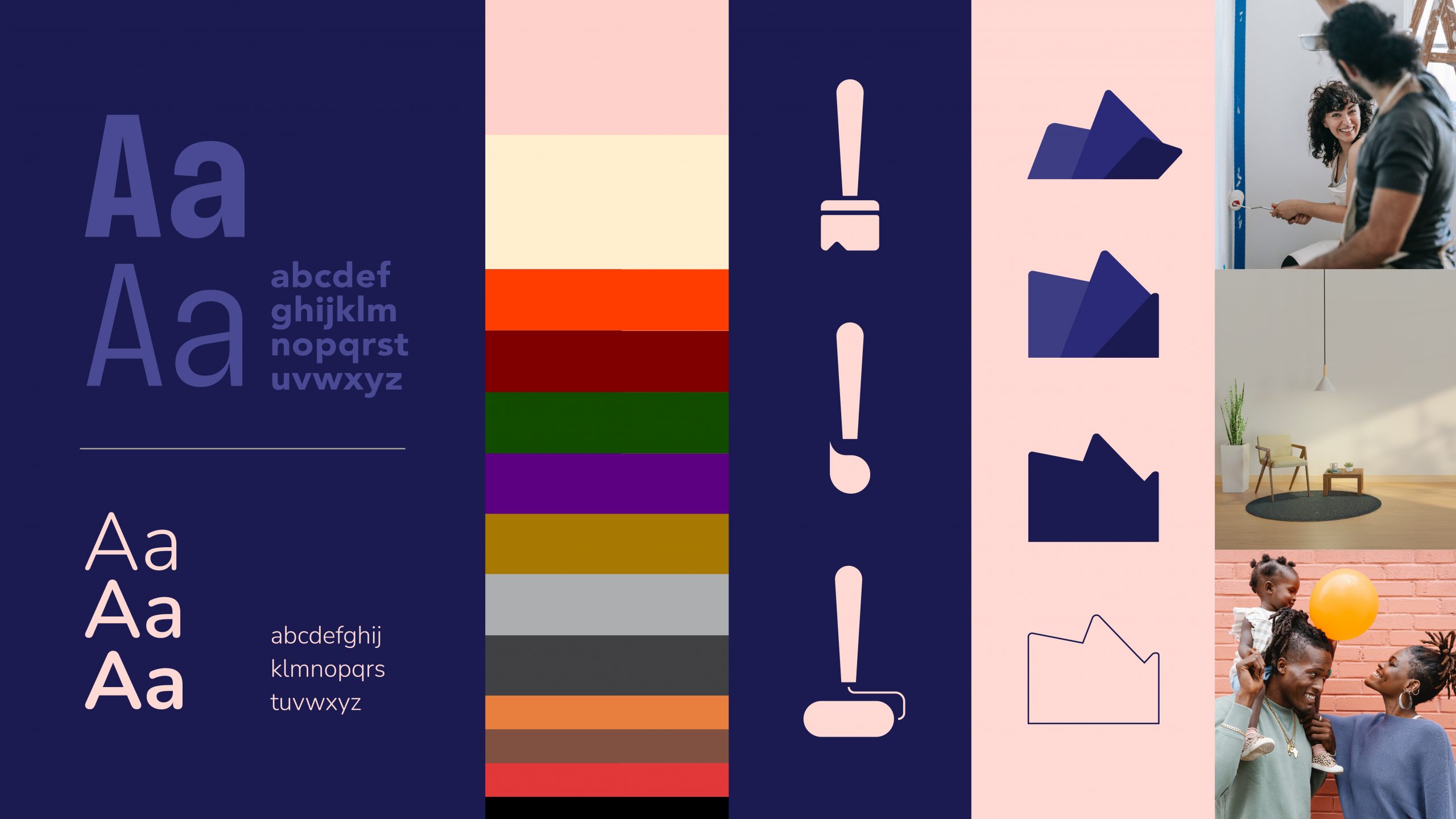
We chose a typography that was inspired by the Art Nouveau movement and Pop Culture, alternating between asymmetrical curves and geometric lines, bringing a feeling of commitment, humanization and modernity. The palette is extensive, ranging from the colors of the Tintas MC brand to the colors of the paints inside the cans. The main icons originate from the brush symbol of the sub-brands.
Graphics can be applied in different ways, bringing dynamism to communication without losing the connection between the elements. The photographic direction not only enhances the expression of affection, but also elevates the representation of excellence and quality.

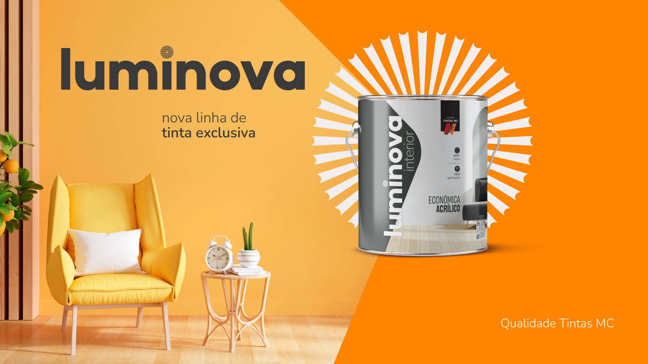
The name Luminova came from the combination of the words luminosity and innovation.
The dot of the letter i shows a ray of light that served as inspiration to create the graphic element that is used in communication.

The diagonal box that holds the Luminova brand was created from one of the components of the parent brand Tintas MC. It is a versatile graphic element, which can be explored in different ways in communication.
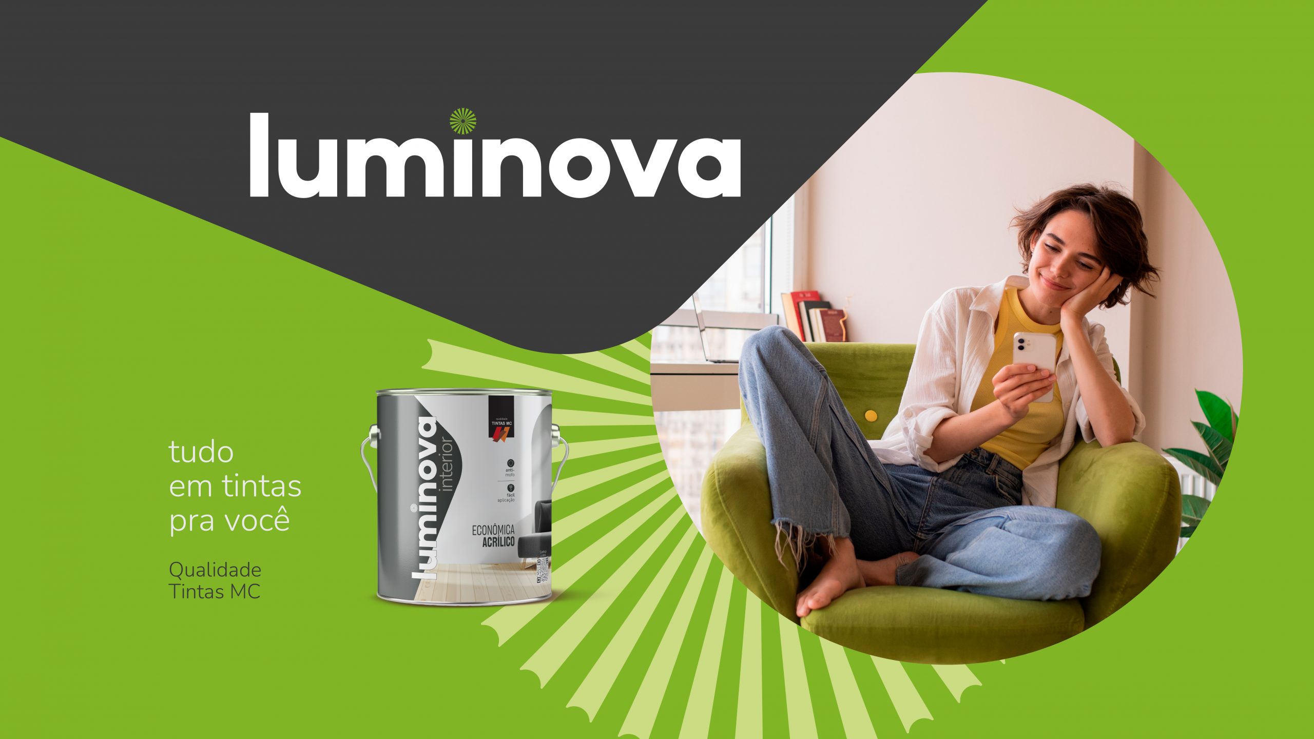
For the Luminova brand we chose to work with the timeless font, known for its organic touch within geometric shapes. The font design also brings feelings of commitment, humanization and modernity. The predominant color of the economical line is gray, which reinforces the pillar of commitment and quality, despite being a low-priced line. The photographic direction reinforces the place where the paint is applied, whilst demonstrating the effectiveness of the product.