Tijuca
Tijuca is part of the portfolio of Cervejaria Cerpa, a traditional company from Pará of German origin with more than 50 years of history. A brand that stands out for the zeal with which it combines the most rigorous and renowned European production techniques combined with the careful selection of ingredients. The creative Brazilianness, which makes the sums of the mixtures something new and extraordinary, is the special note that sets Tijuca apart from its competitors. In addition to all its characteristics, the brand stands out for using, as its main ingredient, the purest water from the Amazon.
The beer sector is undergoing intense innovation and, due to the rapid expansion of the category, it has been redefined by a fragmentation of brands over the last few years. Having identified Tijuca’s potential and defined the bold objective of consolidating the brand on a national scale, intensifying its growth, Pande carried out extensive strategic work, distributed in several stages, to understand the characteristics of the national and international scenario of the beer market. At the beginning of the project, we carried out brand strength and contribution research in order to understand the strengths of each Cerpa brewery brand and compare them with competing brands, segmenting them by target market. Furthermore, the attributes that made them recognized and also the points with unexplored potential for each of them were mapped. This entire stage can be summarized as a process of realizing potential, which indicated Tijuca as a brand with enormous capacity for expansion. The research indicated the main strategic insights that served as the basis for the next phases of the project: the main attributes of the brand; its relevant differences; territories of operation; defining targets; the potential of the portfolio. From that point on, Pande carried out a thorough investigation of the brand’s and its competitors’ scenarios, recommending strategic guidelines to reorganize and reposition it as a prominent player in the country.
A deep understanding of the diagnosis process and the understanding of the bases on which the beer market has moved in recent years was fundamental, and was conducted in partnership with our creative team, which obtained consistent elements to develop an identity that included the maintenance of main equities of a brand that is valued as synonymous with quality in its markets. At the same time as ensuring the understanding of their identity equities, the creative insights provided the basis for the creation of a new, more up-to-date, modern and sophisticated identity. The preliminary work guided the entire project: the brand and portfolio architecture; the brand platform and visual identity. Everything came from our assessments of how to enhance the real value built by the brand. The various stages of the strategic-creative process were later crowned by qualitative research that validated the power of the creative route, approved by consumers and Cervejaria Cerpa’s internal team, in an intense co-creative process.
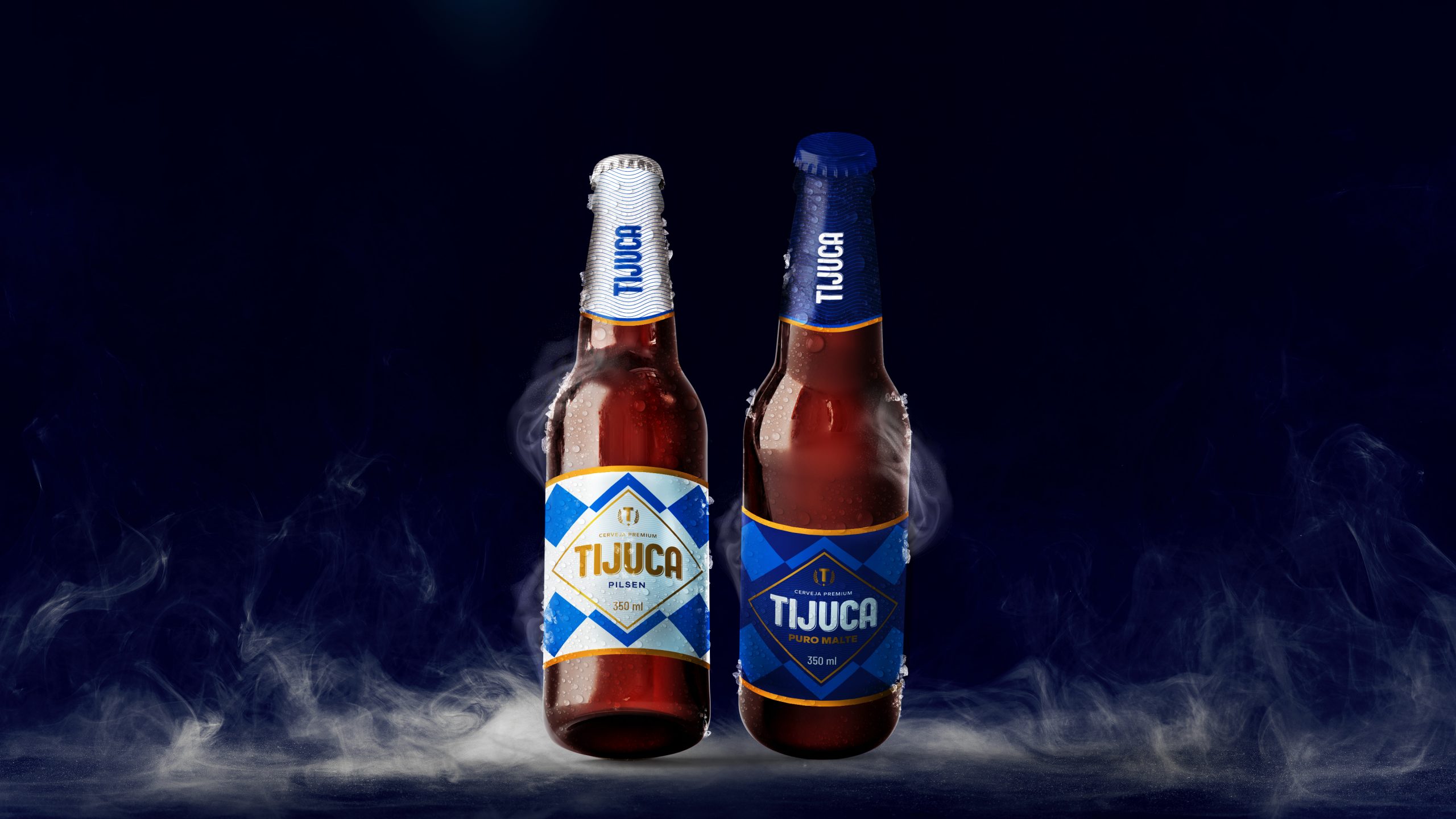
In the creative phase of the project, and after delving into understanding the strategy defined for the Tijuca brand, the Pande creative team mapped out the points that needed to be adjusted to provide a better perception of value. In this sense, we invested in the rejuvenation of the brand and in more modern communication, differentiating Tijuca in the company’s institutional portfolio. Furthermore, we reinforce the distinction of its Pure Malt and Pilsen variants. Defining its territory of activity in the field of Premium beers, Pande enhanced the subtle elements that communicate sophistication and glamour, all without giving up the codes that identify Tijuca as a bold, self-confident, expansive and relaxed brand. The brand then becomes redefined in a territory where good times are shared. Tijuca is the synthesis of the Brazilian spirit: a brand that extracts the best of European culture with the particularities of our country: our greatest wealth, the waters of the Amazon; the name of Tupi-Guarani origin that identifies the brand and the union of the different regions of our continental Brazil, bringing North and South, Pará and Rio together.
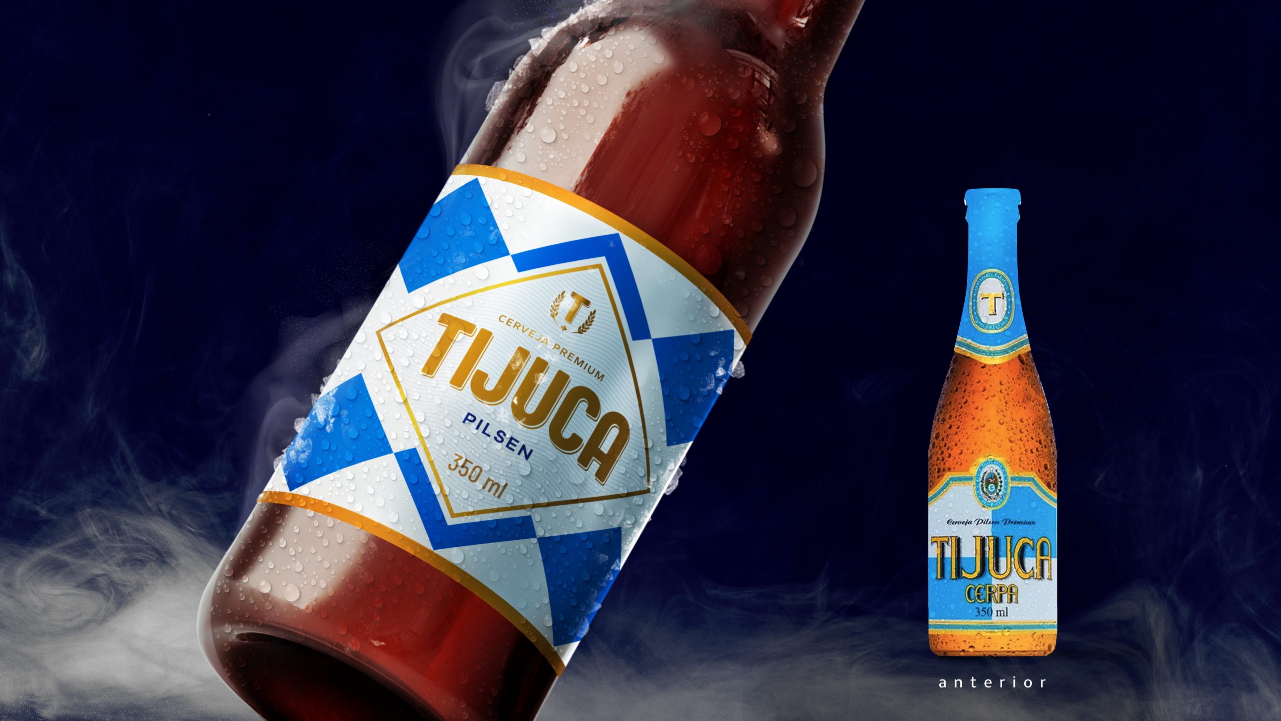
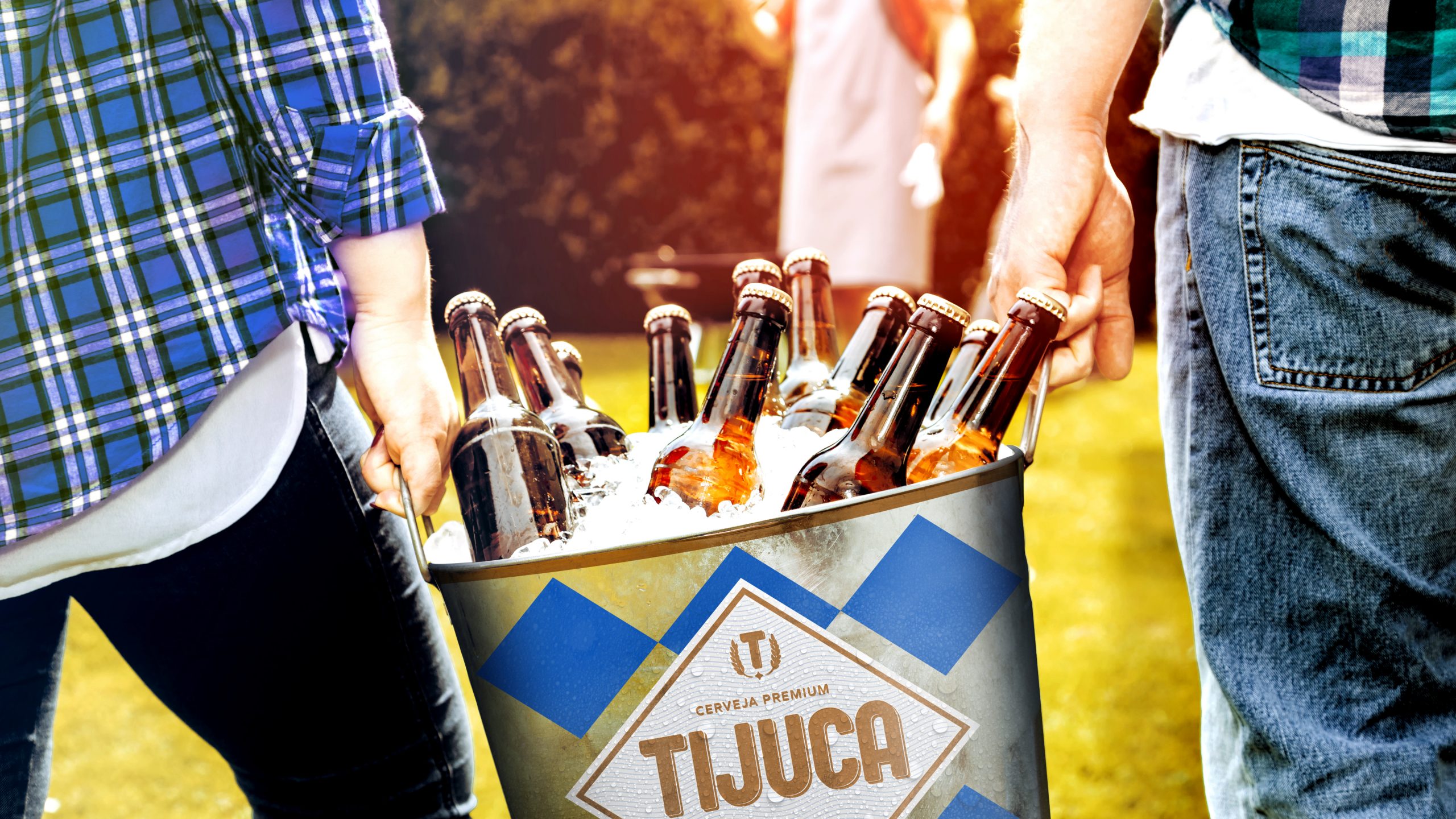
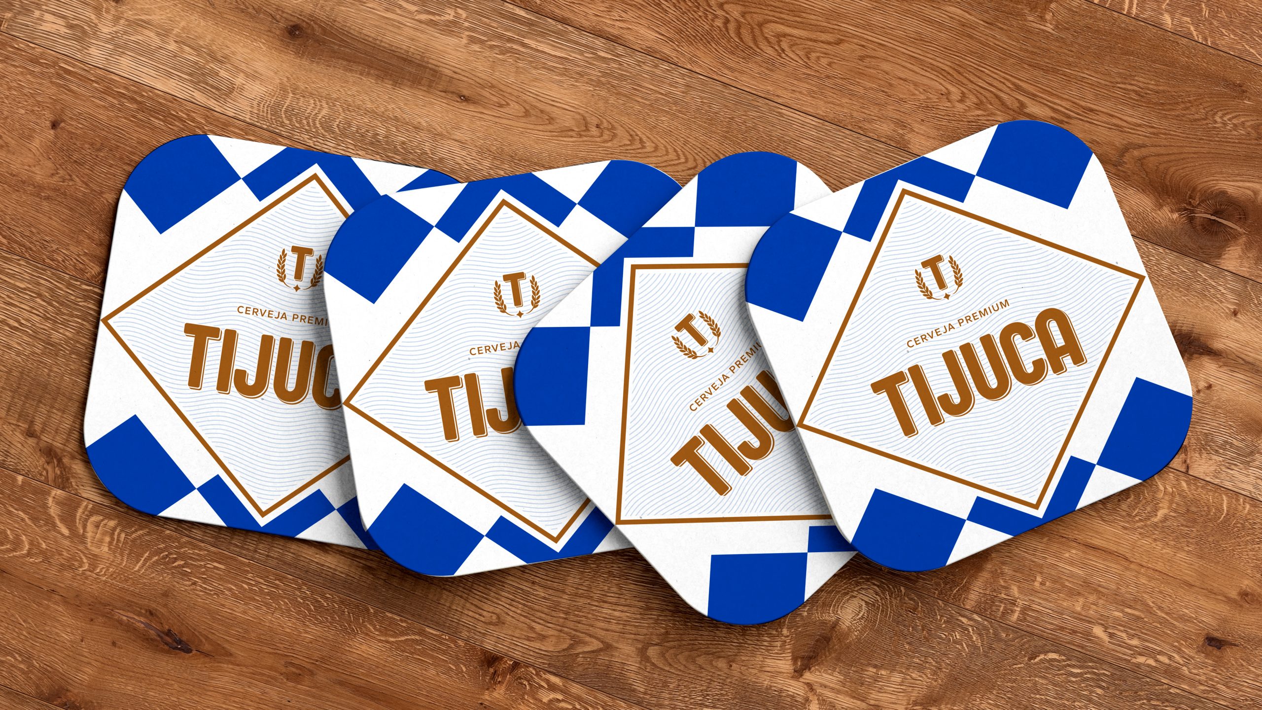
Tijuca is a reference to the most festive and exuberant things we have. The brand, as one of Brazil’s main attributes, overflows versatility and creativity and the good mix with which every Brazilian recognizes and identifies. Originating from several sources, it creates its personality that exalts the freedom of our choices, in a friendly and high-spirited way, with a lot of versatility transmitted by codes that move perfectly in various environments: parties, bars, barbecues with friends, beaches and parks. In fact, as the names suggest, Tijuca is mainly combined with the streets, the sidewalks and promenades, the open spaces and the blue expanses of the sea, rivers and sky. To represent this free movement, the traditional blue color code was maintained, but with modifications to its tones and the softening of the harshest lines.
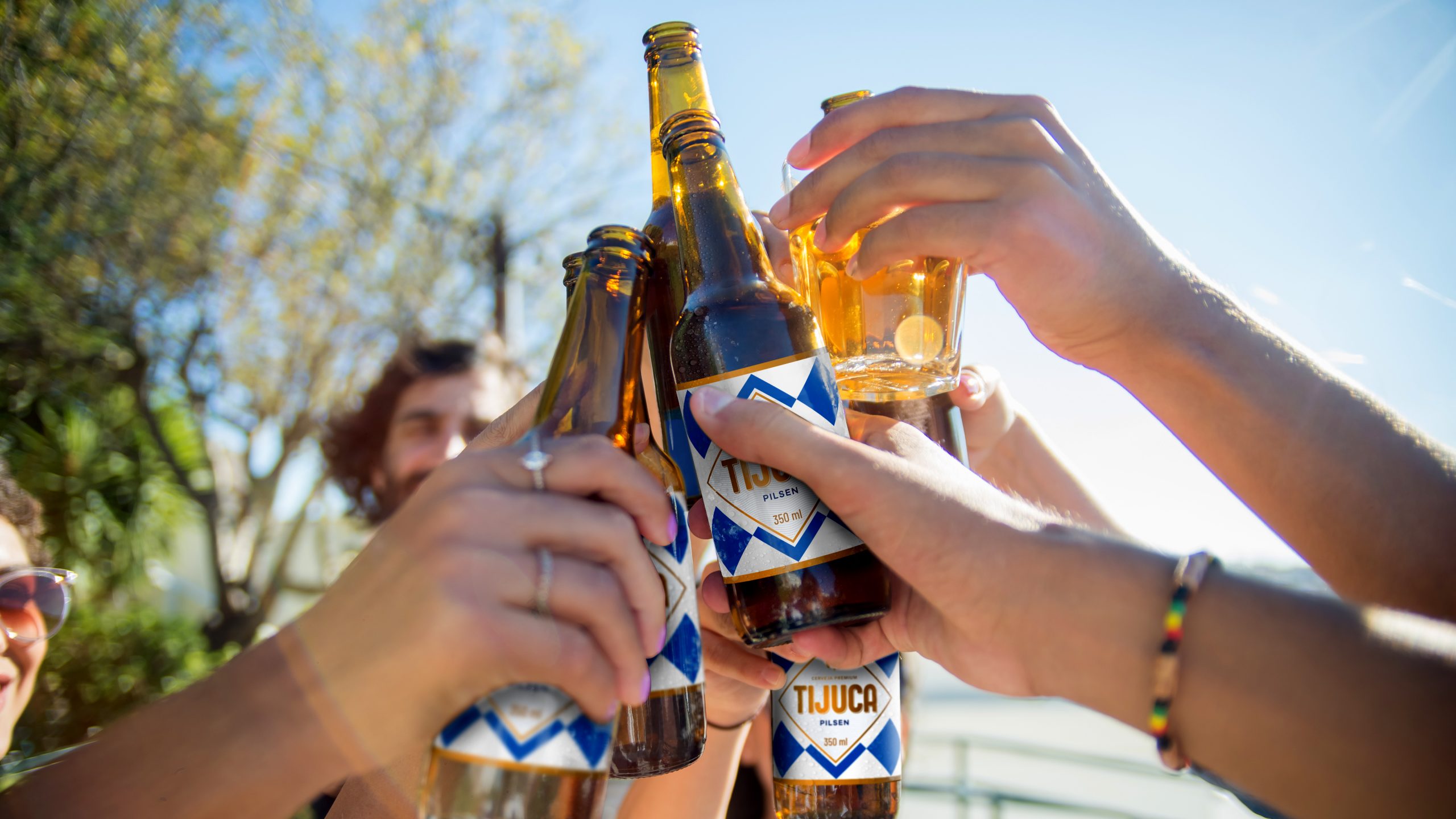
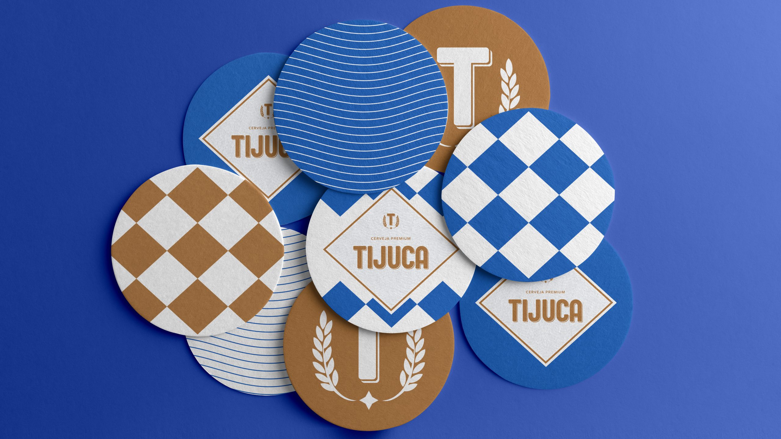
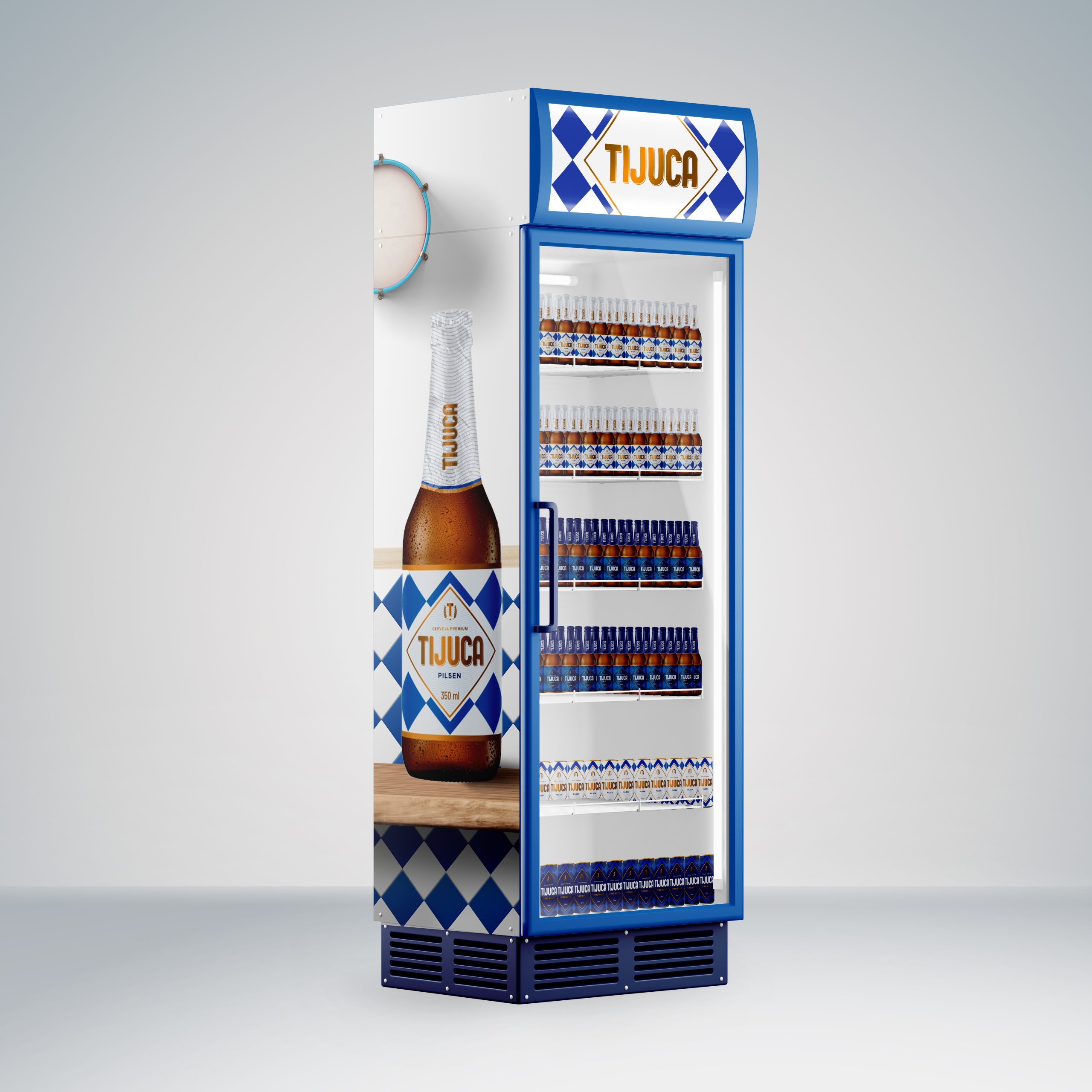
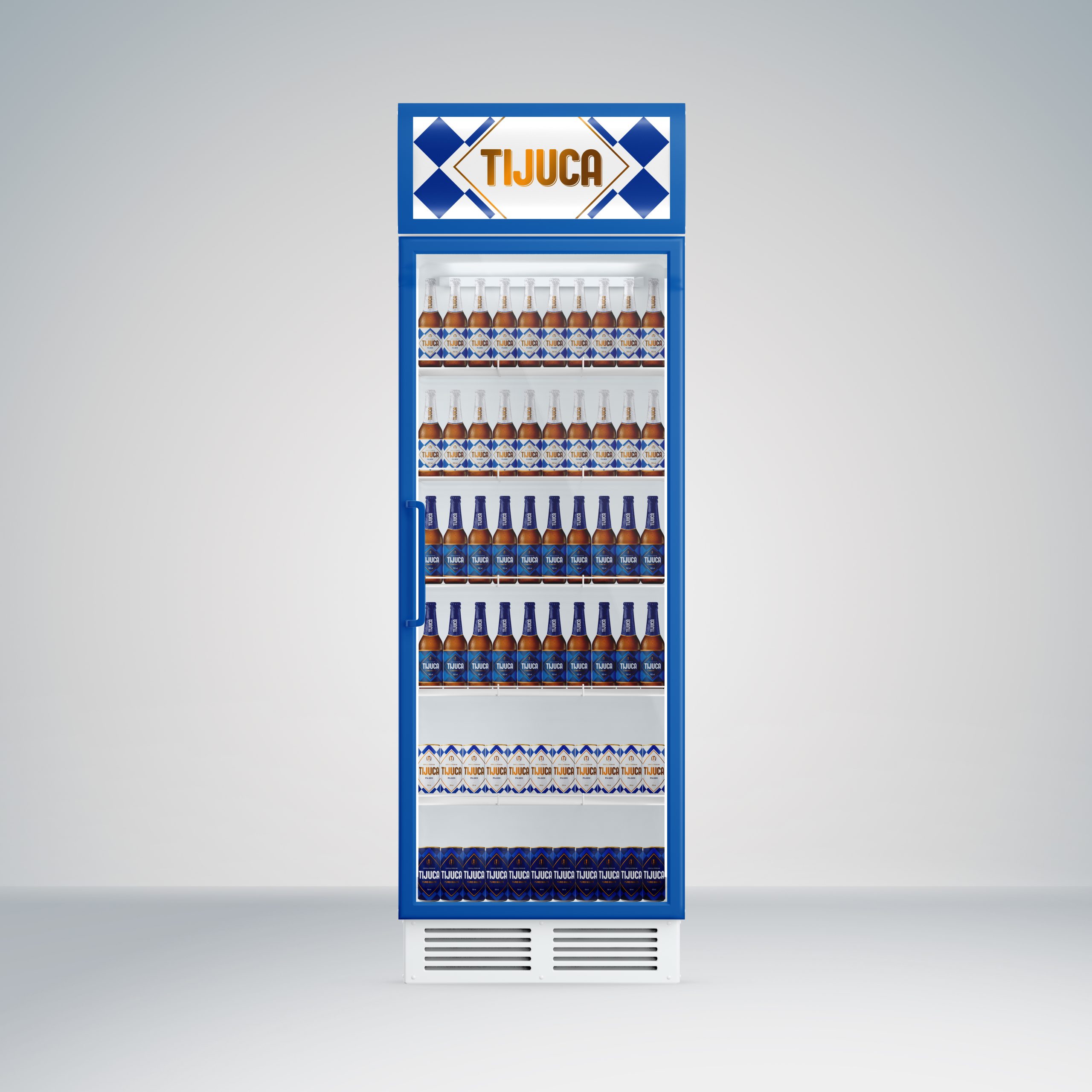
The result of this intense strategic-creative process is a more fluid and lighter packaging, more in line with the youthful and festive Brazilian spirit. The typography used sought to highlight the name, making it more sophisticated and friendly with the rounding of the corners of the font. Lightness of spirit, an attribute related to the profile of its consumer audience, was represented by the exclusion of shadows present in the old layout. And, harmoniously complementing everything (like a tasty beer), there is the distinctive element of diamonds, guaranteeing movement and authenticity characteristic of such a determined brand. The graphic elements that frame the label guarantee gigantic communicative potential that allude to the busy life and bohemia of bars and sidewalks. Its graphics are transformed into proprietary patterns that identify the brand and ensure greater visual prominence on the shelves. The whole of Tijuca’s new visual identity suggests high spirits and relaxation: it is the positive attitude of those who see the glass as always half full, among their friends, all together, united by Tijuca.
