Qsaúde
Health
Brand Identity
Qsaúde was designed to be a distinctive brand in its category. The reference for its implementation is the international models of health insurance plans that invert the logic of the traditional approach, that is: from the exclusive treatment of the disease, the focus of the new models also becomes the monitoring of the users’ health through investment in constant monitoring aiming at the maintenance of health. This rationale underlies the whole direction of the brand’s creation.
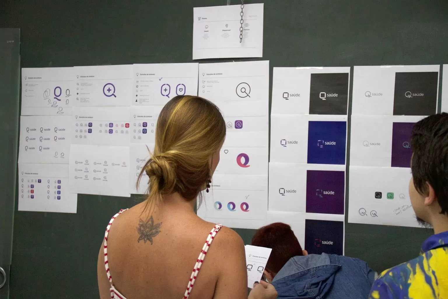
Pande’s great challenge was, based on Qsaúde’s differentials, helping to define and make the brand’s strategic pillars perceptible; determine its main values ??and create a striking and proprietary visual identity that shows proximity, dialogism, constancy, and agility. We also had to consider that the brand’s logo should have a prominent presence in digital media, both in the communicative aspect and in the sense of its functionality.
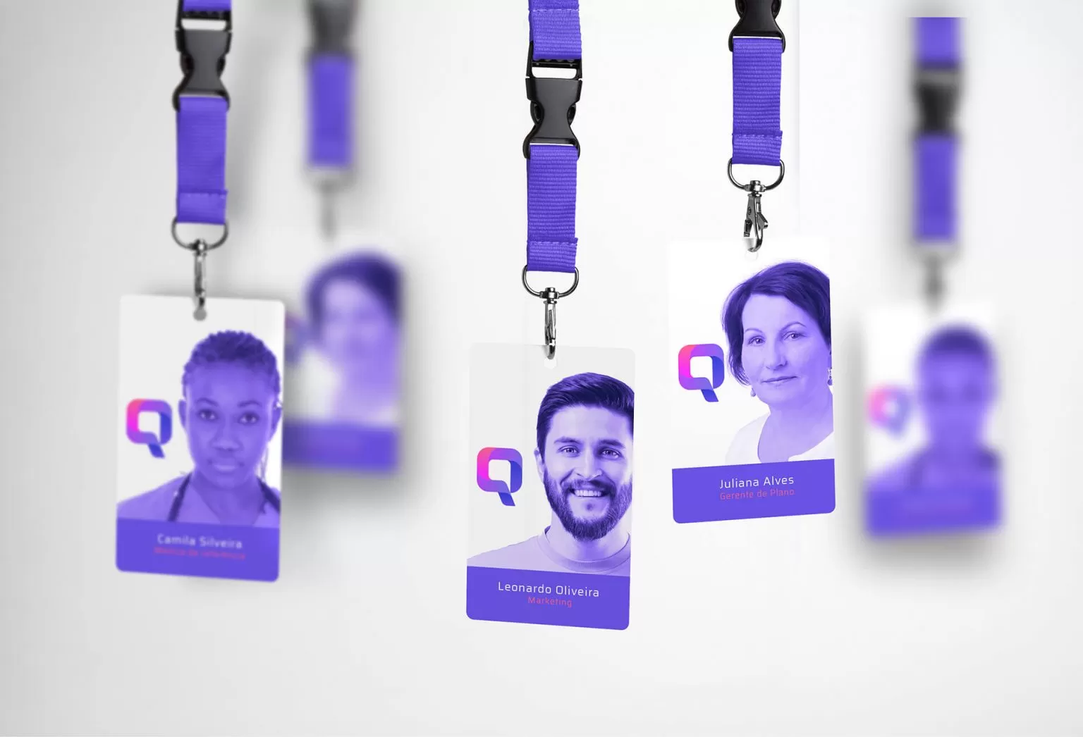
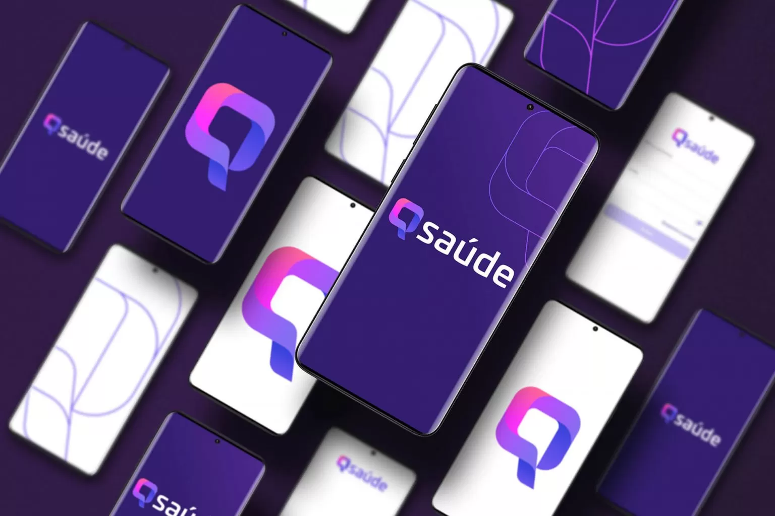
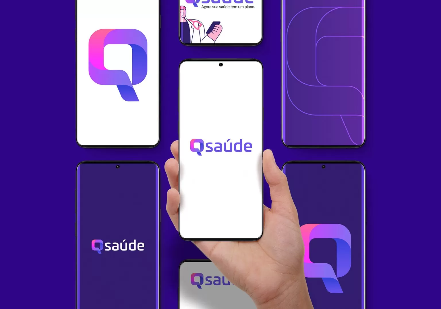
After delimiting the brand’s pillars: kindness, availability, and precision, we started to work on a powerful logo, as disruptive as the brand, and that communicated its attributes. Designed to have strength in a digital context of greater accessibility, we created a light icon, and even so, strong, colorful, vibrant, and expressive; a logo opposed to the standard models of the category (which, as a rule, are rigid and cold). We materialize the differences of the proposed service through the brand’s graphic elements. The relational approach between Qsaúde and its users is synthesized by the letter “Q” in its logo, whose format refers to “speech bubbles” and represents the humanized communication offered by the service. For Pande, the Q of the matter (Q of Question) always involves understanding the values ??of a brand and making them visible, palpable. Qsaúde’s visual identity is a happy example of our mission accomplished: from gestation to the implementation of the brand.