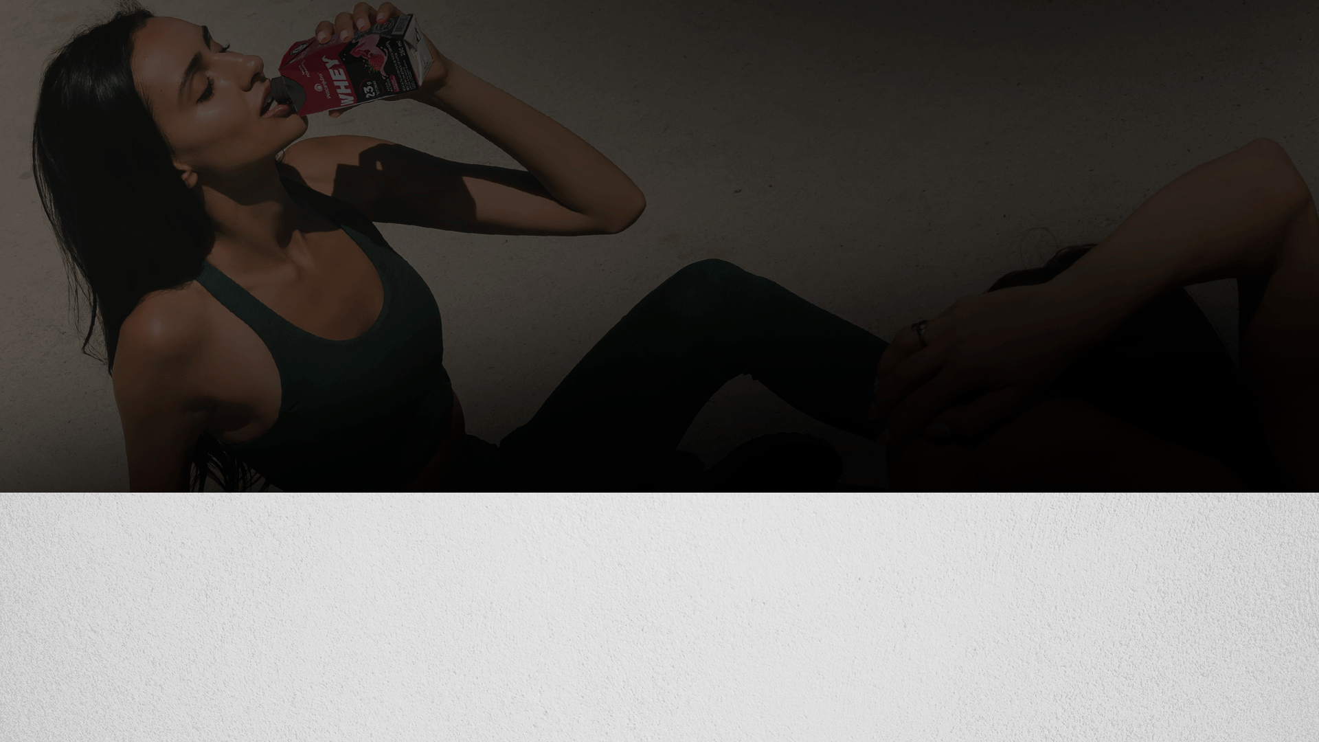
Piracanjuba Whey

Pande was responsible for creating the visual identity (brand and packaging) for the launch of Piracanjuba Whey in 2018. The strategy adopted for the launch was to work with the visual equities of the Piracanjuba brand with the aim of generating value for the newly arrived brand on the market. .
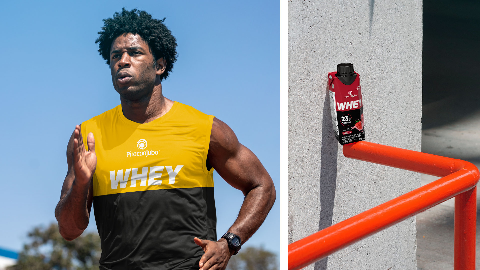
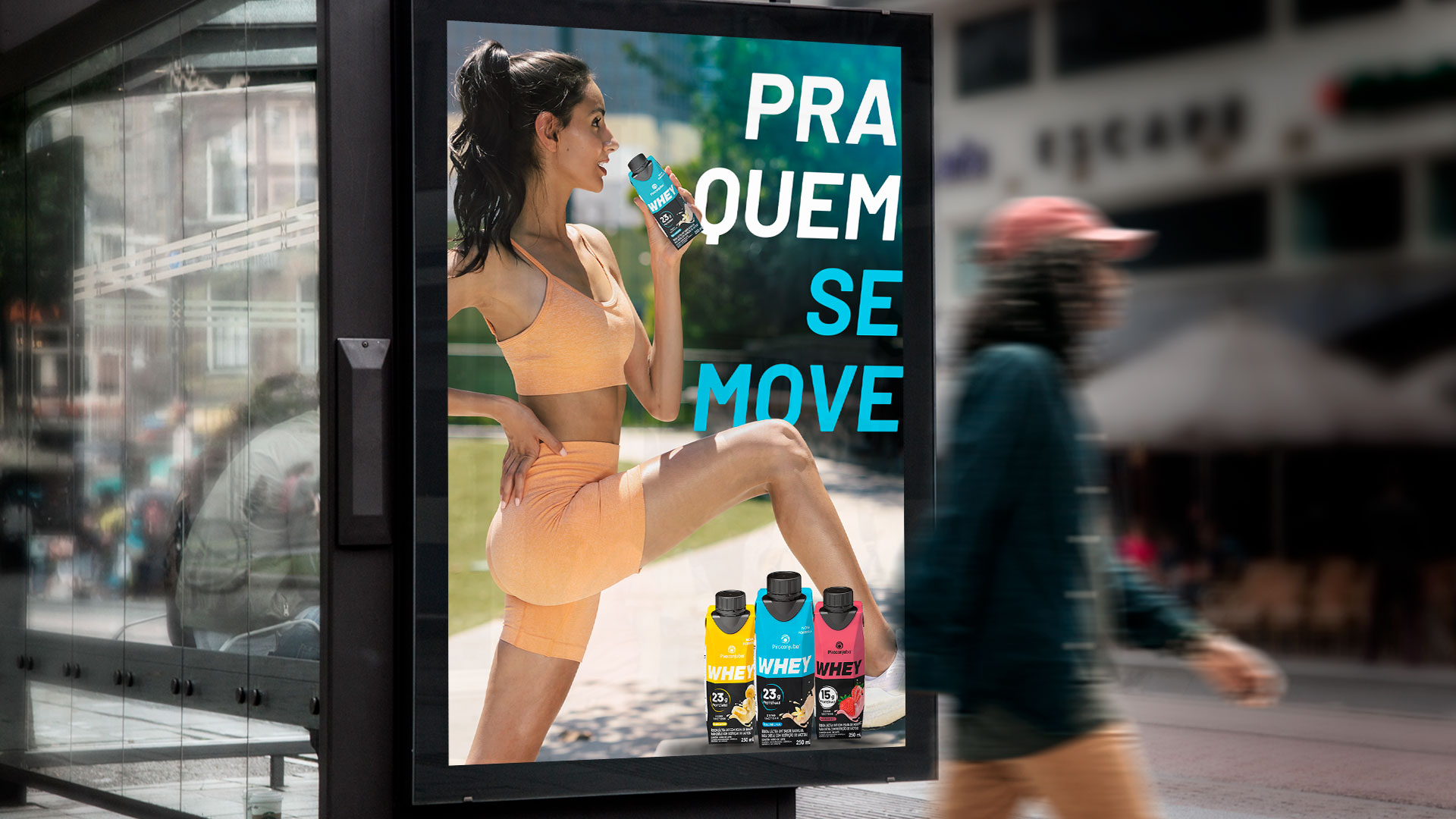
For the redesign in 2023, the Whey brand was consolidated in the protein drink segment, so our objective was to develop a proprietary identity: one that referred to performance and was in tune with the different audiences that train; whether in a lighter form or for those who exercise in high-impact activities. Furthermore, we extended the portfolio to 15g protein versions to meet the needs of new audiences.
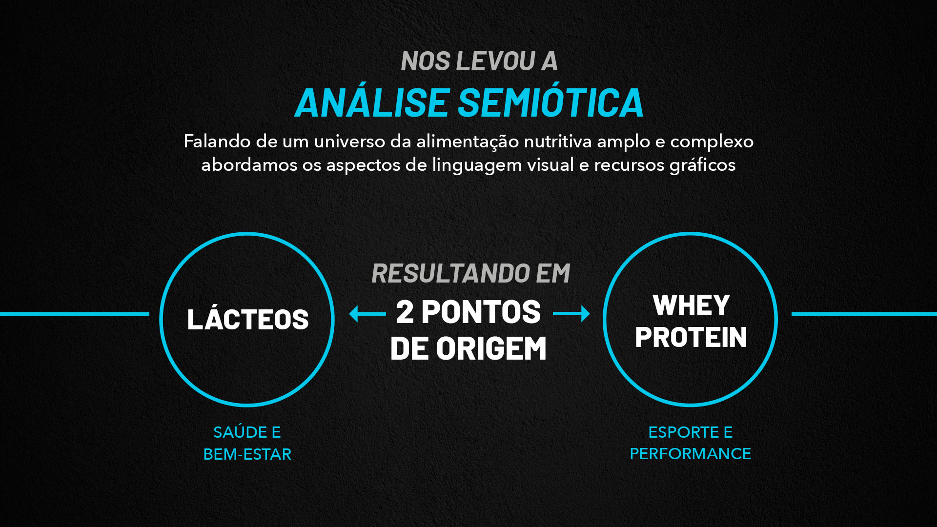
Seeking to understand the scenario and recommend Piracanjuba Whey’s new moment, we revisited research materials from the brand and the context of consumption in relation to the protein dairy drink throughout history and today. Given this dip, we are faced with a category that goes beyond high performance (training) and also dialogues with a consumer well-being routine, expanding the moments and needs of consumption.
Thus, we were able to develop the brand’s new packaging, which brings the main equities already built and recognized among Piracanjuba Whey consumers, combined with the power of the universe of high performance, impact and results of the category. In this way, the new identity brings a necessary evolution in the face of the new consumption context, without losing the essence of the Piracanjuba Whey brand, recognized and admired by its consumers.


From this, we carried out a semiotic analysis understanding the construction of the category through the main codes used, recognized and differentiating.
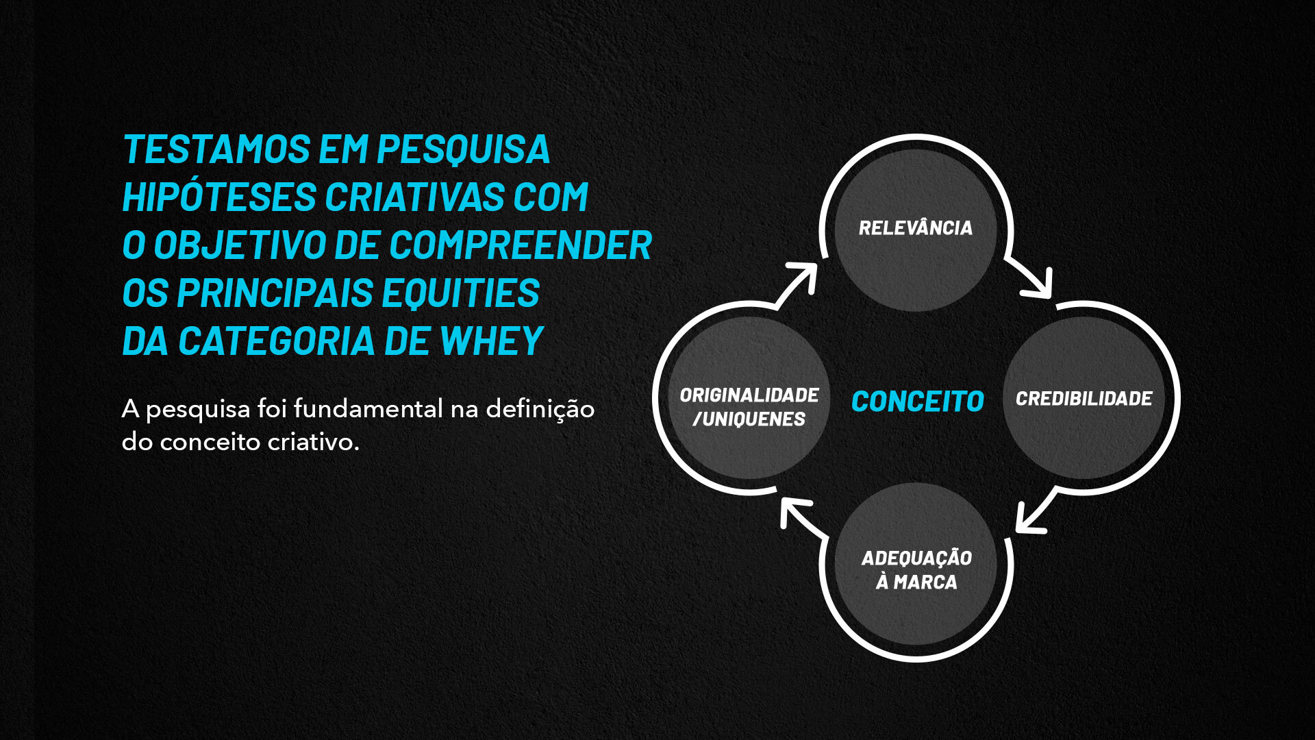
As a consolidation of this process, we worked on three visual concepts that were used for presentation to the consumer public through qualitative focus group research from which the necessary inputs came out for the adjustments and consolidation of Piracanjuba Whey’s new visual moment.
After the research, we completed the development of the new Whey packaging, bringing relevant equities present in the universe of protein drinks, without losing the essence of the Piracanjuba brand.
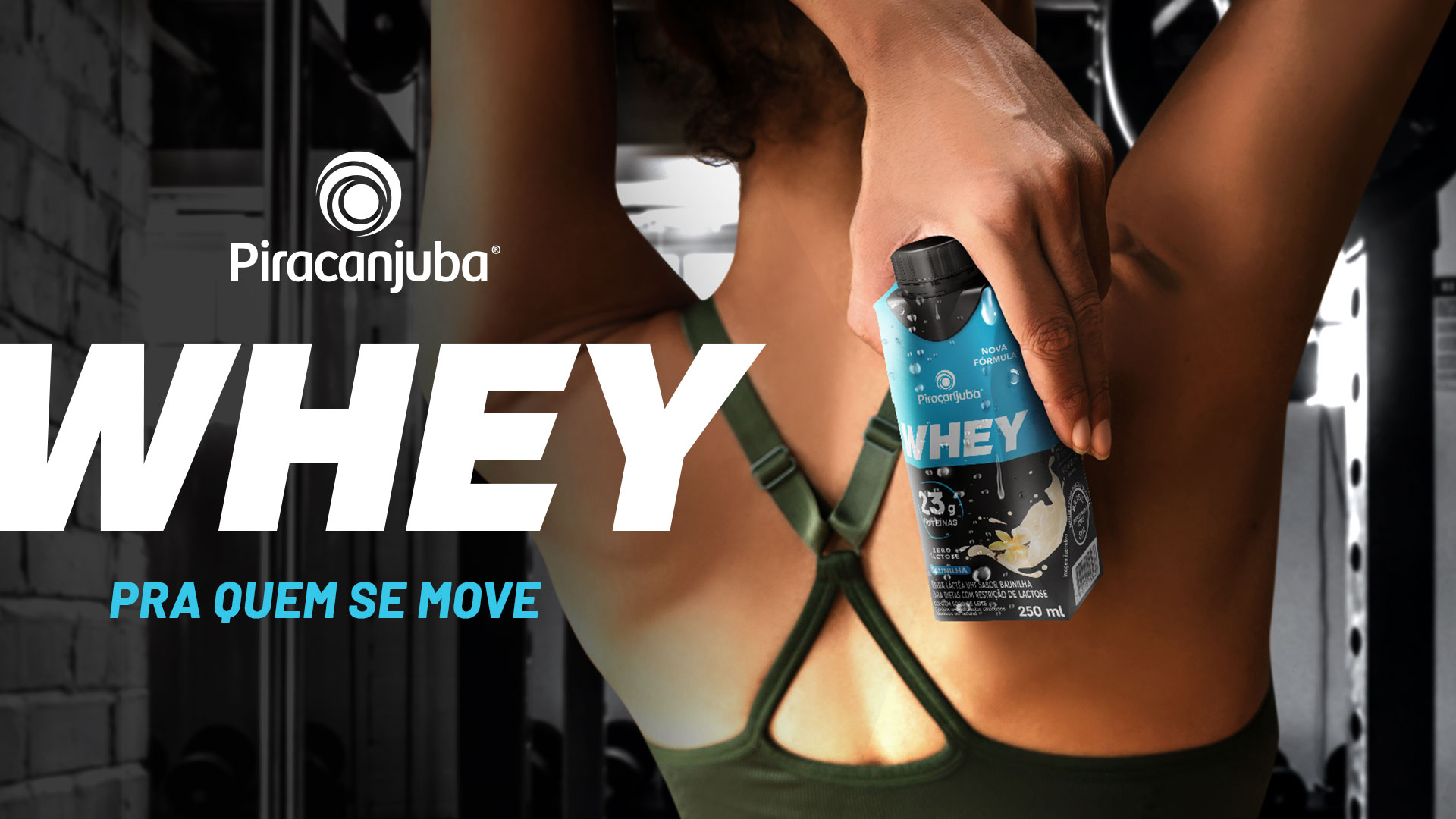
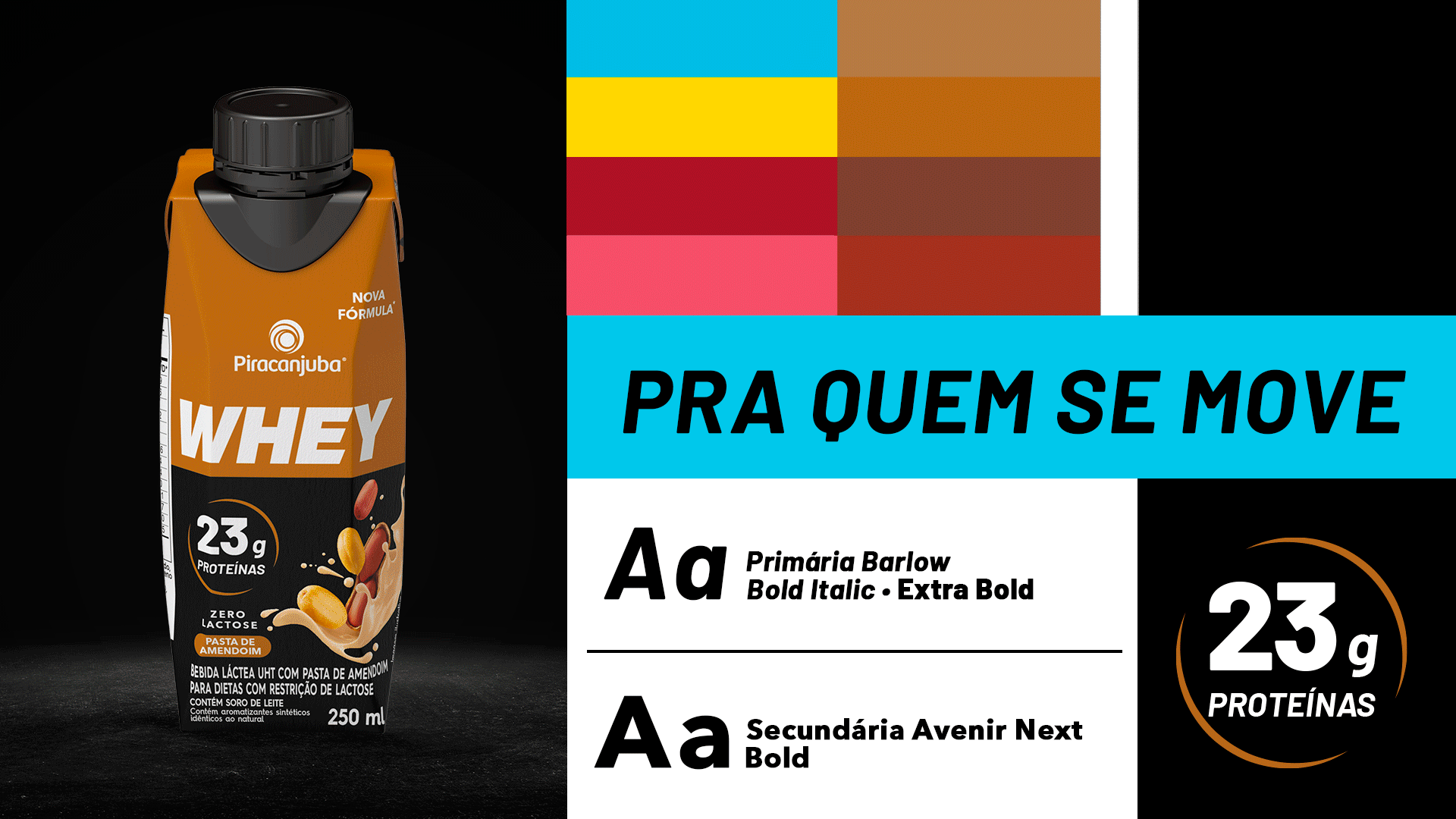
The redesign of Piracanjuba Whey packaging was designed to bring the power of performance together with the essence of piracanjuba. To achieve this, we brought graphic and visual equities that reinforce the universe of the Whey category.
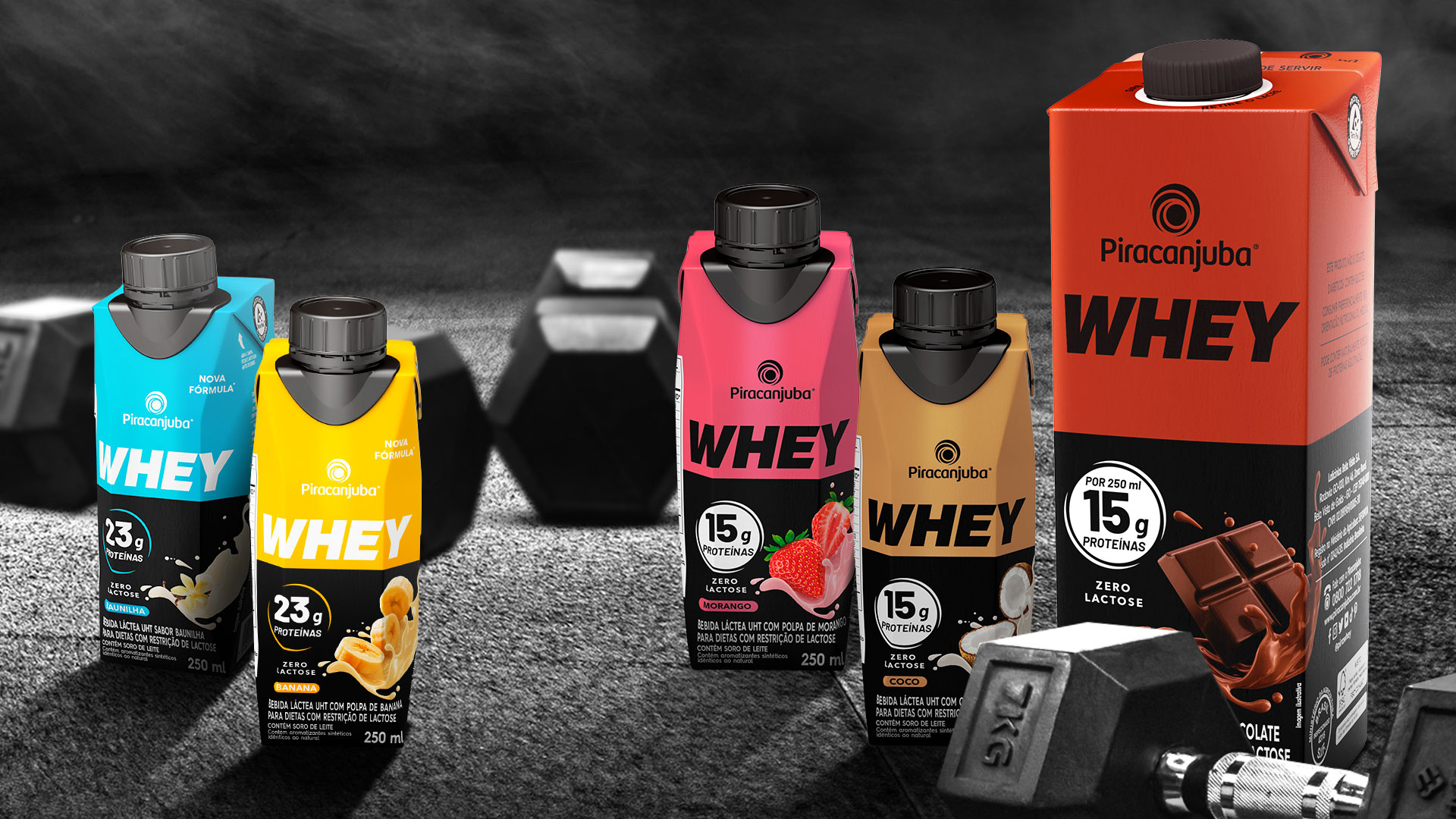
The color palette contrasts with the black of the packaging, generating clarity in communicating each flavor.
We reworked the presentation of the protein claim, information relevant to the public who consume this type of product, which changes color according to the amount of protein, 15g or 23g.