Nutren
Nutren is a brand from Nestlé Health Science Brazil that has a strong presence in the supplement market. Aiming to expand its portfolio and offer nutritional solutions in the category of vitamins and minerals in capsules, Nutren asked Pande for the creation of packaging for a new product line that further reinforces the health care of its consumers. The company has dedicated itself to expanding its expertise in the production of Vitamins, Minerals, Herbals, and Supplements.
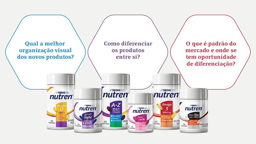
Recognized and valued for its supplements, the new challenge is to enter the vitamin market. Some of the questions we sought to answer with the new project were: how to introduce Nutren into a new category? Which visual elements represent the brand and should be maintained and enhanced in the portfolio? How to differentiate the products from one another? What is the market standard and where are there opportunities for differentiation?
In its research, Pande found that both in premium and popular drug stores there is an overexposure of brands, generating a fight for the consumer’s attention. In front of the shelves, the feeling is one of confusion and information overload. The organization is usually done by product type or brand. We noticed that when presented by brand, the products were more easily identified by the consumer, reinforcing the visual identity of the line. When organized by product, some brands disappear and others stand out because they have a more appealing identity, with strong colors or large logos. This, however, also contributes to visual clutter. Our mission was to bring an identity that would stand out on the shelves, communicating, in an efficient and clear way, the characteristics of the Nutren product.
We analyze the portfolio differentiation, the distinction between the lines, and the organization of the information. Most brands followed a monolithic identity organization, that is, with the same structure. They divide the lines according to the specialties they want to highlight: a more technological proposal; specific target or differentiated function. Given this scenario, our challenge was to strengthen the visual identity from a structure that highlights the specificity of each product. Considering the size of the product packaging (which have small bottles), we worked on the Nutren elements to highlight them on the shelves.
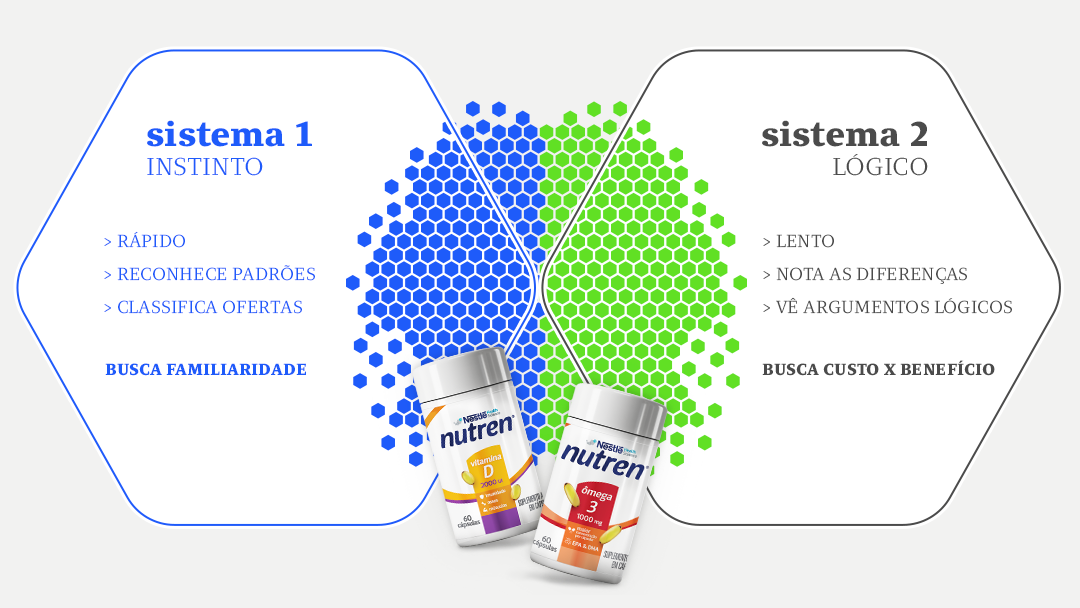
We also did a category analysis for the capsule release. Their patterns, information hierarchy, differentiating elements, and graphic elements were evaluated. We also considered the neurological dynamics of buying and consuming to develop the arts in an attractive way. Since this launch is a new brand within the vitamin market, it is important to convey familiarity to the consumer from the usual codes of the category. We suggested that some elements of the brand should be worked on to generate perception of quality and result. Keeping the well-known visual codes, we present the main attributes of the new line, highlighting Nutren’s already recognized quality.
The main differentiation code used in the market is colors, and there is variation among the various competing brands in the hierarchy of information. Our challenge was to balance the brand highlight with the product description, enhancing the category codes and making it clear that Nutren VMHS is a vitamin, not a powder or liquid supplement.
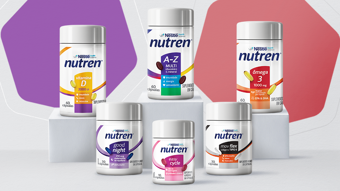
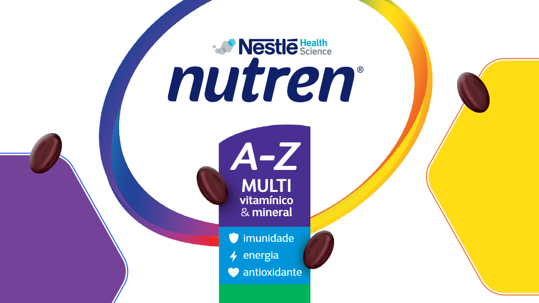
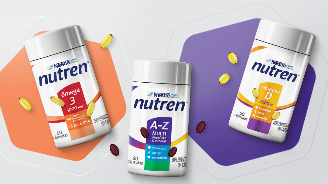
Based on Nutren’s graphic structure, we created a line of vitamins that brings a large white area to the layout to generate more synergy with the category and to stand out on the shelves. The different label colors pointed out the divisions created within this new line.
The figuration of the capsules reinforces the type of product being offered, making it clear that it is a vitamin. Label lamination ensures a more premium finish to the packaging.
The Nutren brand was applied very prominently on the packaging, making it easy to recognize. Description and claims about functionality directly indicate that the unit is the desired product. A simple but very stylish construction. As for the structure of the label design, we have the arc and the stone, with a stripe of varying color (according to the product) on which the characteristics and the benefits are stated.