Modess
With more than 30 years in the Brazilian disposables market, Ever Green is going through a new cycle. Investments in brands and in the team have led the company to be the head of a new movement in the categories in which it operates and in its own history. A great deal of expectation is riding on the relaunch of the historic Modess brand, which is absent from the feminine and hygiene care category for more than 10 years. There are some other important efforts for this phase, such as reorganizing brand assets and strengthening corporate brand. Ever Green is looking to bring light for the future running of the business.
Everyone remembers or somehow has heard about Modess, especially women over 30. They have a clear memory of the brand. Even though, despite its representativeness, how should this brand be dealt with today? Pande was invited by Ever Green for the relaunch of this commercial icon. The project was divided into 3 main stages: immersion and diagnosis, positioning, and visual identity. Here are the main challenges and solutions identified by the team involved in the project.
Diving into the historical universe of the brand, we identified an avant-garde legacy and a name that is still very strong and relevant in the feminine universe, but with a huge challenge. The world has changed, as have the challenges and agendas of the last 90 years. Therefore, it was necessary to understand, among other things, what the brand’s role would be in this new context and how it would engage with the new consumer needs and compete in the market.
Having this in mind, we understood that it was necessary to anchor the meaning of the brand beyond the functional and technological attributes. Thinking out carefully in the new version, it was necessary to understand the role of the brand and its contribution to the lives of contemporary and future women.
Looking to determine the strategic and creative paths, our team of professionals immersed deep in the feminine universe through studies that included understanding the history, essence, and meaning of the feminine, also menstrual and life cycles. Having as base the point of origin and main pillars identified in the brand, also with demands of consumption and social context, we recommend the approaches for the new positioning that gives continuity to its history and opens space for talking about Brazil’s feminine care today and in the future.
Identifying the brand’s points of origin and essence, it became clear the role it played in the 90’s. Attempting to get closer to its target audience, it broke taboos by talking about menstruation and understanding women’s needs. The brand introduced a female mentor called “Anita Galvão”, a character created to be the spokesperson of Modess. Through her, consumers’ questions sent by mailbox could be answered for a team of woman pedagogues. That way Modess built relevance and was present at a time of women’s emancipation, launching the first disposable sanitary napkin in Brazil. The brand also was pioneer in the feminine universe promoting spaces of listening, exchange, and self-knowledge.
Now it is different. Taboos have been broken and many conquests were made. But there is still much to do and conquer. Nowadays, we often feel a lack of space for breathing; for looking at oneself or at the other; for a coffee and a good conversation. Summing up, we lack the time to explore our uniqueness and be ourselves. Having this in mind, in its new version, Modess will continue its history restarting the conversation about the complexity of the feminine universe, which is always so collective and private.
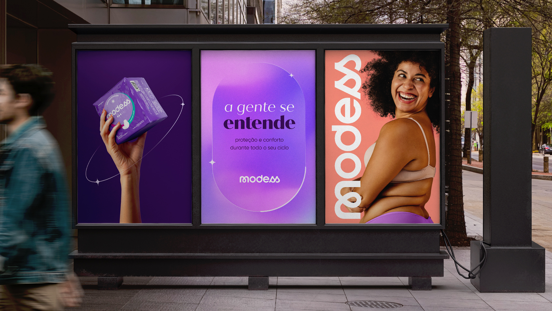
We identified wisdom, warmth, and softness as pillars to be enhanced. We chose to visually represent the new phase of the brand using elements of ancestry, support, wisdom, intuition, and essential codes of the feminine universe that can be easily identified through the embrace that the brand suggests. This led the choice of colors and graphic elements relating them to this essentiality.
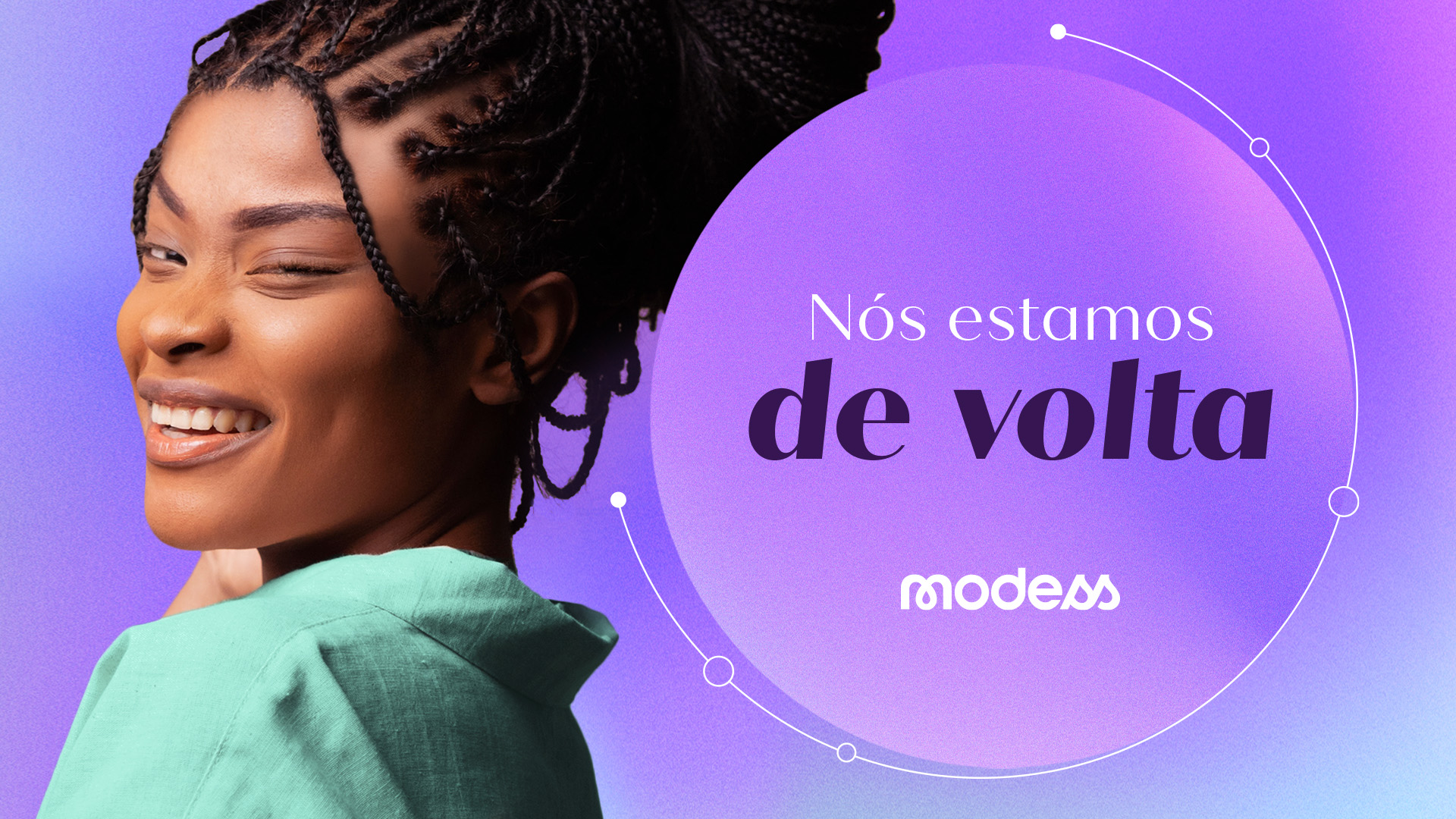
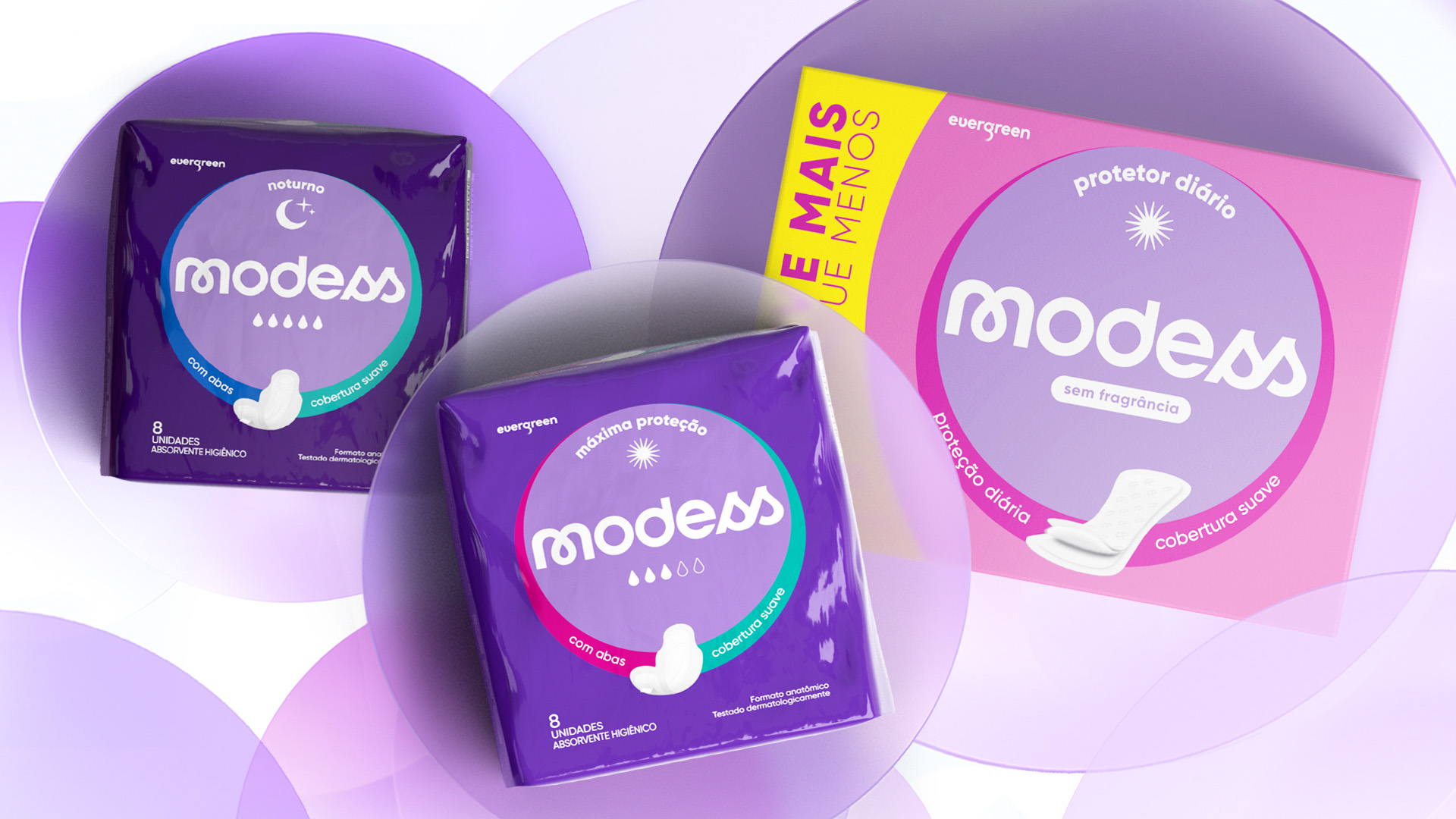
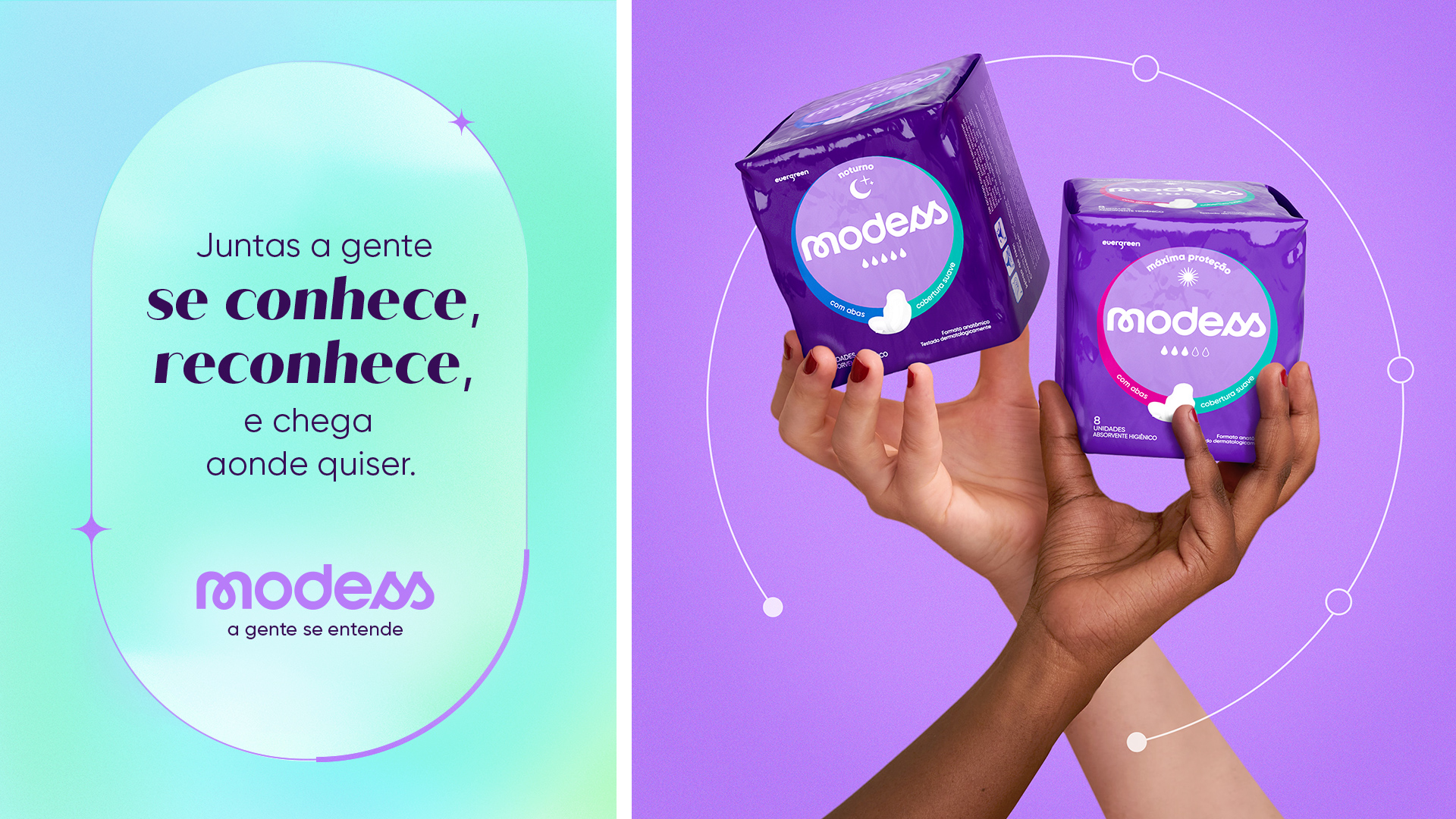
In a fulfilling, interested and soft way, Modess seeks to resignify chaos through the identity of each one of us. Highlighting feminine strength, it suggests the countless characteristics of our gender: our intuitive, discreet, and invisible power; our ability to unite, listen, and exchange knowledge; our typical eagerness to learn and transform; our full involvement, as an embrace.
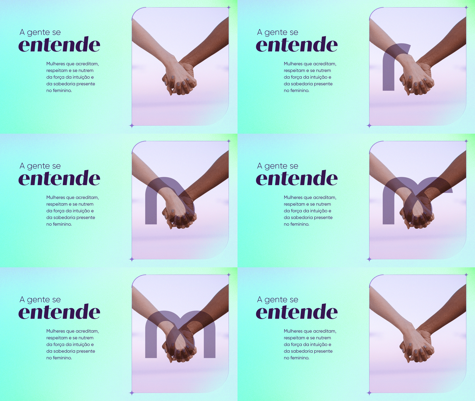
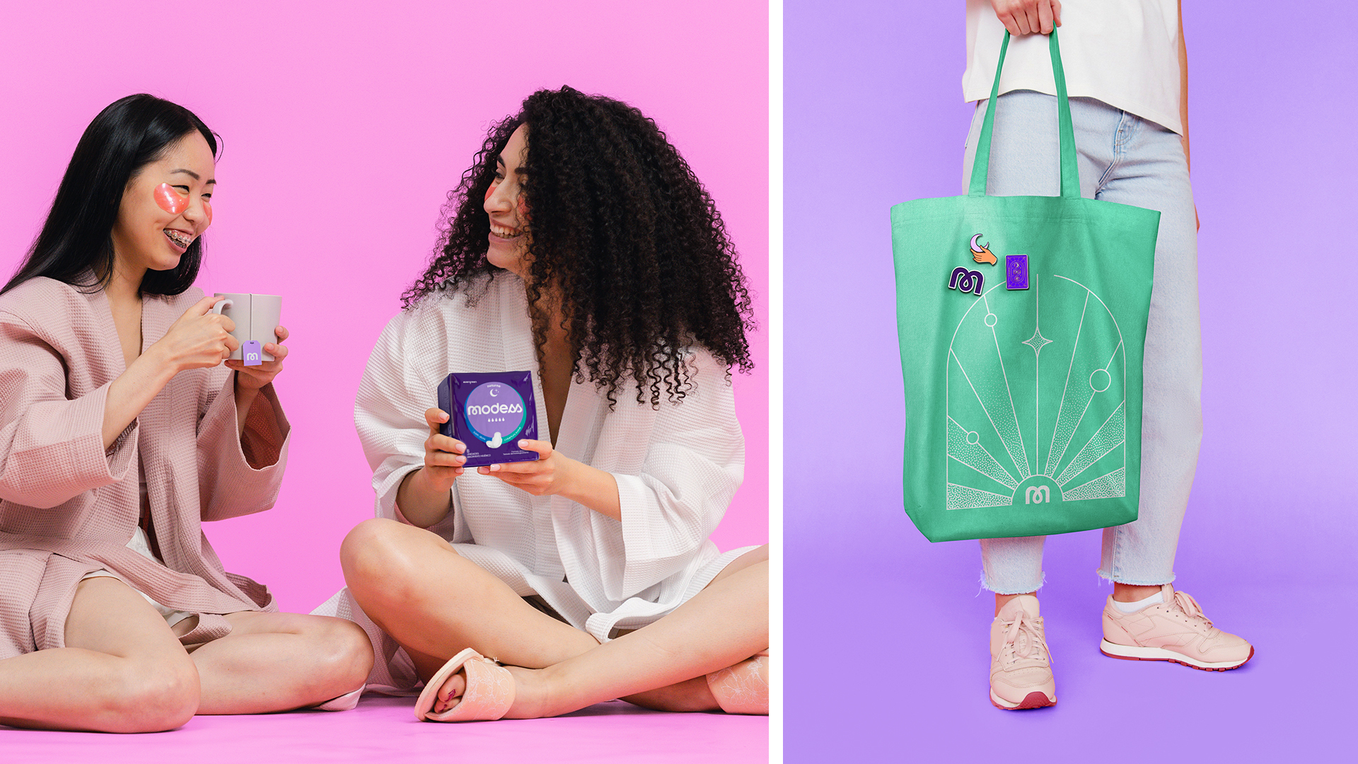
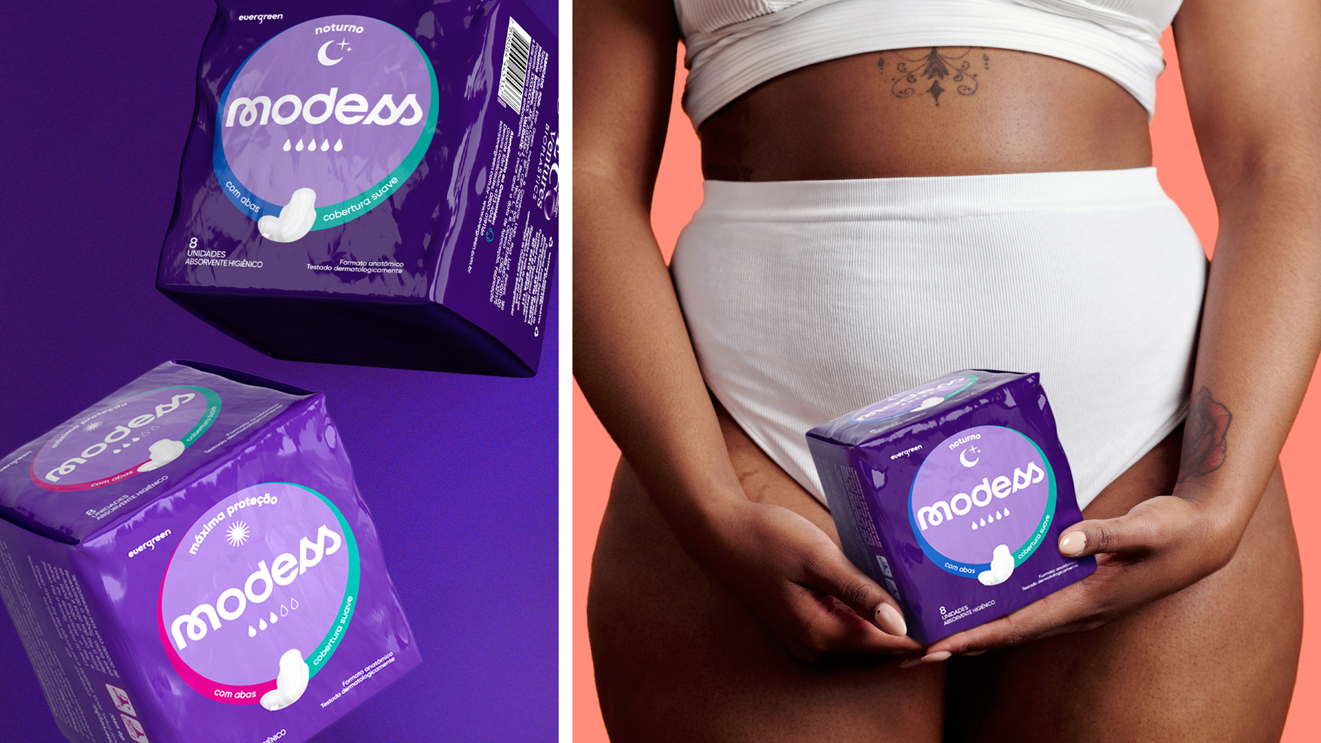
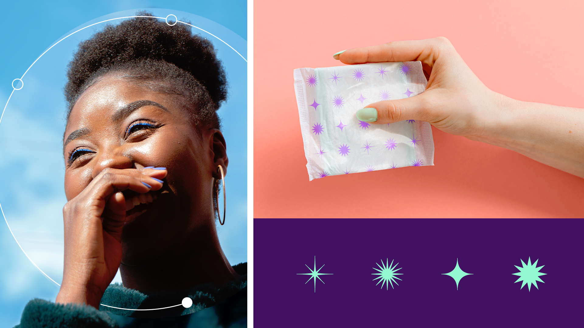
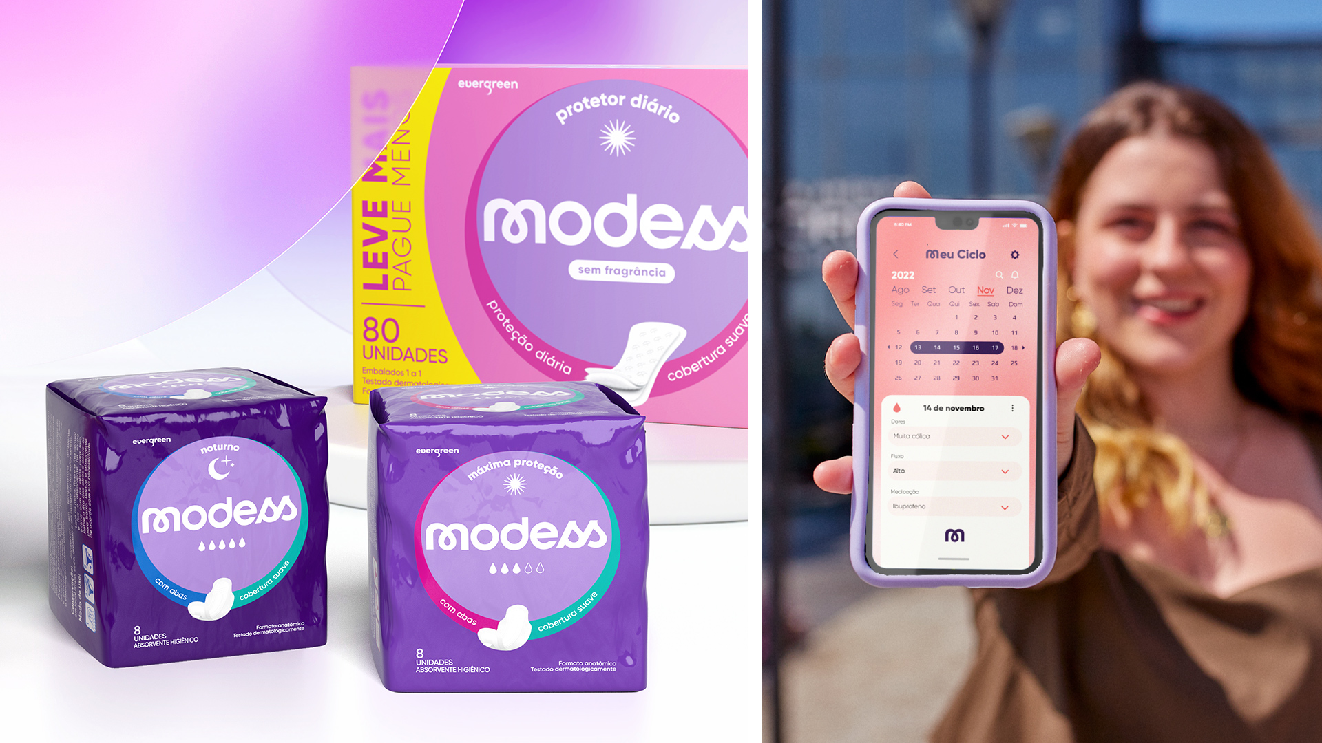
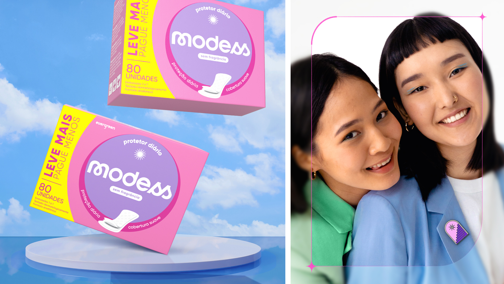
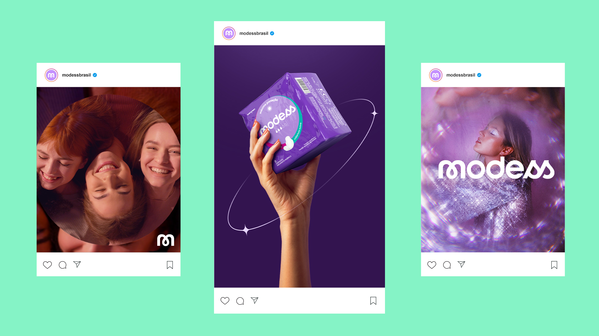
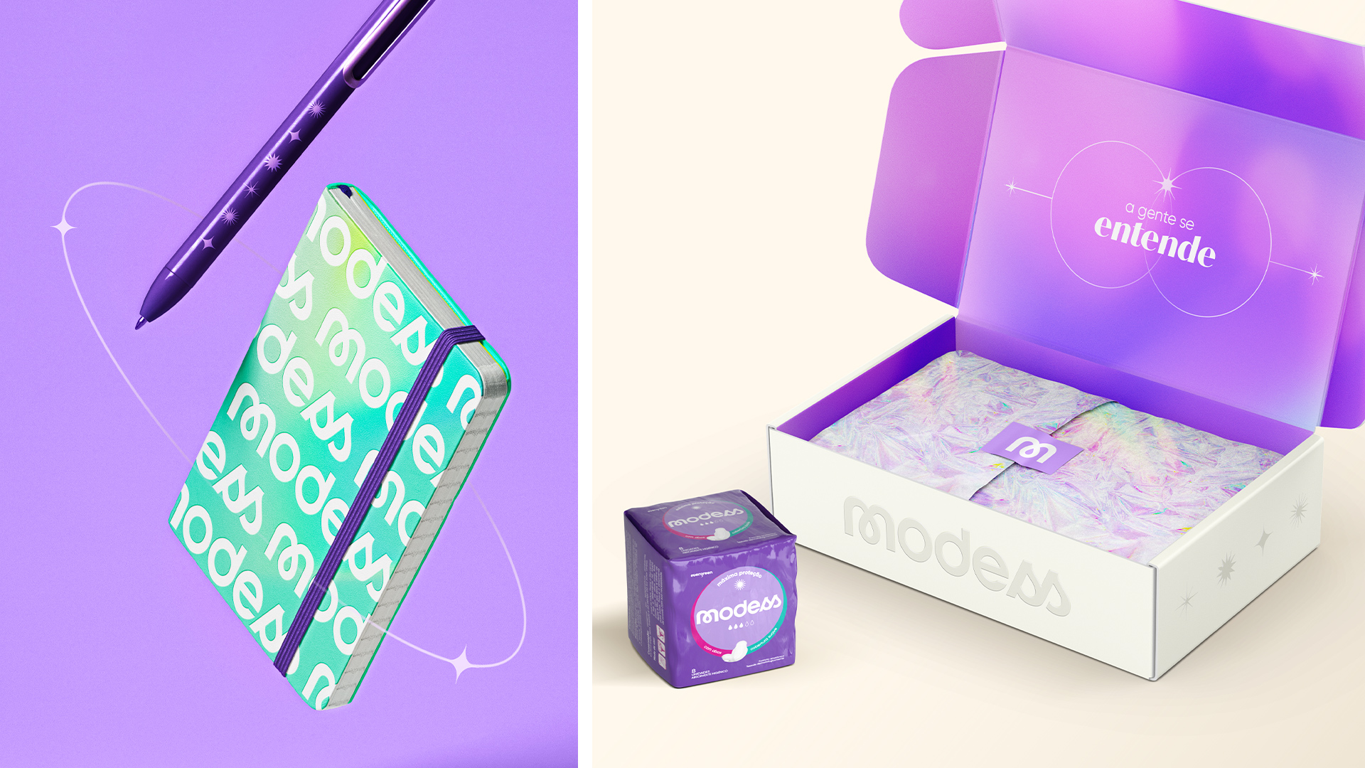
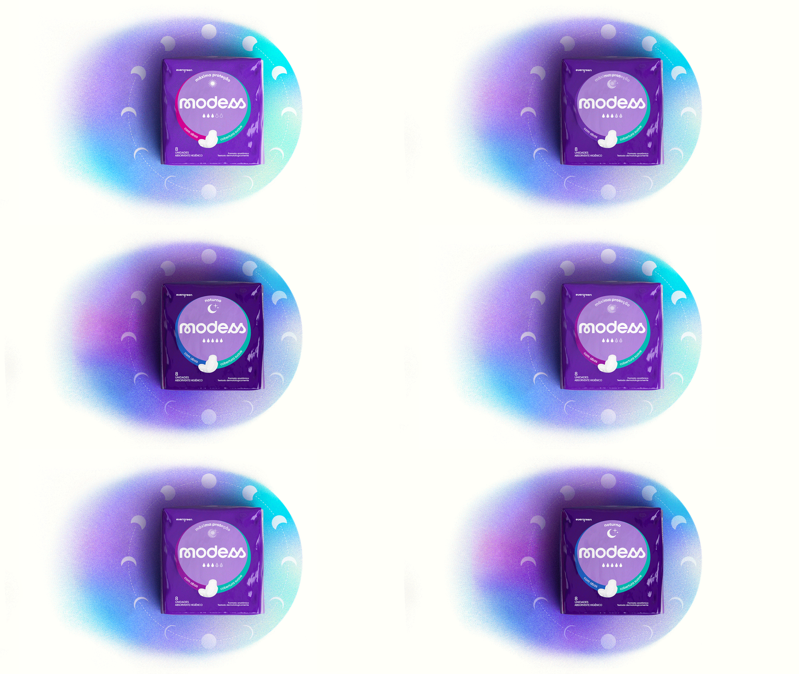
The brand is unobtrusively presented and the blood drop embraced by the “M”. The typography is rounded and the “SS” letters create an allusion to handwritten fonts. The brand is straight, simple, and necessary, with elements coming together in a protective embrace. The language of the brand comes from the essential woman, with a mystical and modern touch. The color purple is used softly, with gradients that emanate energy, blurred backgrounds, softening, and sparkles.

