Leinertex

Leinertex, the leading paint brand in the Midwest of Brazil, has over 40 years of history. In the region, it was the first paint factory and today, with investments and dedication, it houses the most equipped laboratory in the territory. Following the standards of multinational brands, it became a reference in the market and its expansion enabled an important performance and leadership also in the North region.
It is recognized for its excellent cost-benefit, in addition to technological efficiency and technical support. All this without losing the family DNA, which is a reason for great pride and the origin of the dream of creating the brand. Today Leinertex seeks expansion and recognition of new territories and audiences, in addition to its consolidation in the regions where it already operates.
Starting from Leinertex’s purpose of increasing its expansion and performance in the paint segment in Brazil, our challenge was to investigate and recommend the next strategic guidelines for its repositioning, developing the visual identity and its product portfolio, thus enabling greater conditions for the growth of its business. For this, it was necessary to be clear about the positioning and definition of where it wanted to go, unifying and directing brand communication, to become an important name among the largest in the national segment, being recognized as such in new regions and strengthening, even more, its identity in the places where it was already known.
After deepening and investigating the paints category, it was concluded that the brand should have its positioning centered on the consumer, approaching a territory of emotional communication. Therefore, the important attributes of practicality and cost-benefit, characteristic of the brand’s legacy, should be present and better developed from there.

In this sense, the new brand discourse connects the dream of the brand’s founders with the consumer’s desire to carry out that long-awaited project.
For this, a deep immersion was necessary to understand the brand’s main attributes, PDV (Point of Sale), consumer habits, and competitors. Field research and interviews (both internal and with consumers) were essential to understanding better how the consumer journey works in this category, which seeks a greater emotional connection with premium brands, as it is involved in idealizing and implementing the long-awaited reform.
It is important that the brand grants access to different ways of dreaming, regardless of income or region of the country.
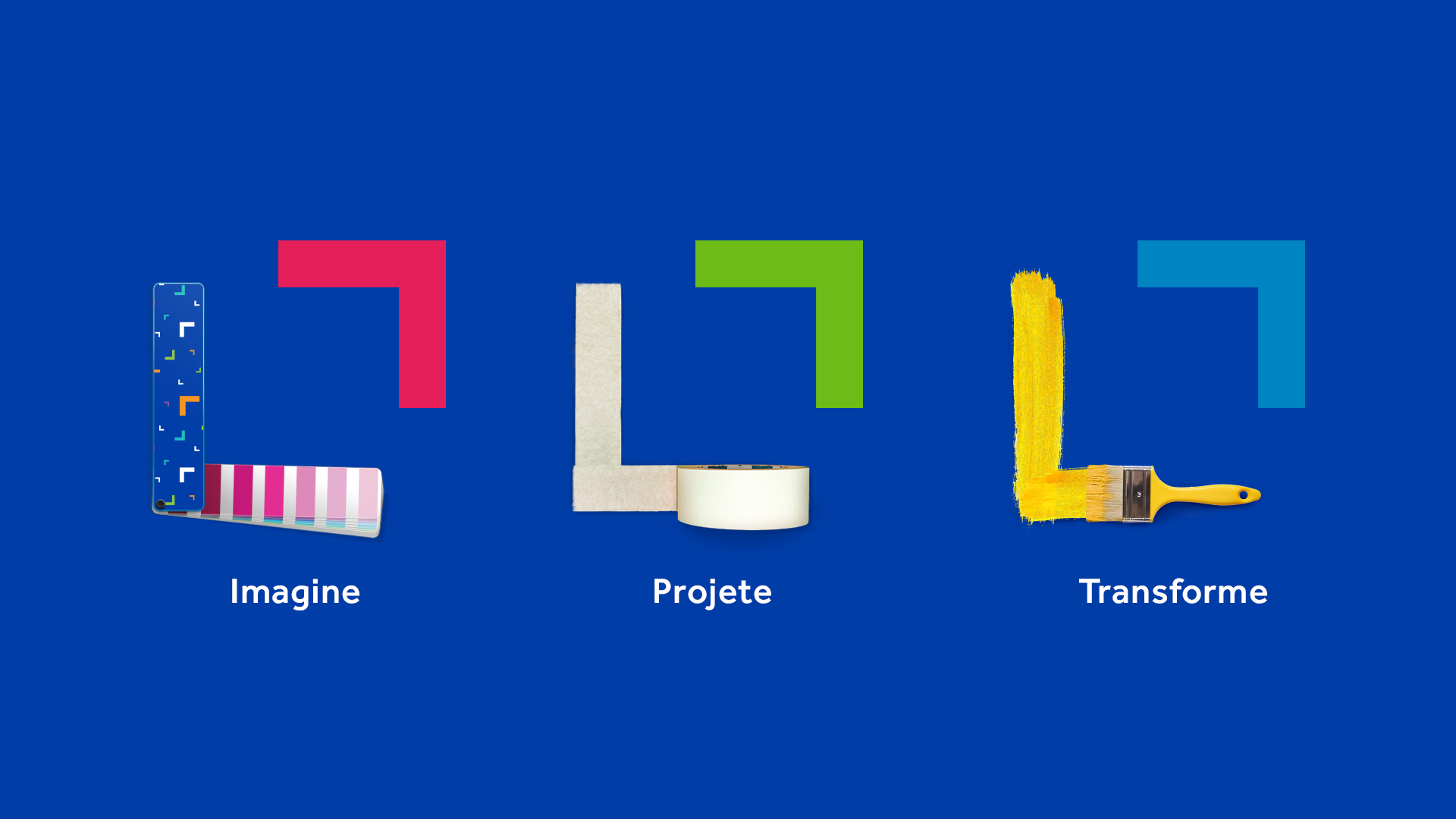
As for the communication strategy, we created three pillars: Imagine, Design, and Transform. The “Imagine” pillar works on the idealization of the environment, which addresses the search for references, colors, and detailing of finishings. “Design” encourages people to be “hands-on”, measuring the environment and putting the reform execution plan into action. The “Transform” refers to the positive feeling generated by the reform carried out. The person’s satisfaction and interaction with their new home or environment are explored here.
Designing is to imagine, frame, measure.
People use the framing hand gesture to imagine or design a future vision about something. In the logo, the framing highlights the brand and, in the language, it details what should be focused on, but it can also be expanded in different ways, creating a variable element.
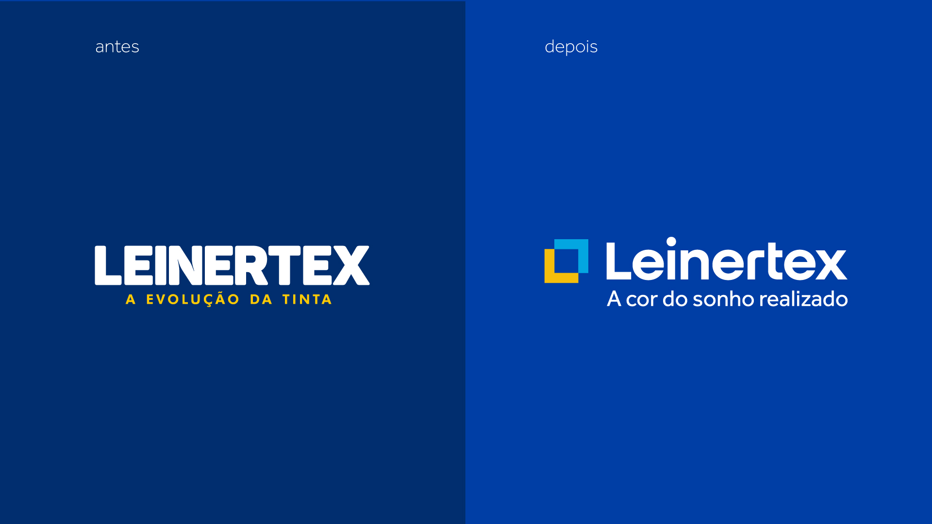
The new symbol represents this framing and, when we isolate its elements, we have an arrow pointing upwards, representing the look to the future and growth (design premises) and we also have the “L”, representing the name Leinertex, which carries with it that family meaning so important for the company.


To represent the “the color of dream come true” positioning, colors should be present in the visual identity, creating a vibrant and friendly brand. The blue, characteristic of the brand, underwent a chromatic revision, becoming more vivid.


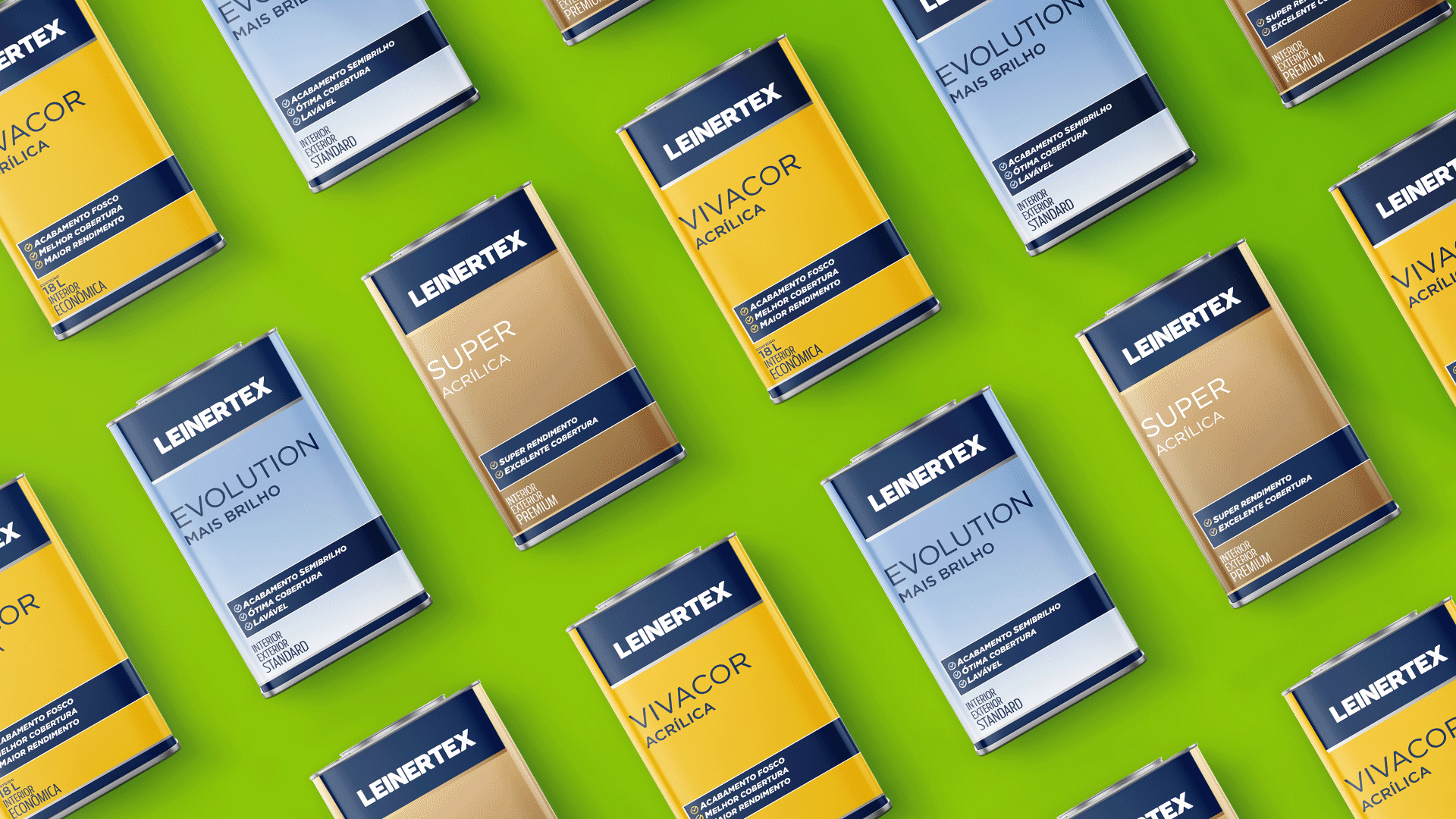
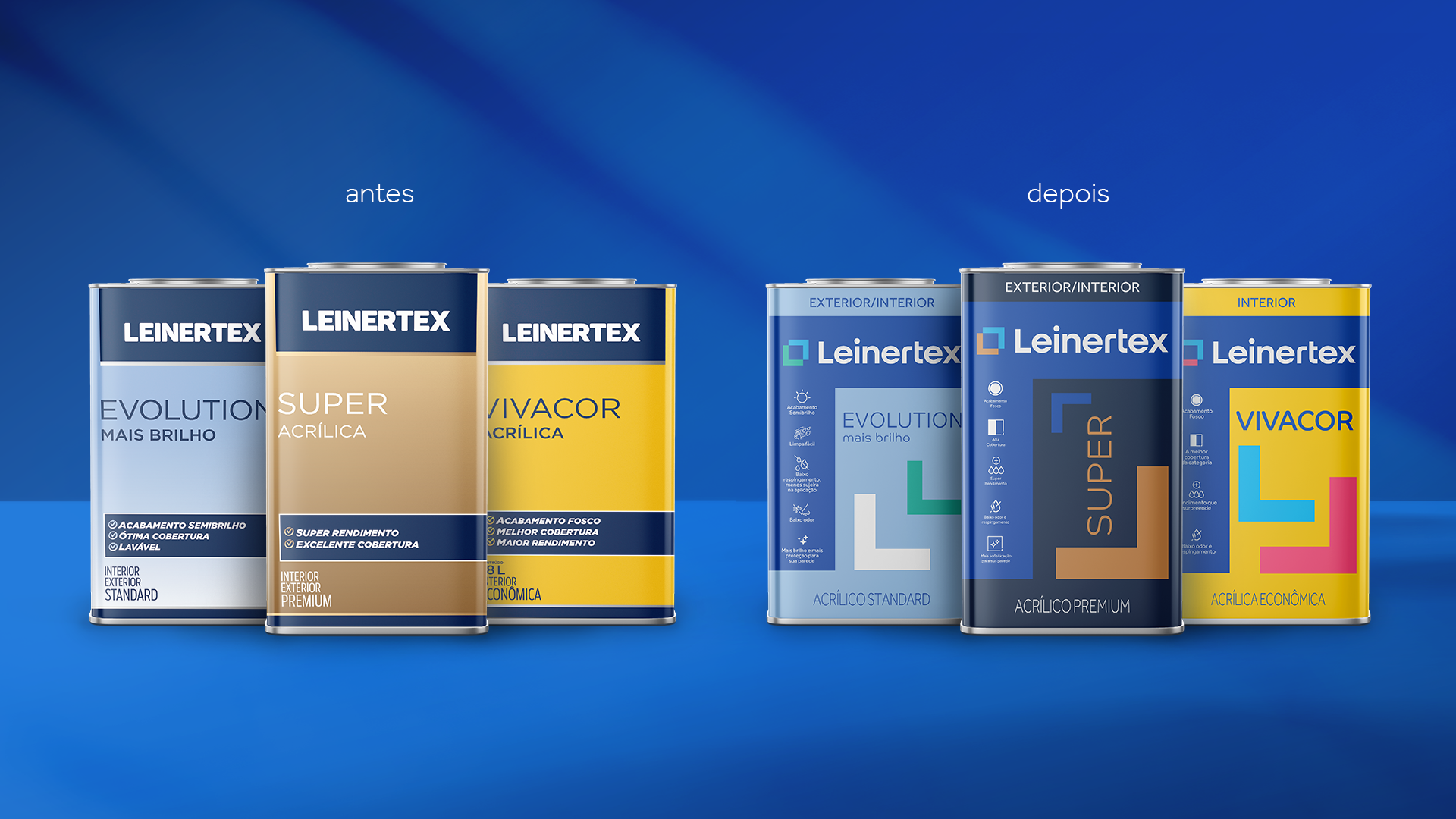
As for the packaging, we created a modular structure based on the brand’s new icon, highlighting a header area for the logo and another reserved for the claims (the premise of practicality and help to the consumer). Based on the possibility of making the composition more flexible, each product line has a graphism organization. With this feature, in addition to the chromatic variation, we obtain a greater differentiation within the lines of the portfolio.

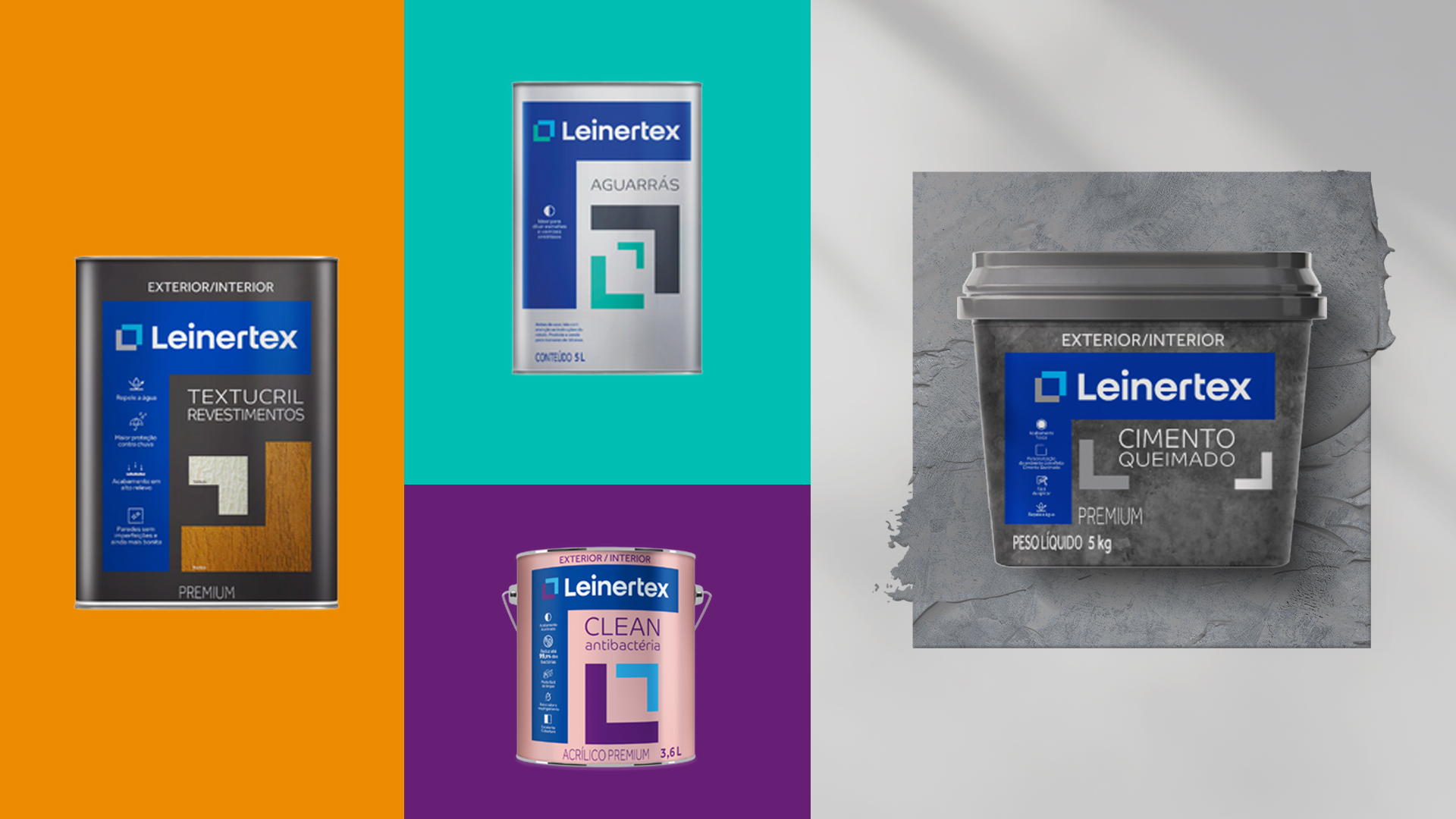
The redesign resulted in a proprietary, cheerful, and close identity, capable of visually representing the entire strategic change of the brand.