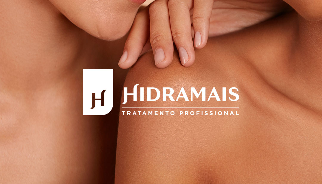
Hidramais
Beauty and Personal Care
Hidramais Tratamento Profissional, a brand owned by Biocap Laboratório, has the fundamental role of bringing innovation to all Brazilian women, based on premises such as technology, high performance and results. The partnership with Pande consolidates the current change process of the company and makes the variety of the portfolio a boost to the growth of the business.
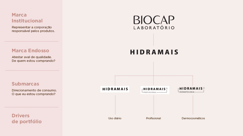
The main challenge of the project was to establish a strategy to organize Biocap Laboratório’s portfolio of brands and products, in addition to raising the perceived value of the Hidramais brand, creating an objective and powerful channeling for the development of the brand in all sectors: industrial, commercial, product, marketing and financial.
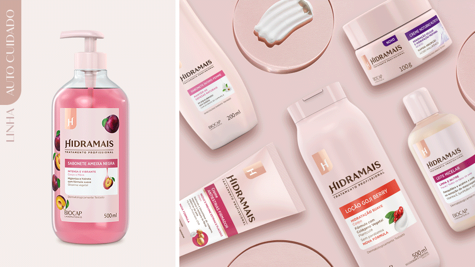
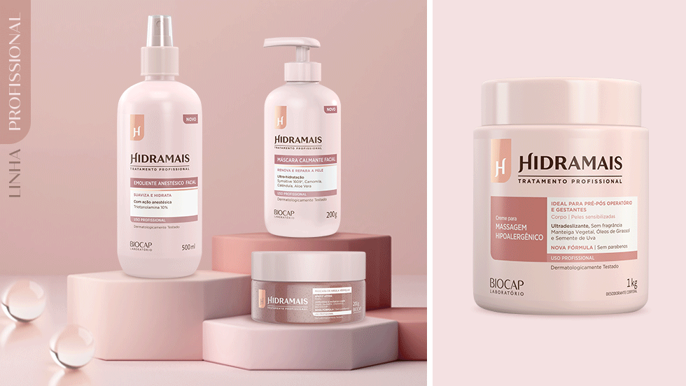
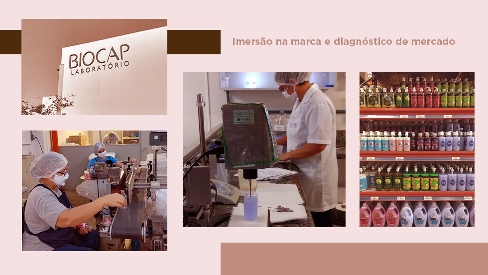
Based on the steps of brand immersion, market diagnosis (POS research, competition analysis, and benchmarks), and consumer research, the development of strategic recommendations which structure the brand platform and the new portfolio architecture was possible. In these strategic recommendations, the Hidramais Professional line is no longer an exclusive product line for beauticians and becomes the brand’s positioning, which begins to invest in layers of value with emotional, functional, and aesthetic bases. Thus, all consumers, including those who are not specialists in professional treatments, now have access to products with professional results.
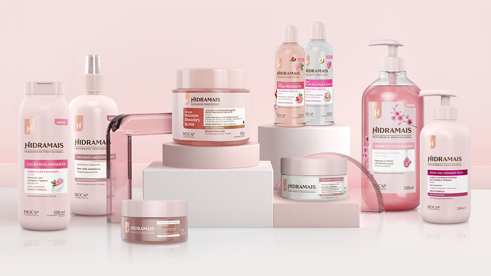
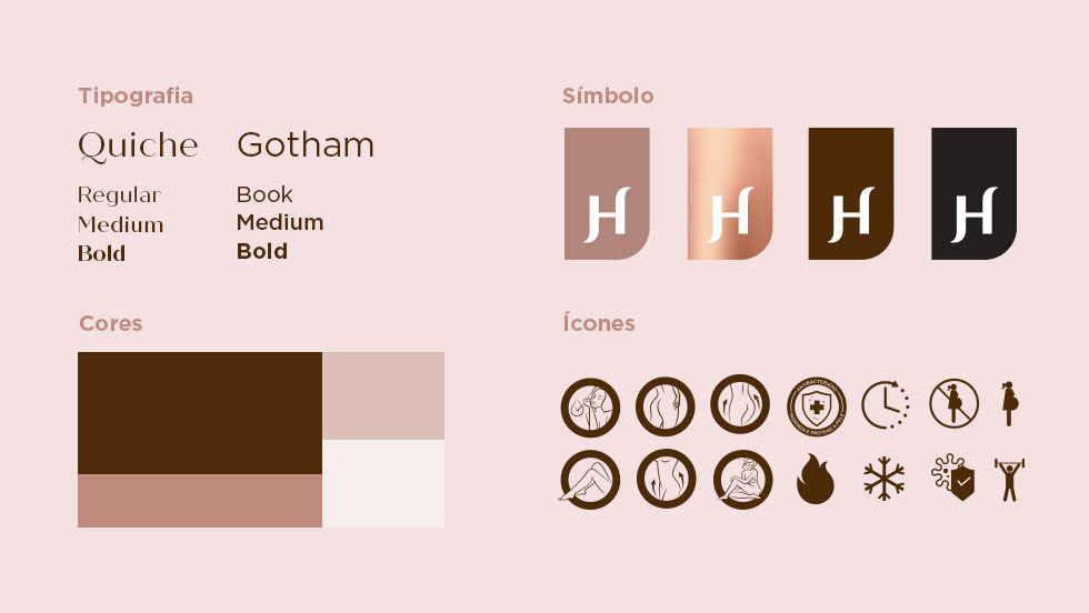
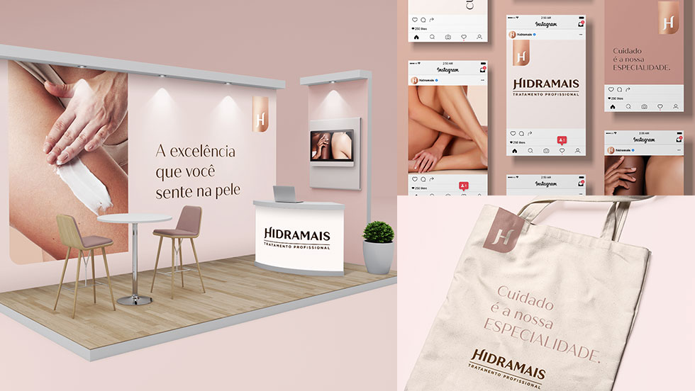
Once the strategy was established, the next step was to reformulate Hidramais’ visual identity, which became Hidramais Tratamento Profissional, to graphically represent its areas of expression: Specialist, Friend, and Accessible. We created a strong, proprietary language, with great prominence on the shelves and in the virtual universe, which maximizes recognition by consumers and increases conversion into sales.
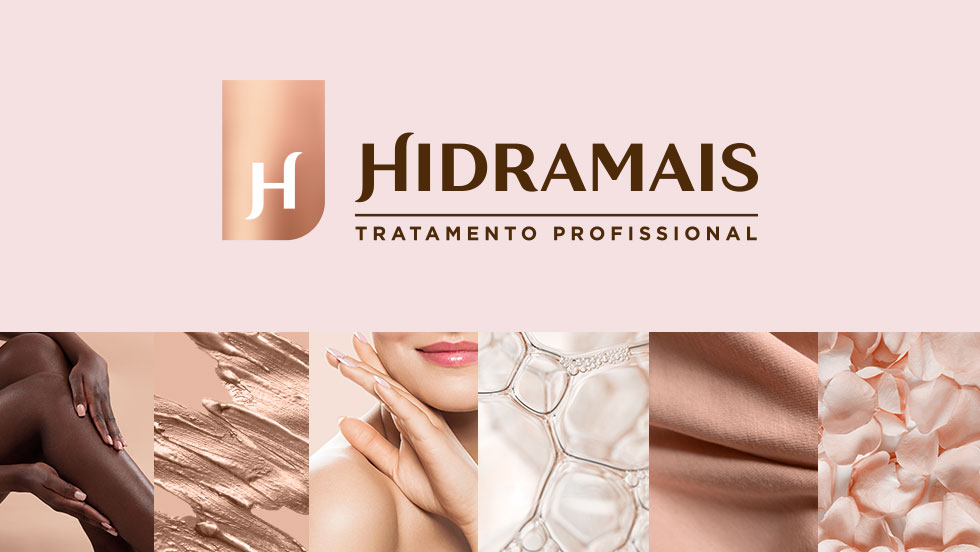
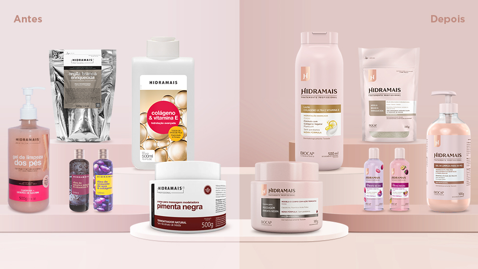
The Hidramais brand was perceived as affordable, but the quality of the products was not evidenced. Therefore, the identity proposal was to invest in the perception of quality to add value to the brand.
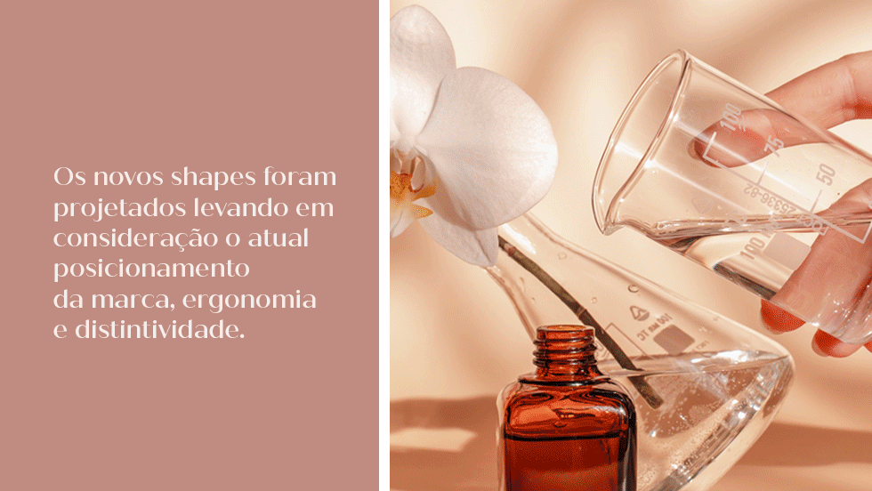
Another important point for the project is the redesign of the packaging shapes. In the creation process, we considered the criteria of ergonomics, distinction and positioning, always relating them to the main conceptual concepts strategically defined. We made a journey mapping and ergonomics and packaging assessments with non-professional consumers and beauticians.
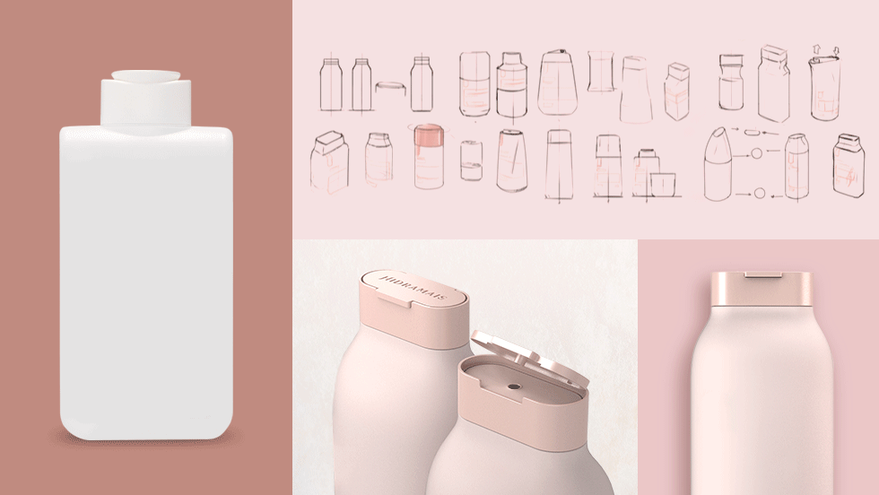
The result was the development of a flexible and consistent proprietary identity that communicates clearly with the professional and non-professional consumer, while maintaining unity between the different product lines. The brand’s new visual universe has delicate representations, in pastel tones, ensuring modernity and exclusivity to Hidramais.