Carrefour Viver
Food and Beverages
Graphic design
In 2005, Pande received the challenge of creating a House Brand for Carrefour’s health foods segment, a first in the Brazilian Market at that time. And thus, following a deep study of the market and consumer behavior, trend research, brand positioning definition and the creation and naming of the logo, the Viver brand was conceived.go.
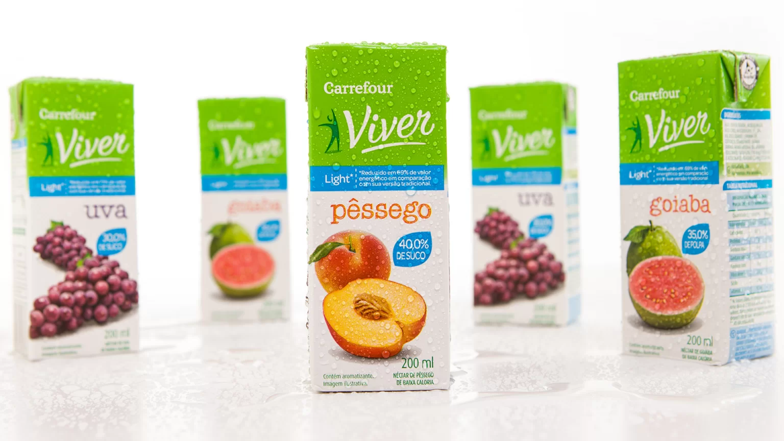
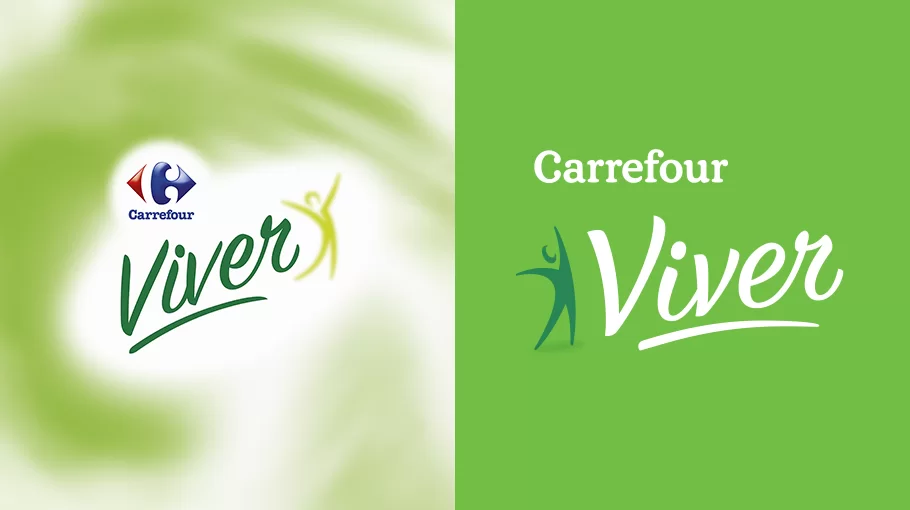
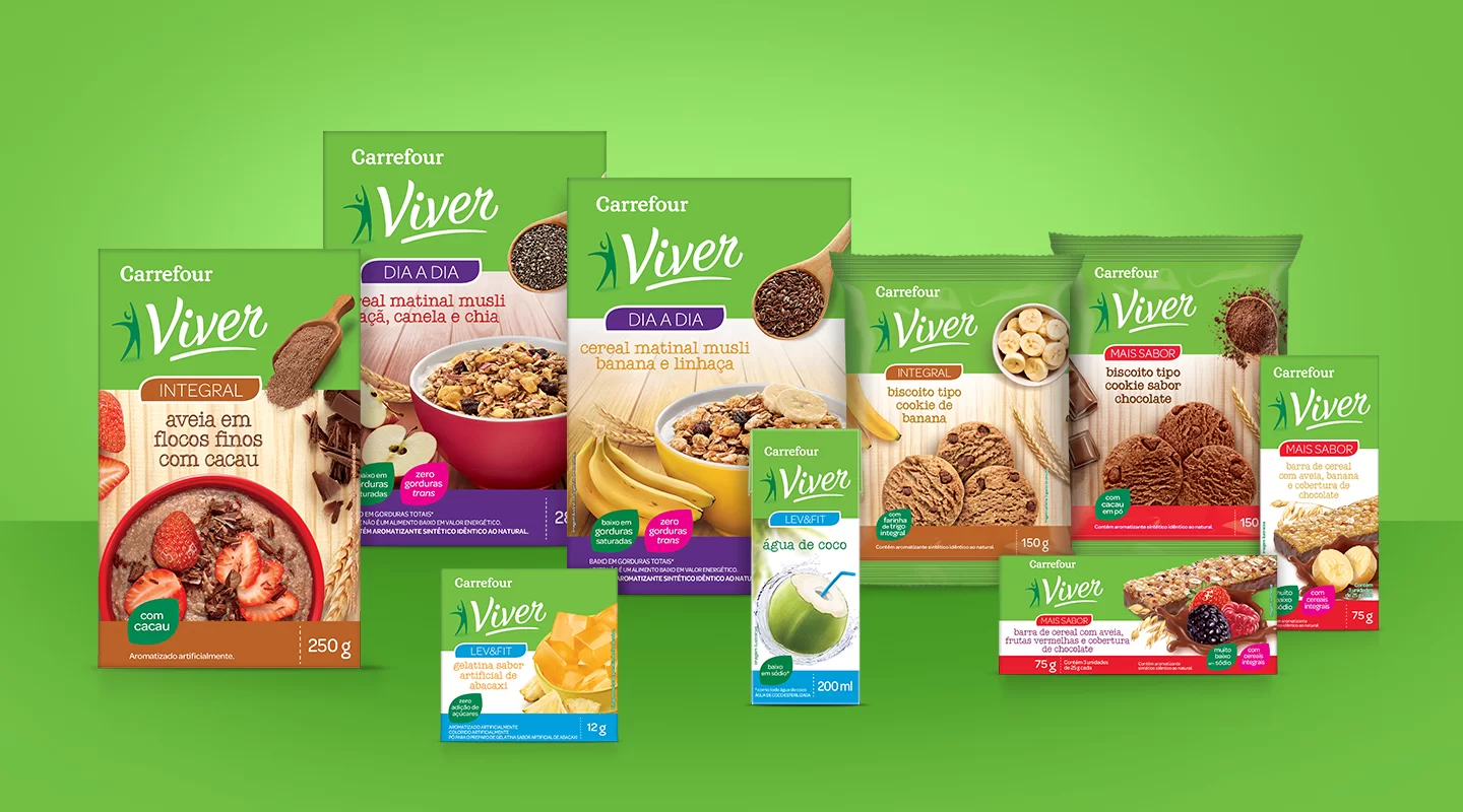
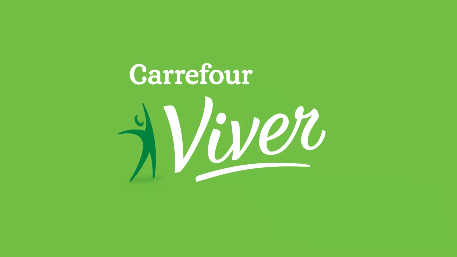
Almost a decade later, a few updates have been made to the line identity in order to adjust it to the current positioning of Carrefour’s House Brand. In 2014, the challenge was to update and rejuvenate the Viver brand without losing either its identity or personality. The redesigning of the brand strengthens the competitive aspects of its line of products against the competition, guaranteeing its leadership in respect to the growing market in health foods.
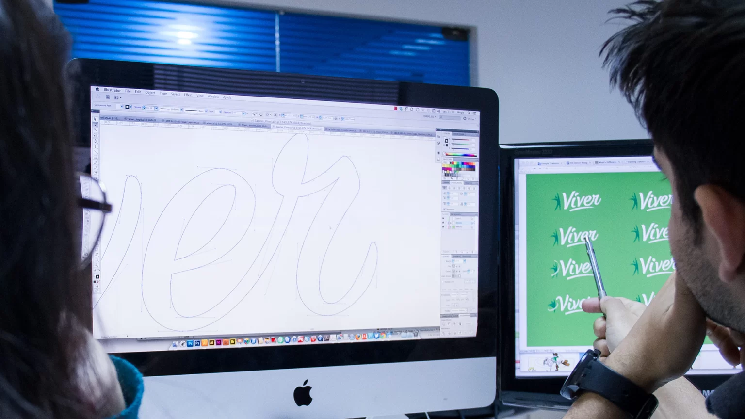
The revamping of the Viver Brand saw an adjustment to the lettering, giving it more rounded and better finished serif endings, thereby enhancing brand expression. The change further provides a sensation of not only greater consistency on the supermarket shelves, but also one that reflects prime quality for the Brand. The brand’s graphic symbol has also become more visible and direct,aiding its application and legibility on the product.

