All Points
Allpoints is an innovative startup that, in 2016, started operations as a loyalty program for independent hotel chains. In 2019, due to its enormous success, it started a new round of investments (Series A) with the objective of raising funds to finance another growth cycle.
At that time, Pande decided to become an investor in Allpoints. In addition to its role as an investor, the agency was responsible for conducting an extensive branding project focused on structuring the bases for the business expansion plan.
Some questions needed to be answered: What is our purpose? In which territories do we deliver value? Who are we made for? What makes us unique? What is the best way to communicate what we do?
In order to answer these questions, a process was structured in 3 phases: immersion and diagnosis, brand strategy and redesign of all the brand’s visual identity systems.
During the immersion process, we investigated the internal team’s understanding of the brand, the loyalty market, travelers’ buying habits, and related markets. It was clear that the brand / company had a much greater performance potential than the loyalty program business model in which it operated, so it should redirect its efforts beyond the relationship with hotels and needed to establish direct contact with travelers.
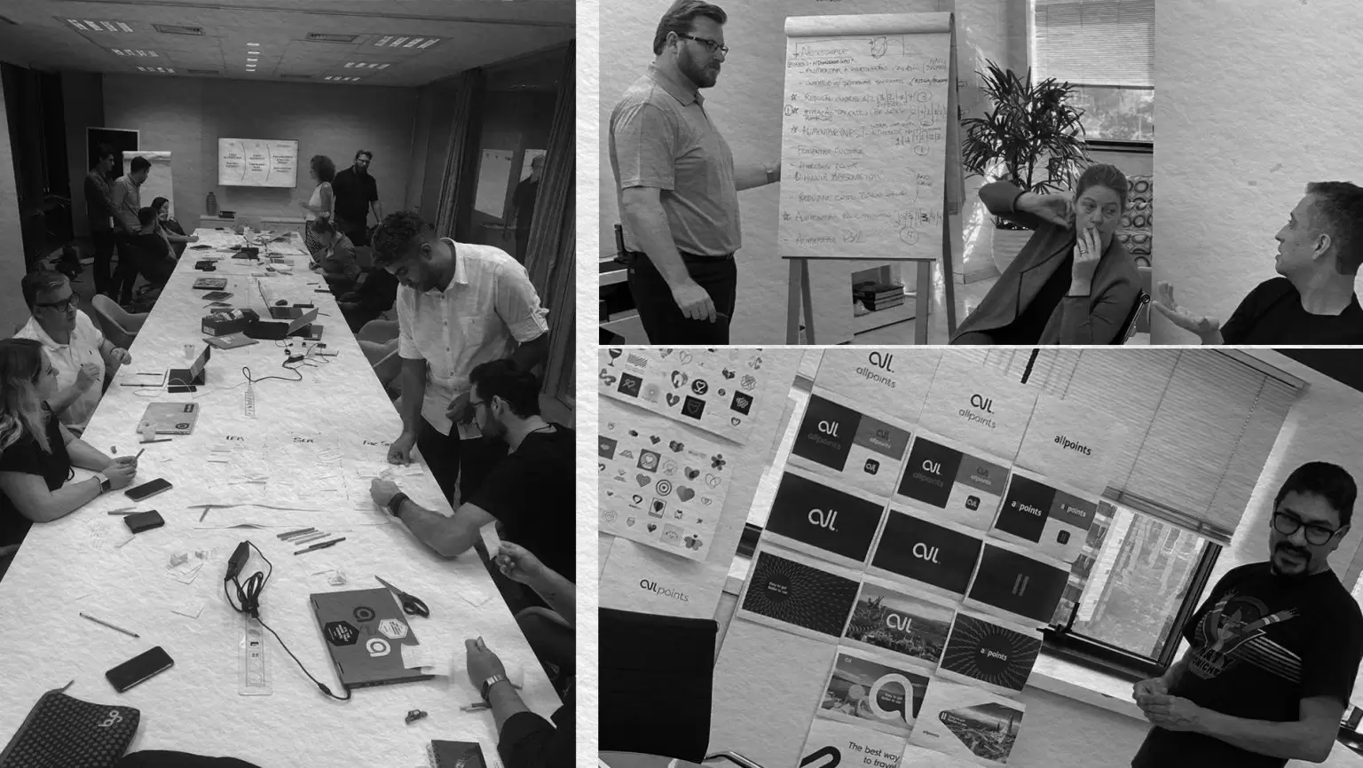
The strategy phase included the creation of a new brand platform that, in addition to organizing and clarifying the new positioning of the company, formed the basis for directing communication efforts. All the pillars were redefined: the purpose of the brand, its territory of operation, its value proposal, the tone of voice of the brand and also the central idea of communication. In addition, a strategic matrix was created so that its executives and investors could clearly identify the main growth drivers of the business and, mainly, how to approach them under the new positioning perspective.
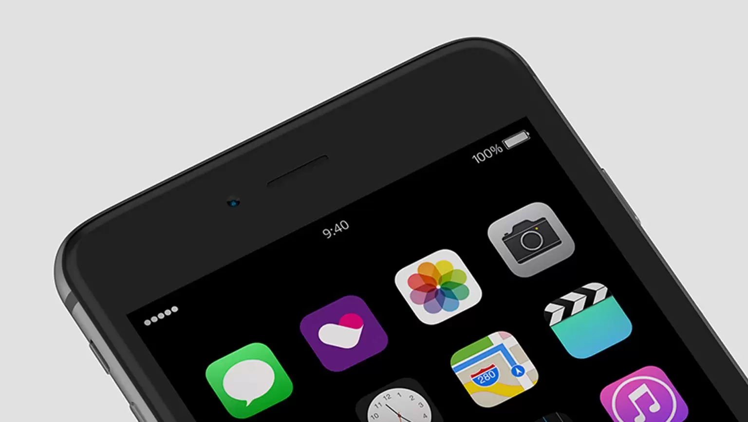
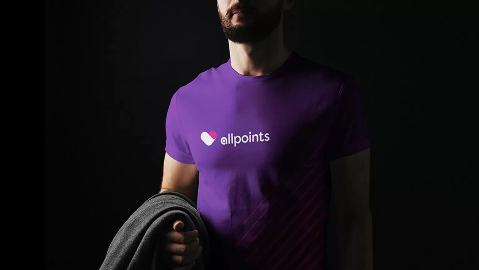
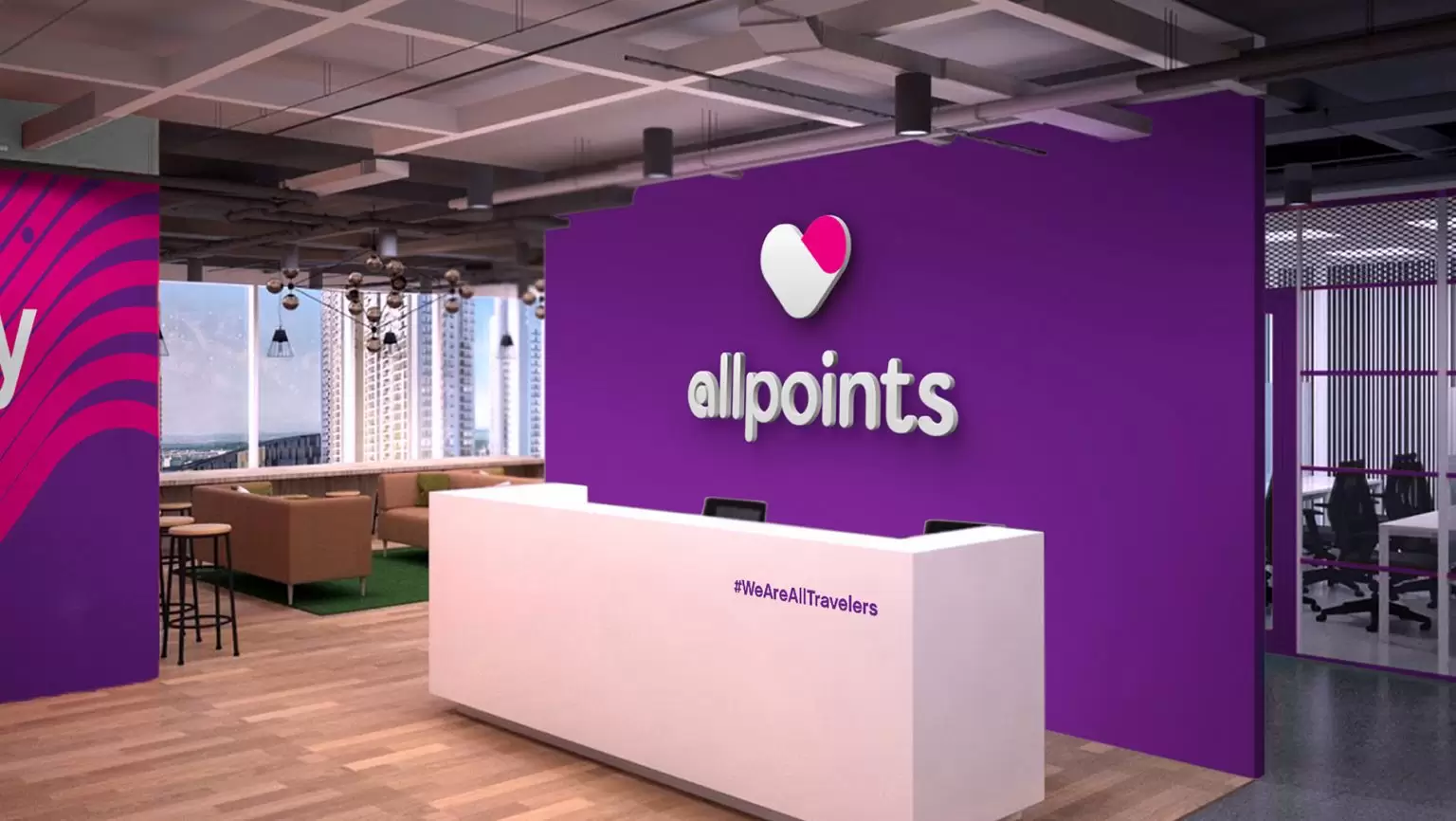
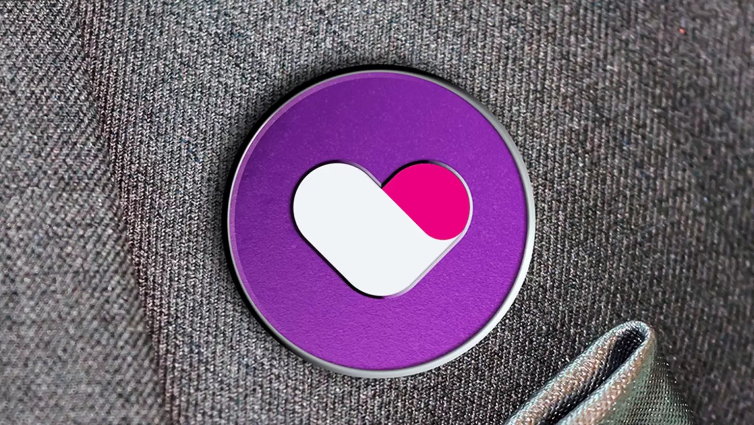
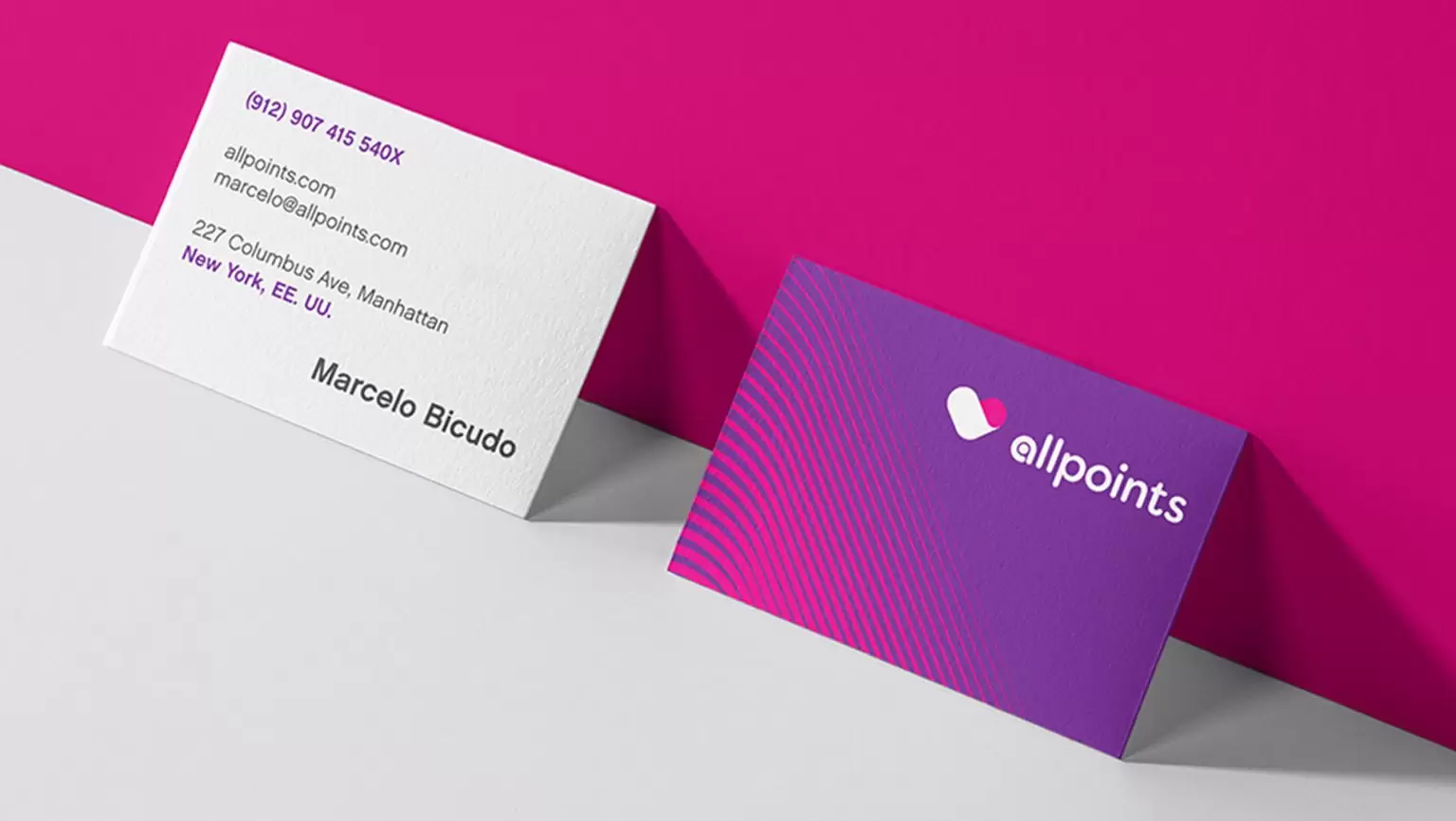
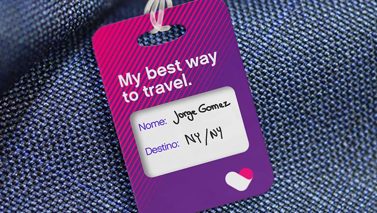
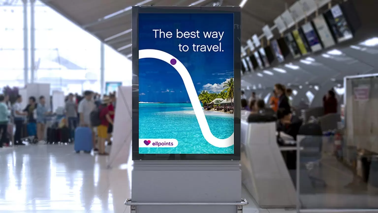
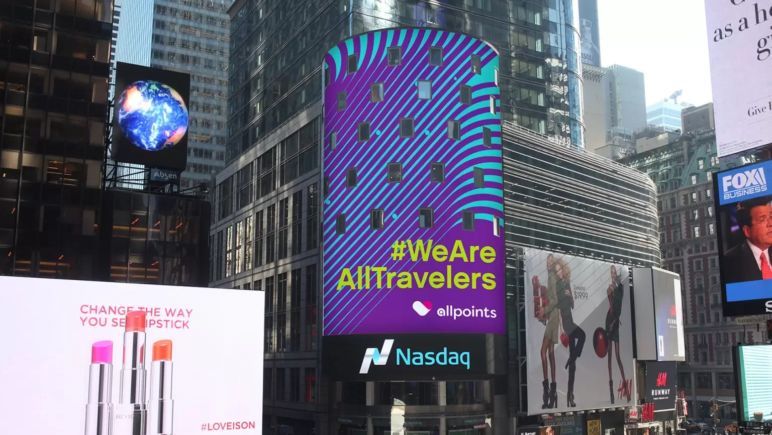
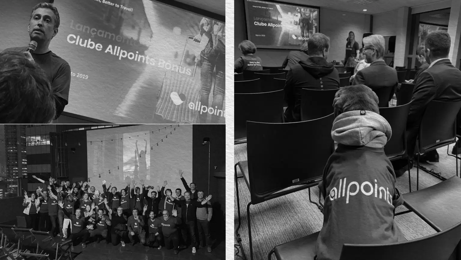
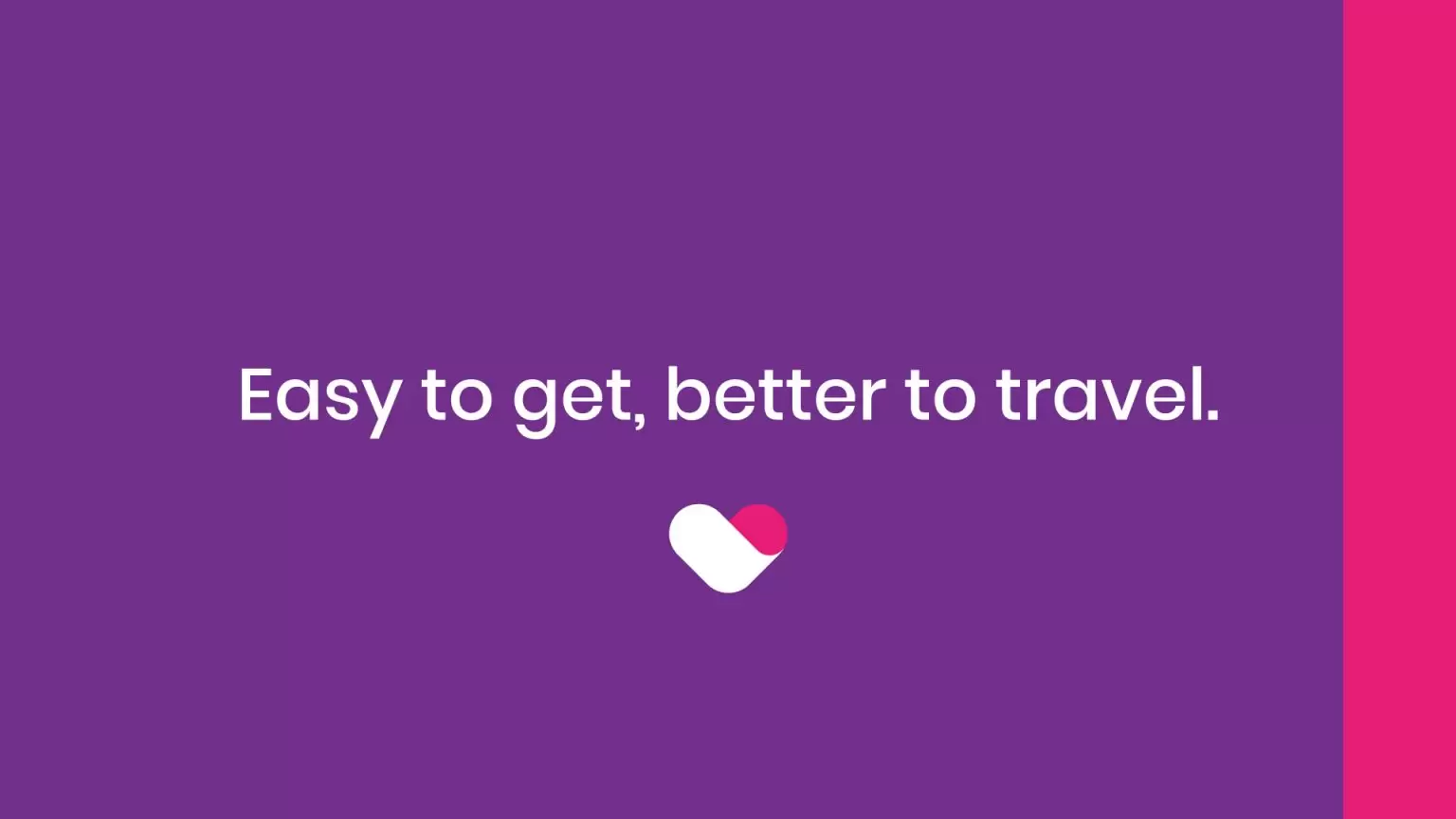
Finally, Pande’s creative team adapted the entire Allpoints identity system, which, in line with the brand positioning, now has a new icon; expansion and revision of the chromatic palette; creation of support graphics and creation of a new tagline: EASY TO GET, BETTER TO TRAVEL. All done with the aim of creating a rich, direct and versatile identity, suitable for the digital environment.